## Chart: Probability Distribution of q for Different l Values
### Overview
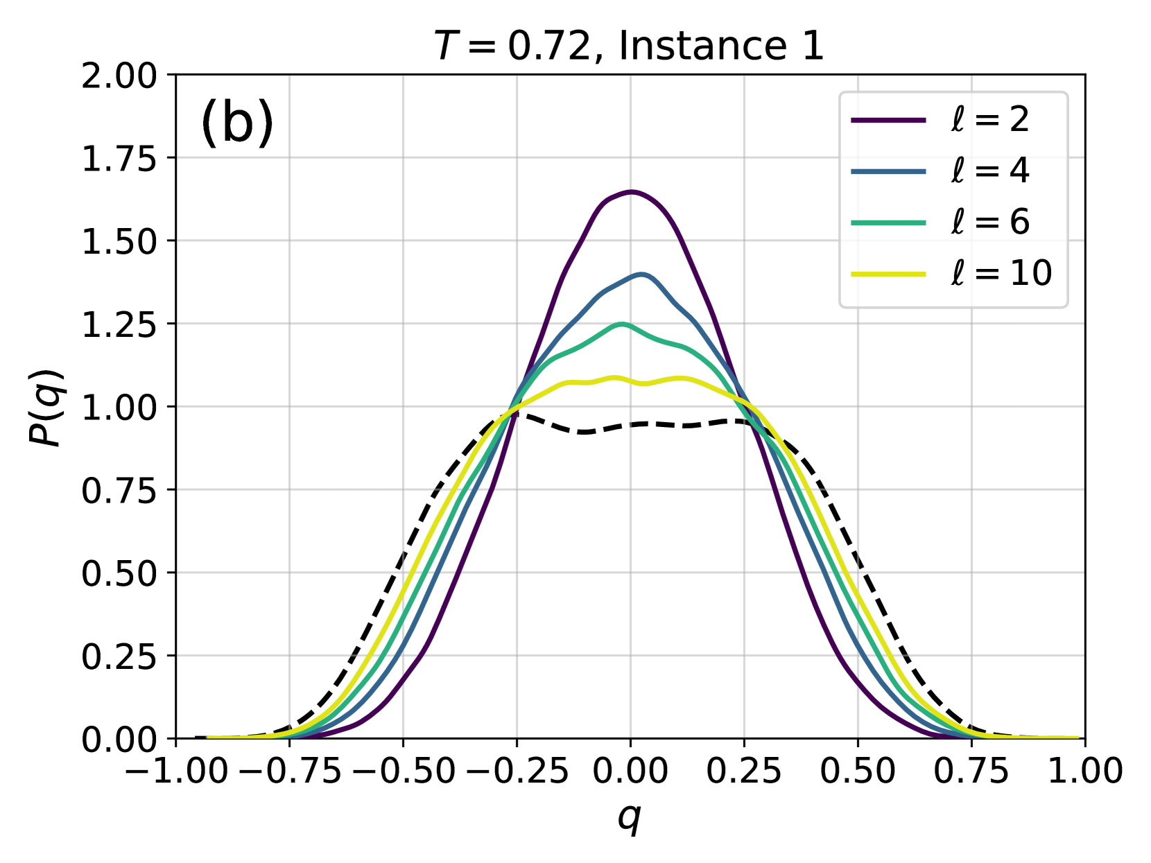
The image presents a line chart illustrating the probability distribution of a variable 'q' for different values of 'l'. The chart displays four distinct curves, each representing a specific 'l' value (2, 4, 6, and 10). The chart is labeled with "T = 0.72, Instance 1" at the top, indicating specific parameters for the data. The y-axis represents P(q), the probability, and the x-axis represents the value of q, ranging from -1.00 to 1.00.
### Components/Axes
* **Title:** T = 0.72, Instance 1
* **X-axis Label:** q
* **Y-axis Label:** P(q)
* **Legend:** Located in the top-right corner.
* l = 2 (Purple, dashed line)
* l = 4 (Blue, solid line)
* l = 6 (Green, solid line)
* l = 10 (Yellow, solid line)
* **X-axis Scale:** Ranges from -1.00 to 1.00, with markings at -0.75, -0.50, -0.25, 0.00, 0.25, 0.50, 0.75, and 1.00.
* **Y-axis Scale:** Ranges from 0.00 to 2.00, with markings at 0.25, 0.50, 0.75, 1.00, 1.25, 1.50, 1.75, and 2.00.
* **Label (b):** Located in the top-left corner.
### Detailed Analysis
Let's analyze each line individually, noting approximate values:
* **l = 2 (Purple, dashed):** This line exhibits a relatively broad distribution, peaking around q = 0.00 with a maximum probability of approximately 1.10. It descends symmetrically on both sides, reaching approximately 0.00 at q = -0.75 and q = 0.75.
* **l = 4 (Blue, solid):** This line is more concentrated around q = 0.00, with a peak probability of approximately 1.25. It descends more rapidly than the l=2 line, reaching approximately 0.00 at q = -0.50 and q = 0.50.
* **l = 6 (Green, solid):** This line is even more concentrated, peaking at approximately q = 0.00 with a maximum probability of around 1.60. It reaches approximately 0.00 at q = -0.25 and q = 0.25.
* **l = 10 (Yellow, solid):** This line is the most concentrated, with a sharp peak at approximately q = 0.00 and a maximum probability of around 1.75. It approaches 0.00 at approximately q = -0.10 and q = 0.10.
All lines are roughly symmetrical around q = 0.00. As 'l' increases, the distribution becomes narrower and taller, indicating a higher probability concentrated around q = 0.00.
### Key Observations
* The distributions become more peaked as 'l' increases.
* The width of the distributions decreases as 'l' increases.
* The maximum probability value increases as 'l' increases.
* All distributions are centered around q = 0.00.
* The dashed line (l=2) is qualitatively different from the solid lines.
### Interpretation
The chart demonstrates how the probability distribution of 'q' changes with varying values of 'l', while keeping 'T' constant at 0.72. The parameter 'l' appears to control the concentration or spread of the distribution. Higher values of 'l' lead to a more focused distribution around q = 0.00, suggesting that as 'l' increases, the variable 'q' is more likely to be close to zero. This could represent a narrowing of possible outcomes or a reduction in uncertainty. The dashed line for l=2 suggests a different underlying process or a qualitatively different behavior compared to the other values of 'l'. The parameter 'T' likely influences the overall shape and scale of the distributions, but its specific role isn't directly apparent from this single chart. The "Instance 1" label suggests that this is one realization of a stochastic process, and other instances might exhibit different distributions.