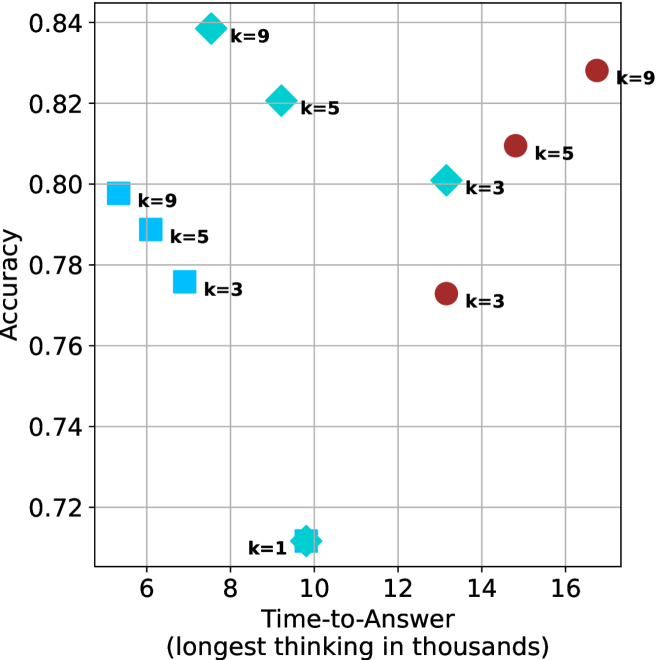
## Scatter Plot: Accuracy vs. Time-to-Answer
### Overview
The image is a scatter plot showing the relationship between "Accuracy" and "Time-to-Answer" (longest thinking in thousands). There are three distinct data series, each represented by a different shape and color: squares (light blue), diamonds (light blue), and circles (dark red). Each data point is labeled with a "k=" value, indicating a parameter or category.
### Components/Axes
* **X-axis:** "Time-to-Answer (longest thinking in thousands)". The scale ranges from approximately 5 to 17, with gridlines at integer values.
* **Y-axis:** "Accuracy". The scale ranges from 0.72 to 0.84, with gridlines at intervals of 0.02.
* **Data Series:**
* Squares (light blue): Represent one data series with k=3, k=5, and k=9.
* Diamonds (light blue): Represent one data series with k=1, k=3, k=5, and k=9.
* Circles (dark red): Represent one data series with k=3, k=5, and k=9.
* **Labels:** Each data point is labeled with its corresponding "k=" value.
### Detailed Analysis
* **Squares (light blue):**
* k=3: Time-to-Answer ≈ 7, Accuracy ≈ 0.77
* k=5: Time-to-Answer ≈ 6, Accuracy ≈ 0.79
* k=9: Time-to-Answer ≈ 6, Accuracy ≈ 0.80
Trend: As 'k' increases, the accuracy appears to increase slightly, while the time-to-answer remains relatively constant.
* **Diamonds (light blue):**
* k=1: Time-to-Answer ≈ 10, Accuracy ≈ 0.71
* k=3: Time-to-Answer ≈ 13, Accuracy ≈ 0.80
* k=5: Time-to-Answer ≈ 9.5, Accuracy ≈ 0.82
* k=9: Time-to-Answer ≈ 8, Accuracy ≈ 0.84
Trend: As 'k' increases, the accuracy increases, and the time-to-answer initially decreases, then increases slightly.
* **Circles (dark red):**
* k=3: Time-to-Answer ≈ 13.5, Accuracy ≈ 0.77
* k=5: Time-to-Answer ≈ 14.5, Accuracy ≈ 0.81
* k=9: Time-to-Answer ≈ 16.5, Accuracy ≈ 0.83
Trend: As 'k' increases, both the accuracy and the time-to-answer increase.
### Key Observations
* The light blue diamonds generally exhibit higher accuracy compared to the other two series for similar 'k' values.
* The dark red circles show a clear positive correlation between 'k' and both accuracy and time-to-answer.
* The light blue squares show a slight positive correlation between 'k' and accuracy, with a relatively constant time-to-answer.
* The lowest accuracy is observed for the light blue diamond with k=1.
### Interpretation
The scatter plot visualizes the performance of a system or model under different configurations represented by the 'k' parameter. The three data series (squares, diamonds, and circles) likely represent different algorithms, models, or settings.
The data suggests that:
* The light blue diamond configuration is generally more accurate, especially for higher 'k' values, but it also has a varying time-to-answer.
* The dark red circle configuration shows a trade-off between accuracy and time-to-answer, as increasing 'k' improves accuracy but also increases the time required to produce an answer.
* The light blue square configuration offers a relatively stable time-to-answer with a slight improvement in accuracy as 'k' increases.
The choice of the optimal configuration would depend on the specific requirements of the application, balancing the need for high accuracy with the acceptable time-to-answer. The outlier at k=1 for the light blue diamonds suggests that this configuration may be particularly sensitive or unstable.