\n
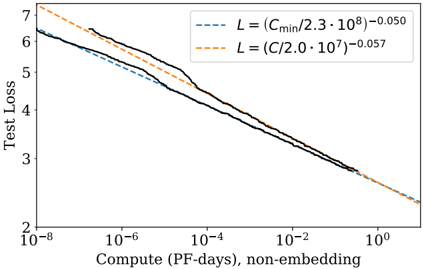
## Line Chart: Test Loss vs. Compute (PF-days, non-embedding)
### Overview
This image presents a line chart illustrating the relationship between "Compute (PF-days, non-embedding)" on the x-axis and "Test Loss" on the y-axis. Two different loss functions, denoted by equations, are compared. The chart displays the trend of test loss as compute increases, with shaded areas representing confidence intervals around each line.
### Components/Axes
* **X-axis Title:** "Compute (PF-days, non-embedding)"
* **X-axis Scale:** Logarithmic, ranging from 10<sup>-8</sup> to 10<sup>0</sup> (1).
* **Y-axis Title:** "Test Loss"
* **Y-axis Scale:** Linear, ranging from 2 to 7.
* **Legend:** Located in the top-right corner.
* **Line 1:** Dashed blue line labeled "L = (C<sub>min</sub>/2.3 ⋅ 10<sup>8</sup>)<sup>-0.050</sup>"
* **Line 2:** Dashed orange line labeled "L = (C/2.0 ⋅ 10<sup>7</sup>)<sup>-0.057</sup>"
### Detailed Analysis
**Line 1 (Blue, Dashed): L = (C<sub>min</sub>/2.3 ⋅ 10<sup>8</sup>)<sup>-0.050</sup>**
The blue line shows a decreasing trend in test loss as compute increases. The line starts at approximately 6.4 at a compute value of 10<sup>-8</sup> and decreases to approximately 2.6 at a compute value of 10<sup>0</sup>. The shaded area around the line indicates a confidence interval, with the upper bound generally around 0.3-0.5 above the line and the lower bound around 0.2-0.4 below the line.
**Line 2 (Orange, Dashed): L = (C/2.0 ⋅ 10<sup>7</sup>)<sup>-0.057</sup>**
The orange line also exhibits a decreasing trend in test loss with increasing compute. It begins at approximately 6.7 at a compute value of 10<sup>-8</sup> and descends to approximately 2.3 at a compute value of 10<sup>0</sup>. The shaded area around this line is similar in width to the blue line's, with the upper bound generally around 0.3-0.5 above the line and the lower bound around 0.2-0.4 below the line.
**Trend Comparison:**
Both lines demonstrate a similar decreasing trend, indicating that increasing compute generally leads to lower test loss for both loss functions. The orange line appears to consistently be slightly above the blue line across the entire range of compute values, suggesting that the loss function represented by the blue line may perform slightly better.
### Key Observations
* Both loss functions show diminishing returns as compute increases. The rate of decrease in test loss slows down as compute gets larger.
* The confidence intervals suggest that the observed trends are statistically significant, but there is still some variability in the test loss for each compute value.
* The difference between the two loss functions is relatively small, but consistent.
### Interpretation
The chart demonstrates the impact of compute on model performance, as measured by test loss. The decreasing trend in test loss with increasing compute suggests that more computational resources can lead to improved model accuracy. The comparison of two different loss functions allows for an evaluation of their relative effectiveness. The slightly better performance of the loss function represented by the blue line (L = (C<sub>min</sub>/2.3 ⋅ 10<sup>8</sup>)<sup>-0.050</sup>) suggests that it may be a more suitable choice for this particular task. The logarithmic scale on the x-axis highlights the importance of even small increases in compute at very low compute values. The confidence intervals provide a measure of the uncertainty associated with the observed trends, indicating that the results should be interpreted with caution. The chart suggests that there is a point of diminishing returns, where further increases in compute yield progressively smaller improvements in test loss.