TECHNICAL ASSET FINGERPRINT
684c1e345fac7abf70bc7a34
Click to view fullscreen
Press ESC or click to close
FOUND IN PAPERS
EXPERT: healer-alpha-free VERSION 1
RUNTIME: free/openrouter/healer-alpha
INTEL_VERIFIED
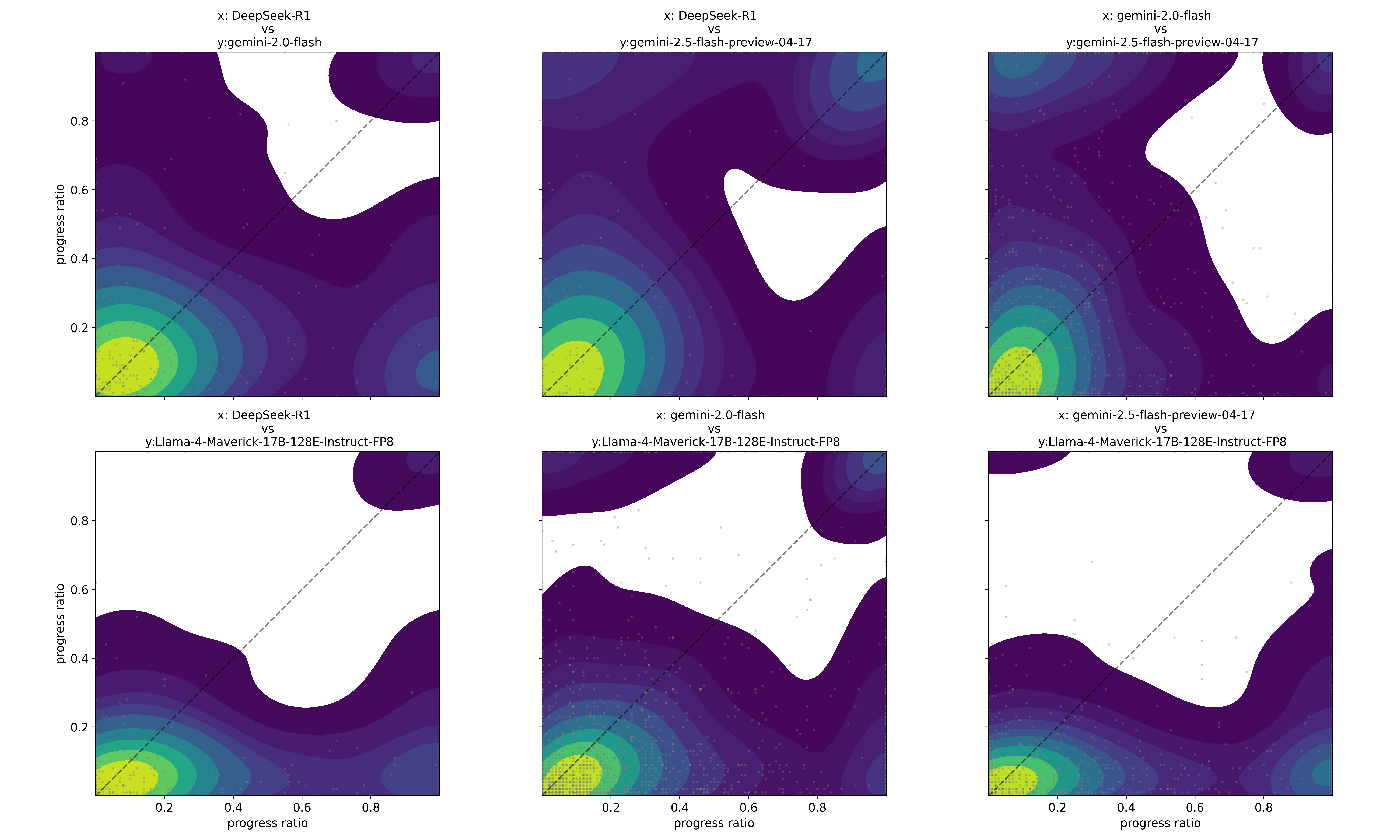
## [Contour Plot Grid]: AI Model Performance Comparison via Progress Ratio
### Overview
The image displays a 2x3 grid of contour plots (density heatmaps) comparing the performance of four different AI models. Each plot is a pairwise comparison, with the x-axis and y-axis both representing a "progress ratio" metric ranging from 0 to 1. The plots visualize the joint distribution of performance scores for two models across a set of tasks or benchmarks. A dashed diagonal line (y=x) in each plot serves as a reference for equal performance.
### Components/Axes
* **Plot Structure:** Six individual plots arranged in two rows and three columns.
* **Axes:** All plots share identical axes.
* **X-axis Label:** `progress ratio` (visible on bottom row plots).
* **Y-axis Label:** `progress ratio` (visible on leftmost column plots).
* **Axis Scale:** Linear scale from 0.0 to 1.0, with major tick marks at 0.2, 0.4, 0.6, and 0.8.
* **Titles:** Each plot has a title specifying the two models being compared in the format "x: [Model A] vs y: [Model B]".
* **Top Row (Left to Right):**
1. `x: DeepSeek-R1 vs y: gemini-2.0-flash`
2. `x: DeepSeek-R1 vs y: gemini-2.5-flash-preview-04-17`
3. `x: gemini-2.0-flash vs y: gemini-2.5-flash-preview-04-17`
* **Bottom Row (Left to Right):**
1. `x: DeepSeek-R1 vs y: Llama-4-Maverick-17B-128E-Instruct-FP8`
2. `x: gemini-2.0-flash vs y: Llama-4-Maverick-17B-128E-Instruct-FP8`
3. `x: gemini-2.5-flash-preview-04-17 vs y: Llama-4-Maverick-17B-128E-Instruct-FP8`
* **Visual Encoding:**
* **Color Gradient:** Represents data point density. The scale transitions from bright yellow (highest density) through green and teal to dark purple (lowest density). White areas indicate regions with no or negligible data points.
* **Diagonal Line:** A dashed gray line from (0,0) to (1,1) in each plot. Points above this line indicate the y-axis model has a higher progress ratio; points below indicate the x-axis model is higher.
* **Data Points:** Small, semi-transparent gray dots are scattered across the plots, representing individual data points underlying the density contours.
### Detailed Analysis
**Trend Verification & Spatial Grounding:**
1. **Top-Left (DeepSeek-R1 vs. gemini-2.0-flash):**
* **Trend:** The highest density (yellow) is concentrated in the bottom-left corner (progress ratios < 0.2 for both models). The density contours extend further along the x-axis (DeepSeek-R1) than the y-axis (gemini-2.0-flash). A significant white region exists in the upper-right quadrant.
* **Interpretation:** For most tasks, both models show low progress. However, when progress is made, DeepSeek-R1 tends to achieve a higher ratio than gemini-2.0-flash, as evidenced by the density mass lying predominantly below the diagonal line.
2. **Top-Middle (DeepSeek-R1 vs. gemini-2.5-flash-preview-04-17):**
* **Trend:** Similar high-density cluster at the origin. The white region is more pronounced and extends closer to the diagonal line compared to the first plot. The density contours show a more balanced spread around the diagonal in the mid-range (0.2-0.6).
* **Interpretation:** The performance gap between DeepSeek-R1 and gemini-2.5-flash-preview is narrower than with gemini-2.0-flash. There are more instances where both models achieve moderate to high progress ratios simultaneously.
3. **Top-Right (gemini-2.0-flash vs. gemini-2.5-flash-preview-04-17):**
* **Trend:** The density distribution is more symmetric around the diagonal line. The yellow core is at the origin, but the contours spread more evenly into the plot area. The white region is smaller and located in the top-right corner.
* **Interpretation:** These two Gemini models have highly correlated performance. Their progress ratios are similar across the majority of tasks, with gemini-2.5-flash-preview showing a slight edge in some regions (density slightly favors the area above the diagonal).
4. **Bottom-Left (DeepSeek-R1 vs. Llama-4-Maverick-17B-128E-Instruct-FP8):**
* **Trend:** The density is heavily skewed below the diagonal line. The yellow region is elongated along the x-axis. A large white area occupies the upper half of the plot.
* **Interpretation:** DeepSeek-R1 consistently outperforms Llama-4-Maverick on this metric. There are very few tasks where Llama-4-Maverick achieves a higher progress ratio than DeepSeek-R1.
5. **Bottom-Middle (gemini-2.0-flash vs. Llama-4-Maverick-17B-128E-Instruct-FP8):**
* **Trend:** Density is concentrated below the diagonal, but with a more substantial spread above it compared to the previous plot. The contours show a "ridge" of moderate density extending along the diagonal.
* **Interpretation:** gemini-2.0-flash generally performs better than Llama-4-Maverick, but the performance difference is less extreme than with DeepSeek-R1. There is a subset of tasks where their performance is comparable.
6. **Bottom-Right (gemini-2.5-flash-preview-04-17 vs. Llama-4-Maverick-17B-128E-Instruct-FP8):**
* **Trend:** The density distribution is the most balanced relative to the diagonal among the bottom row plots. While the core is at the origin, significant density exists both above and below the line in the 0.0-0.4 range.
* **Interpretation:** The performance of gemini-2.5-flash-preview and Llama-4-Maverick is the most competitive of the comparisons against Llama. Neither model shows a dominant advantage across all tasks.
### Key Observations
* **Universal Low-Progress Cluster:** All six plots show the highest data density (yellow) clustered near (0,0). This indicates that for a large portion of the evaluated tasks, all models struggle and achieve very low progress ratios.
* **Model Hierarchy:** A clear performance hierarchy emerges from the visual patterns:
1. **DeepSeek-R1** appears to be the strongest model, consistently lying above (outperforming) others.
2. **gemini-2.5-flash-preview-04-17** is the next strongest, showing balanced or slightly superior performance against gemini-2.0-flash and Llama-4-Maverick.
3. **gemini-2.0-flash** is generally outperformed by the above two.
4. **Llama-4-Maverick-17B-128E-Instruct-FP8** is the weakest in these comparisons, frequently lying below the diagonal.
* **Performance Correlation:** Models from the same family (the two Gemini models) show the most correlated performance (plot is most symmetric around the diagonal). Comparisons between different families (e.g., DeepSeek vs. Gemini, any vs. Llama) show more asymmetric distributions.
### Interpretation
This visualization provides a nuanced, task-level view of relative model capabilities beyond simple average scores. The "progress ratio" likely measures success or improvement on specific problems.
* **What the Data Suggests:** The data demonstrates that model superiority is not absolute but depends on the task distribution. While a clear ranking exists (DeepSeek-R1 > gemini-2.5-flash > gemini-2.0-flash > Llama-4-Maverick), there is significant overlap and task-specific variation. The large low-progress cluster for all models highlights a common set of challenging problems where current AI capabilities plateau.
* **Relationship Between Elements:** The pairwise plots collectively build a comparative landscape. By holding one model constant across a row (e.g., Llama-4-Maverick on the bottom), we can see how other models compare against a common baseline. The diagonal line is the critical reference, transforming a density plot into a direct comparison tool.
* **Notable Anomalies/Outliers:** The white regions are notable. They represent combinations of progress ratios that are rarely or never observed. For example, in the DeepSeek-R1 vs. Llama-4-Maverick plot, the large white area in the top-left (high y, low x) signifies that it's extremely rare for Llama-4-Maverick to significantly outperform DeepSeek-R1 on a task. The scattered gray dots represent these rare outlier events.
DECODING INTELLIGENCE...