\n
## Line Chart: Training Metrics and Overlap Rates
### Overview
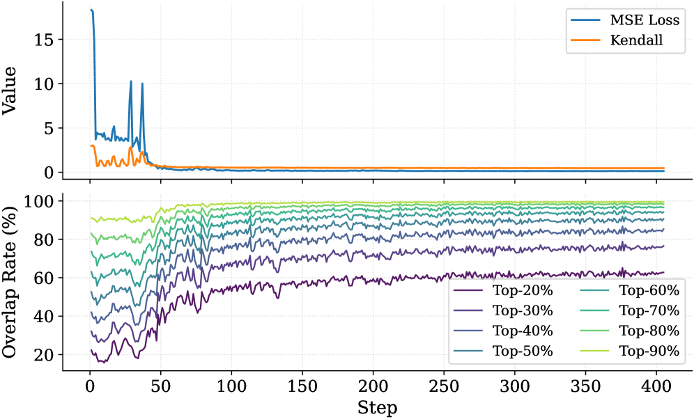
The image displays a two-panel vertical line chart tracking metrics over 400 training steps. The top panel shows two loss/correlation metrics, while the bottom panel shows the "Overlap Rate" for different top-percentage cohorts. The overall trend indicates model convergence and increasing stability in predictions over time.
### Components/Axes
**Shared X-Axis (Both Panels):**
* **Label:** `Step`
* **Scale:** Linear, from 0 to 400, with major ticks every 50 steps.
**Top Panel:**
* **Y-Axis Label:** `Value`
* **Scale:** Linear, from 0 to approximately 18.
* **Legend (Top-Right):**
* `MSE Loss` (Blue line)
* `Kendall` (Orange line)
**Bottom Panel:**
* **Y-Axis Label:** `Overlap Rate (%)`
* **Scale:** Linear, from 0% to 100%, with major ticks every 20%.
* **Legend (Bottom-Right, 2 columns):**
* `Top-20%` (Dark Purple)
* `Top-30%` (Purple)
* `Top-40%` (Blue-Purple)
* `Top-50%` (Blue)
* `Top-60%` (Teal)
* `Top-70%` (Green-Teal)
* `Top-80%` (Light Green)
* `Top-90%` (Yellow-Green)
### Detailed Analysis
**Top Panel (MSE Loss & Kendall):**
* **MSE Loss (Blue):** Starts at a very high value (approx. 18) at step 0. It drops rapidly to around 5 by step 25, then exhibits significant volatility with two sharp spikes back to ~10 around steps 40 and 50. After step 60, it decays smoothly and stabilizes at a very low value (approx. 0.1-0.3) from step 100 onward.
* **Kendall (Orange):** Starts at a moderate value (approx. 3). It fluctuates noisily between 0 and 3 for the first 60 steps. After step 60, it converges to a stable value very close to 0 (approx. 0.0-0.2) for the remainder of the training.
**Bottom Panel (Overlap Rate %):**
* **General Trend:** All eight lines show a similar pattern: high volatility and lower values in the first 50-75 steps, followed by a steady increase and stabilization. The lines are strictly ordered, with higher Top-% cohorts having higher Overlap Rates.
* **Top-90% (Yellow-Green):** Starts highest (~90%), quickly rises, and stabilizes near 98-99% after step 100.
* **Top-80% (Light Green):** Starts ~80%, stabilizes near 95-97%.
* **Top-70% (Green-Teal):** Starts ~70%, stabilizes near 92-94%.
* **Top-60% (Teal):** Starts ~60%, stabilizes near 88-90%.
* **Top-50% (Blue):** Starts ~50%, stabilizes near 82-85%.
* **Top-40% (Blue-Purple):** Starts ~40%, stabilizes near 75-78%.
* **Top-30% (Purple):** Starts ~30%, stabilizes near 65-68%.
* **Top-20% (Dark Purple):** Starts lowest (~20%), shows the most pronounced upward trend, and stabilizes at the lowest level, approximately 60-62%.
### Key Observations
1. **Phase Transition:** A clear phase change occurs around step 50-75. Before this, metrics are volatile; after, they enter a stable, convergent phase.
2. **Loss Spike Correlation:** The two large spikes in MSE Loss (steps ~40, 50) correspond to a period of increased noise and a slight dip in the Overlap Rate lines, suggesting a temporary disruption in training.
3. **Stable Hierarchy:** In the bottom panel, the ordering of the Overlap Rate lines by Top-% cohort is perfectly maintained throughout all 400 steps. No lines cross.
4. **Convergence Values:** The final Overlap Rate is not 100% for any cohort, even Top-90%. There is a persistent gap, with the Top-20% cohort showing the largest deficit (~38% non-overlap).
### Interpretation
This chart likely visualizes the training progress of a machine learning model, possibly involving ranking or selection tasks.
* **Top Panel Meaning:** The `MSE Loss` measures prediction error, which decreases and stabilizes, indicating the model is learning. The `Kendall` metric (likely Kendall's Tau) measures rank correlation. Its convergence to near zero is unusual and suggests the model's predicted rankings become uncorrelated with some initial or reference ranking as training progresses. This could be intentional (e.g., learning a new ranking) or a sign of a problem.
* **Bottom Panel Meaning:** The "Overlap Rate" measures how often the model's top-K% predictions match a target set. The increasing rates show the model's predictions are becoming more consistent with the target over time. The strict hierarchy is logical: it's easier to correctly identify the top 90% of items than the top 20%.
* **Overall Narrative:** The model undergoes an unstable initial phase (high loss, volatile overlap) before converging. Post-convergence, it achieves high but imperfect overlap with the target, with performance degrading as the prediction task becomes more precise (from Top-90% to Top-20%). The near-zero Kendall Tau combined with high Overlap Rates is a key point for investigation—it may indicate the model learns the correct *set* of top items but not their precise *order* relative to the original ranking.