## Bar Chart: R1-Qwen | AIME25
### Overview
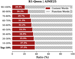
The image is a horizontal bar chart comparing the ratio of "Content Words" and "Function Words" across different percentile ranges (Top-10% to 90-100%). The chart shows how the proportion of content words changes as we move from the top percentile to the lower percentiles.
### Components/Axes
* **Title:** R1-Qwen | AIME25
* **Y-axis (Categories):** Percentile ranges (Top-10%, 10-20%, 20-30%, 30-40%, 40-50%, 50-60%, 60-70%, 70-80%, 80-90%, 90-100%)
* **X-axis (Values):** Ratio (%) from 0 to 100
* **Legend:** Located at the top-right of the chart.
* Content Words (Dark Red)
* Function Words (Light Gray with diagonal lines)
### Detailed Analysis
The chart displays the ratio of content words in dark red and function words in light gray with diagonal lines for each percentile range.
* **Top-10%:** Content Words: 37.5%, Function Words: approximately 62.5%
* **10-20%:** Content Words: 37.5%, Function Words: approximately 62.5%
* **20-30%:** Content Words: 35.9%, Function Words: approximately 64.1%
* **30-40%:** Content Words: 34.9%, Function Words: approximately 65.1%
* **40-50%:** Content Words: 33.5%, Function Words: approximately 66.5%
* **50-60%:** Content Words: 32.2%, Function Words: approximately 67.8%
* **60-70%:** Content Words: 31.3%, Function Words: approximately 68.7%
* **70-80%:** Content Words: 29.7%, Function Words: approximately 70.3%
* **80-90%:** Content Words: 26.2%, Function Words: approximately 73.8%
* **90-100%:** Content Words: 20.9%, Function Words: approximately 79.1%
**Trend Verification:**
The "Content Words" series shows a decreasing trend as we move from the Top-10% to the 90-100% range. Conversely, the "Function Words" series shows an increasing trend.
### Key Observations
* The proportion of content words is highest in the Top-10% and 10-20% ranges (37.5%).
* The proportion of content words decreases as the percentile range increases (i.e., moving towards 90-100%).
* The proportion of function words increases as the percentile range increases.
### Interpretation
The chart suggests that the top percentiles (Top-10% and 10-20%) use a higher proportion of content words compared to function words. As we move towards the lower percentiles (90-100%), the proportion of function words increases, indicating a shift in the type of language used. This could imply that the top percentiles are more concise and information-dense, while the lower percentiles might use more filler words or grammatical structures. The data demonstrates a clear inverse relationship between the proportion of content words and function words across different percentile ranges.