## Line Charts: Success Rate vs. Number of Actions
### Overview
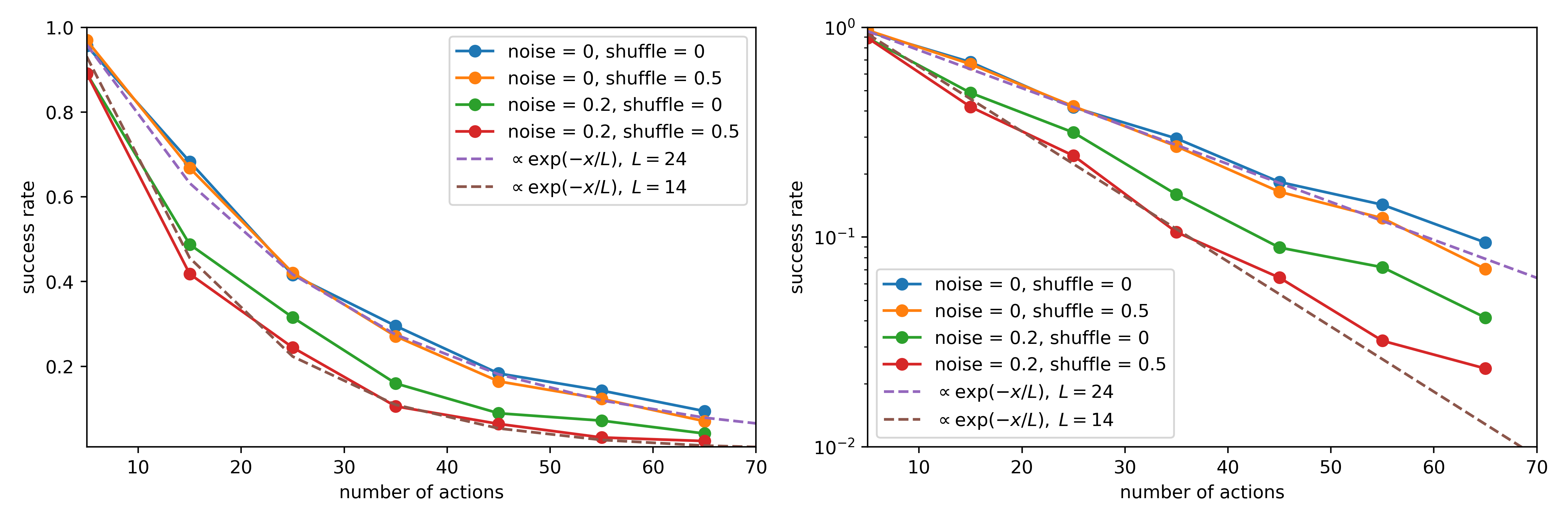
This image displays two side-by-side line charts illustrating the decay of "success rate" as the "number of actions" increases. The left chart utilizes a linear y-axis scale, while the right chart utilizes a logarithmic y-axis scale. Both charts compare four experimental conditions (varying noise and shuffle parameters) against two theoretical exponential decay reference curves.
### Components/Axes
* **Common Axes:**
* **X-axis:** "number of actions", ranging from 5 to 70, with major ticks at 10, 20, 30, 40, 50, 60, 70.
* **Y-axis:** "success rate".
* **Left Chart Y-axis:** Linear scale from 0.0 to 1.0.
* **Right Chart Y-axis:** Logarithmic scale from $10^{-2}$ to $10^0$.
* **Legend (Located in the top-right of the left chart and center-left of the right chart):**
* **Blue solid line/dot:** `noise = 0, shuffle = 0`
* **Orange solid line/dot:** `noise = 0, shuffle = 0.5`
* **Green solid line/dot:** `noise = 0.2, shuffle = 0`
* **Red solid line/dot:** `noise = 0.2, shuffle = 0.5`
* **Purple dashed line:** `∝ exp(-x/L), L = 24`
* **Brown dashed line:** `∝ exp(-x/L), L = 14`
### Detailed Analysis
The data series are plotted at x-values of 5, 15, 25, 35, 45, 55, and 65.
**Trend Verification:**
All four experimental data series exhibit a monotonic downward trend (decay) as the number of actions increases. The logarithmic plot (right) confirms that this decay is exponential, as the lines appear roughly linear on the log-y scale.
**Data Point Extraction (Approximate):**
| Number of Actions | Blue (0,0) | Orange (0, 0.5) | Green (0.2, 0) | Red (0.2, 0.5) |
| :--- | :--- | :--- | :--- | :--- |
| **5** | ~0.98 | ~0.98 | ~0.90 | ~0.89 |
| **15** | ~0.68 | ~0.66 | ~0.49 | ~0.42 |
| **25** | ~0.41 | ~0.42 | ~0.31 | ~0.25 |
| **35** | ~0.30 | ~0.27 | ~0.16 | ~0.11 |
| **45** | ~0.19 | ~0.17 | ~0.09 | ~0.07 |
| **55** | ~0.15 | ~0.13 | ~0.08 | ~0.05 |
| **65** | ~0.10 | ~0.08 | ~0.05 | ~0.03 |
* **Reference Curves:**
* The **Purple dashed line ($L=24$)** closely tracks the Blue and Orange data series.
* The **Brown dashed line ($L=14$)** closely tracks the Red data series.
### Key Observations
* **Noise Impact:** The "noise" parameter is the primary driver of performance degradation. Conditions with `noise = 0` (Blue/Orange) maintain significantly higher success rates than conditions with `noise = 0.2` (Green/Red).
* **Shuffle Impact:** The "shuffle" parameter has a secondary effect. Within the same noise level, the `shuffle = 0.5` condition generally results in a slightly lower success rate compared to `shuffle = 0`.