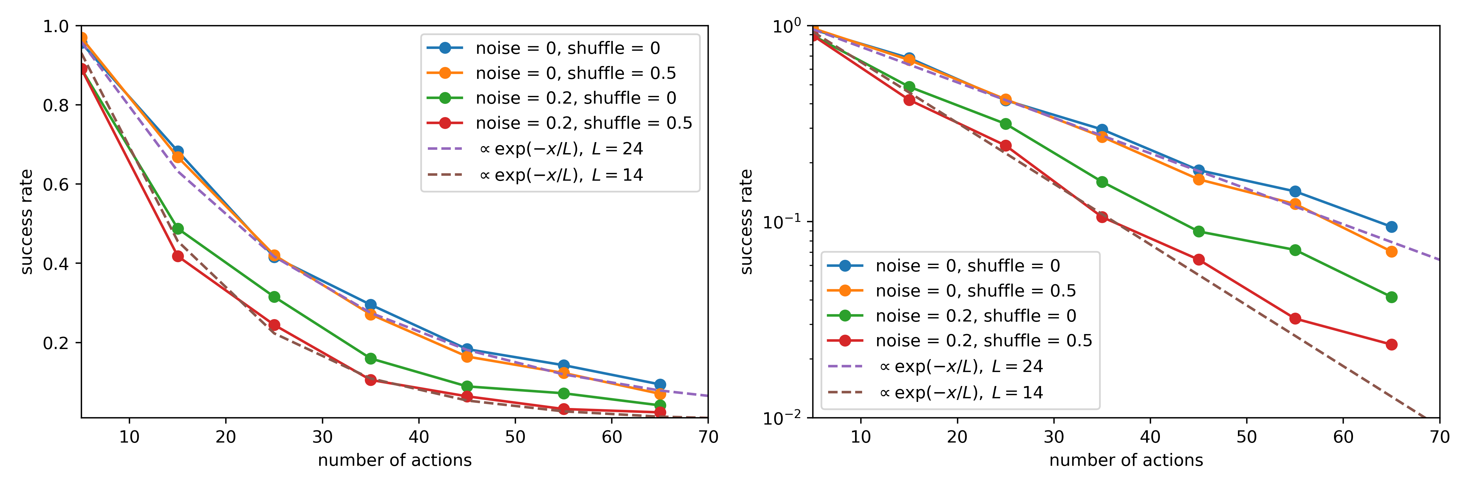
## Line Chart: Success Rate vs. Number of Actions Under Varying Noise and Shuffle Conditions
### Overview
The image displays two line charts side-by-side, presenting the same dataset with different y-axis scales. Both charts plot "success rate" against "number of actions" for four experimental conditions and two theoretical exponential decay models. The left chart uses a linear y-axis, while the right chart uses a logarithmic y-axis (base 10), which linearizes exponential decay trends.
### Components/Axes
* **X-Axis (Both Plots):** Label: "number of actions". Scale: Linear, ranging from approximately 5 to 70. Major tick marks are at 10, 20, 30, 40, 50, 60, 70.
* **Y-Axis (Left Plot):** Label: "success rate". Scale: Linear, ranging from 0.0 to 1.0. Major tick marks are at 0.2, 0.4, 0.6, 0.8, 1.0.
* **Y-Axis (Right Plot):** Label: "success rate". Scale: Logarithmic (base 10), ranging from 10⁻² (0.01) to 10⁰ (1.0). Major tick marks are at 10⁻², 10⁻¹, 10⁰.
* **Legend (Identical for both plots, positioned in the top-right quadrant):**
* **Blue line with circle markers:** `noise = 0, shuffle = 0`
* **Orange line with circle markers:** `noise = 0, shuffle = 0.5`
* **Green line with circle markers:** `noise = 0.2, shuffle = 0`
* **Red line with circle markers:** `noise = 0.2, shuffle = 0.5`
* **Purple dashed line:** `∝ exp(−x/L), L = 24`
* **Brown dashed line:** `∝ exp(−x/L), L = 14`
### Detailed Analysis
**Data Series Trends & Approximate Points:**
All series show a decaying trend: success rate decreases as the number of actions increases.
1. **Blue Line (noise=0, shuffle=0):**
* **Trend:** Highest success rate across all action counts. Decays the slowest.
* **Approximate Points (Left Plot):** (5, ~0.98), (15, ~0.68), (25, ~0.42), (35, ~0.30), (45, ~0.19), (55, ~0.15), (65, ~0.10).
2. **Orange Line (noise=0, shuffle=0.5):**
* **Trend:** Very closely follows the blue line, indicating shuffle=0.5 has minimal effect when noise=0.
* **Approximate Points (Left Plot):** (5, ~0.97), (15, ~0.67), (25, ~0.42), (35, ~0.28), (45, ~0.18), (55, ~0.14), (65, ~0.09).
3. **Green Line (noise=0.2, shuffle=0):**
* **Trend:** Significantly lower success rate than the no-noise conditions (blue/orange). Decays faster.
* **Approximate Points (Left Plot):** (5, ~0.90), (15, ~0.49), (25, ~0.32), (35, ~0.17), (45, ~0.10), (55, ~0.08), (65, ~0.06).
4. **Red Line (noise=0.2, shuffle=0.5):**
* **Trend:** Lowest success rate of all conditions. The combination of noise and shuffle degrades performance the most.
* **Approximate Points (Left Plot):** (5, ~0.88), (15, ~0.42), (25, ~0.24), (35, ~0.12), (45, ~0.07), (55, ~0.05), (65, ~0.04).
5. **Purple Dashed Line (Model: L=24):**
* **Trend:** Represents an exponential decay with characteristic length L=24. It closely fits the blue and orange (no noise) data series.
* **Approximate Points (Right Plot, Log Scale):** Starts at 1.0 for x=0. At x=24, value is ~0.37 (1/e). At x=48, value is ~0.14.
6. **Brown Dashed Line (Model: L=14):**
* **Trend:** Represents a faster exponential decay with L=14. It closely fits the red (noise=0.2, shuffle=0.5) data series.
* **Approximate Points (Right Plot, Log Scale):** Starts at 1.0 for x=0. At x=14, value is ~0.37. At x=28, value is ~0.14.
### Key Observations
1. **Dominant Effect of Noise:** The primary factor reducing success rate is the introduction of noise (noise=0.2). The green and red lines are substantially below the blue and orange lines.
2. **Minor Effect of Shuffle:** When noise is zero, shuffle=0.5 (orange) has negligible impact compared to shuffle=0 (blue). When noise is present, shuffle=0.5 (red) causes a further, noticeable degradation compared to shuffle=0 (green).
3. **Exponential Decay Fit:** The success rate decays exponentially with the number of actions. The no-noise conditions are well-modeled by a decay constant L≈24, while the worst-case condition (noise+shuffle) is better modeled by L≈14.
4. **Logarithmic Scale Clarity:** The right plot (log scale) makes the exponential nature of the decay visually apparent as straight lines and allows for clearer differentiation of the data points at higher action counts where values are small.
### Interpretation
This data demonstrates the robustness of a process (likely a sequential decision-making or planning algorithm) to perturbations. The "success rate" measures the probability of completing a task correctly within a given number of actions.
* **Under ideal conditions (no noise, no shuffle),** the process is highly reliable for short sequences but degrades predictably (exponentially) as the sequence length (number of actions) increases, with a characteristic decay length of about 24 actions.
* **Introducing noise (0.2) severely impacts performance,** cutting the effective reliable sequence length roughly in half (L≈14 for the worst case). This suggests the process is sensitive to inaccurate information or stochasticity in its environment or execution.
* **Shuffling (likely reordering of actions or sub-tasks) has a minimal standalone effect** but exacerbates the negative impact of noise. This implies that the process's structure or ordering is important for maintaining robustness when operating in noisy conditions.
* The exponential decay model provides a simple, quantitative way to compare the robustness of the system under different conditions via the parameter `L`. A higher `L` indicates greater robustness to increasing task length.
**In summary, the charts quantify how noise dramatically reduces the effective operational length of a sequential process, while shuffling acts as a secondary stressor that compounds noise's effect.**