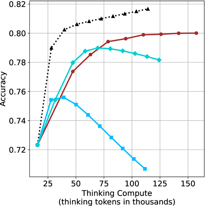
## Line Chart: Accuracy vs. Thinking Compute
### Overview
This image presents a line chart illustrating the relationship between "Thinking Compute" (measured in thousands of tokens) and "Accuracy". The chart displays three distinct data series, each represented by a different colored line, showing how accuracy changes as thinking compute increases. The chart has a grid background for easier readability.
### Components/Axes
* **X-axis:** "Thinking Compute (thinking tokens in thousands)". The scale ranges from approximately 0 to 150, with markers at 25, 50, 75, 100, 125, and 150.
* **Y-axis:** "Accuracy". The scale ranges from approximately 0.72 to 0.82, with gridlines at 0.74, 0.76, 0.78, 0.80, and 0.82.
* **Data Series:** Three lines are present, each representing a different condition or model.
* Black dashed line (dotted)
* Teal (cyan) line
* Red line
### Detailed Analysis
Let's analyze each line individually:
* **Black Dashed Line:** This line exhibits a strong upward trend, starting at approximately 0.72 at a Thinking Compute of 0 and increasing rapidly to approximately 0.815 at a Thinking Compute of 150. The line is consistently increasing, suggesting a positive correlation between Thinking Compute and Accuracy for this series.
* (0, 0.72)
* (25, 0.79)
* (50, 0.805)
* (75, 0.81)
* (100, 0.815)
* (125, 0.815)
* (150, 0.815)
* **Teal Line:** This line initially increases from approximately 0.75 at a Thinking Compute of 0 to a peak of around 0.795 at a Thinking Compute of 75. After this peak, the line declines to approximately 0.76 at a Thinking Compute of 150. This suggests an optimal level of Thinking Compute for this series, beyond which accuracy decreases.
* (0, 0.75)
* (25, 0.78)
* (50, 0.79)
* (75, 0.795)
* (100, 0.785)
* (125, 0.77)
* (150, 0.76)
* **Red Line:** This line shows an initial increase from approximately 0.76 at a Thinking Compute of 0 to a plateau around 0.80, starting at a Thinking Compute of 50 and remaining relatively constant until a Thinking Compute of 150. This indicates that accuracy reaches a saturation point with increasing Thinking Compute for this series.
* (0, 0.76)
* (25, 0.78)
* (50, 0.80)
* (75, 0.80)
* (100, 0.80)
* (125, 0.80)
* (150, 0.80)
### Key Observations
* The black dashed line consistently demonstrates increasing accuracy with increasing Thinking Compute.
* The teal line shows an inverted U-shaped curve, indicating an optimal Thinking Compute level.
* The red line plateaus, suggesting diminishing returns from increased Thinking Compute.
* All three lines start with similar accuracy values around 0.72-0.76.
### Interpretation
The chart suggests that the relationship between Thinking Compute and Accuracy is not linear and varies depending on the specific model or condition being evaluated. The black dashed line indicates that for some models, increasing Thinking Compute consistently improves accuracy. However, for others (teal line), there's an optimal point beyond which further increases in Thinking Compute actually *decrease* accuracy. This could be due to overfitting or other computational limitations. The red line suggests that some models reach a point of saturation where additional Thinking Compute doesn't yield significant improvements.
The differences between the lines could represent different algorithms, model sizes, or training datasets. The chart highlights the importance of finding the right balance between computational resources (Thinking Compute) and model performance (Accuracy). The teal line is particularly interesting, as it suggests that excessive Thinking Compute can be detrimental. This could be a valuable insight for optimizing resource allocation and model design.