## Chart: Accuracy vs. Thinking Compute
### Overview
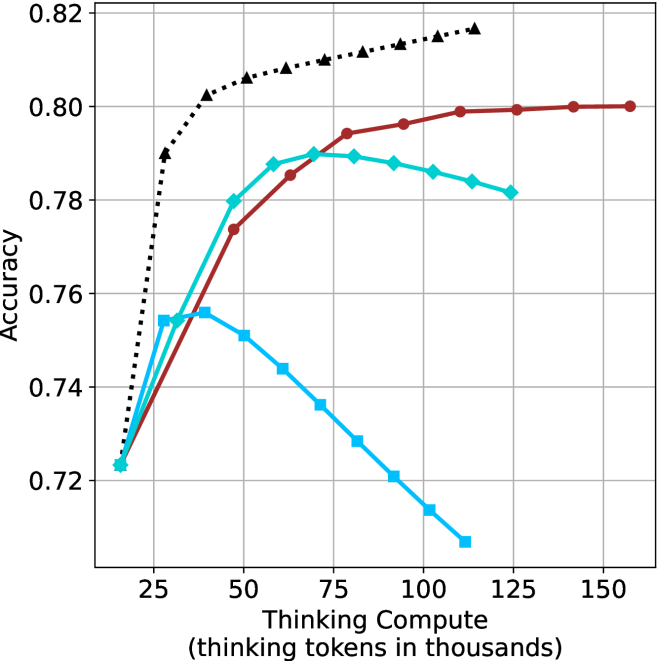
The image is a line chart comparing the accuracy of different models as a function of "Thinking Compute," measured in thousands of thinking tokens. There are four data series represented by different colored lines with distinct markers. The chart shows how accuracy changes as the computational resources increase.
### Components/Axes
* **X-axis:** "Thinking Compute (thinking tokens in thousands)". The scale ranges from approximately 10 to 150, with major ticks at 25, 50, 75, 100, 125, and 150.
* **Y-axis:** "Accuracy". The scale ranges from 0.72 to 0.82, with major ticks at 0.72, 0.74, 0.76, 0.78, 0.80, and 0.82.
* **Data Series:** Four distinct data series are plotted:
* Black dotted line with triangle markers.
* Brown solid line with circle markers.
* Cyan solid line with diamond markers.
* Cyan solid line with square markers.
### Detailed Analysis
* **Black Dotted Line (Triangles):** This line shows a rapid increase in accuracy initially, then plateaus.
* At x=25, y ≈ 0.73
* At x=50, y ≈ 0.80
* At x=75, y ≈ 0.81
* At x=100, y ≈ 0.815
* At x=125, y ≈ 0.818
* **Brown Solid Line (Circles):** This line shows a gradual increase in accuracy, reaching a plateau.
* At x=25, y ≈ 0.73
* At x=50, y ≈ 0.78
* At x=75, y ≈ 0.795
* At x=100, y ≈ 0.798
* At x=125, y ≈ 0.80
* At x=150, y ≈ 0.80
* **Cyan Solid Line (Diamonds):** This line increases initially, then decreases.
* At x=25, y ≈ 0.725
* At x=50, y ≈ 0.78
* At x=75, y ≈ 0.79
* At x=100, y ≈ 0.785
* At x=125, y ≈ 0.782
* **Cyan Solid Line (Squares):** This line increases initially, then decreases significantly.
* At x=25, y ≈ 0.725
* At x=50, y ≈ 0.755
* At x=75, y ≈ 0.74
* At x=100, y ≈ 0.715
* At x=125, y ≈ 0.708
### Key Observations
* The black dotted line (triangles) achieves the highest accuracy overall.
* The brown solid line (circles) plateaus at a lower accuracy than the black dotted line.
* The cyan lines (diamonds and squares) show an initial increase in accuracy, but then decrease as "Thinking Compute" increases beyond a certain point. The cyan line with squares decreases more sharply.
### Interpretation
The chart illustrates the relationship between computational resources ("Thinking Compute") and model accuracy. The black dotted line (triangles) represents a model that benefits most from increased computation, quickly reaching a high accuracy and maintaining it. The brown solid line (circles) also benefits, but plateaus at a lower accuracy. The cyan lines (diamonds and squares) suggest that for some models, increasing computation beyond a certain point can actually decrease accuracy, possibly due to overfitting or other factors. The model represented by the cyan line with squares is particularly sensitive to this effect.