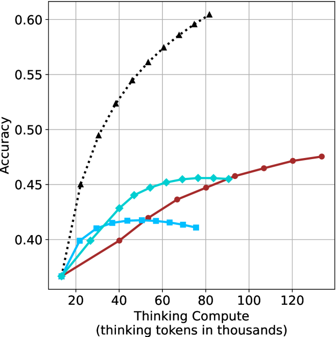
## Line Chart: Accuracy vs. Compute (Thinking Tokens)
### Overview
The image presents a line chart illustrating the relationship between accuracy and compute, measured in thinking tokens (in thousands). The chart displays three distinct data series, each represented by a different colored line, showing how accuracy changes as compute increases. The chart has a grid background for easier readability.
### Components/Axes
* **X-axis Title:** "Compute (thinking tokens in thousands)"
* Scale: Ranges from approximately 0 to 120 (in thousands of tokens).
* Markers: 0, 20, 40, 60, 80, 100, 120
* **Y-axis Title:** "Accuracy"
* Scale: Ranges from approximately 0.35 to 0.60.
* Markers: 0.35, 0.40, 0.45, 0.50, 0.55, 0.60
* **Data Series:**
* Series 1: Black dotted line
* Series 2: Cyan solid line
* Series 3: Red solid line
### Detailed Analysis
* **Series 1 (Black Dotted Line):** This line exhibits a steep upward trend, starting at approximately 0.38 at 0 compute and rapidly increasing to around 0.58 at 40 compute. The rate of increase slows down after 40 compute, reaching approximately 0.59 at 120 compute.
* Data Points (approximate):
* (0, 0.38)
* (20, 0.46)
* (40, 0.58)
* (60, 0.59)
* (80, 0.59)
* (100, 0.59)
* (120, 0.59)
* **Series 2 (Cyan Solid Line):** This line shows a more gradual increase in accuracy. It starts at approximately 0.39 at 0 compute, rises to around 0.44 at 40 compute, plateaus around 0.45 between 60 and 100 compute, and then slightly decreases to approximately 0.43 at 120 compute.
* Data Points (approximate):
* (0, 0.39)
* (20, 0.41)
* (40, 0.44)
* (60, 0.45)
* (80, 0.45)
* (100, 0.45)
* (120, 0.43)
* **Series 3 (Red Solid Line):** This line demonstrates a slow and steady increase in accuracy. It begins at approximately 0.37 at 0 compute, reaches around 0.43 at 40 compute, continues to rise to approximately 0.46 at 80 compute, and finally reaches approximately 0.48 at 120 compute.
* Data Points (approximate):
* (0, 0.37)
* (20, 0.39)
* (40, 0.43)
* (60, 0.44)
* (80, 0.46)
* (100, 0.47)
* (120, 0.48)
### Key Observations
* Series 1 (Black) significantly outperforms the other two series in terms of accuracy, especially at lower compute levels.
* Series 2 (Cyan) shows an initial increase in accuracy, but then plateaus and even slightly declines at higher compute levels.
* Series 3 (Red) exhibits the slowest and most consistent increase in accuracy.
* The rate of accuracy improvement diminishes for all series as compute increases.
### Interpretation
The chart suggests that increasing compute (thinking tokens) generally leads to improved accuracy, but the relationship is not linear and exhibits diminishing returns. The black line likely represents a more efficient or advanced method, achieving high accuracy with relatively less compute. The cyan line could indicate a method that reaches a performance limit, where additional compute does not yield significant improvements. The red line represents a method with a slower learning curve, requiring substantial compute to achieve moderate accuracy gains. The differences in the curves could be due to different algorithms, model sizes, or training strategies. The plateauing of the cyan line is a notable anomaly, suggesting a potential bottleneck or saturation point in that particular method. The chart highlights the importance of optimizing compute resources and selecting appropriate methods to maximize accuracy gains.