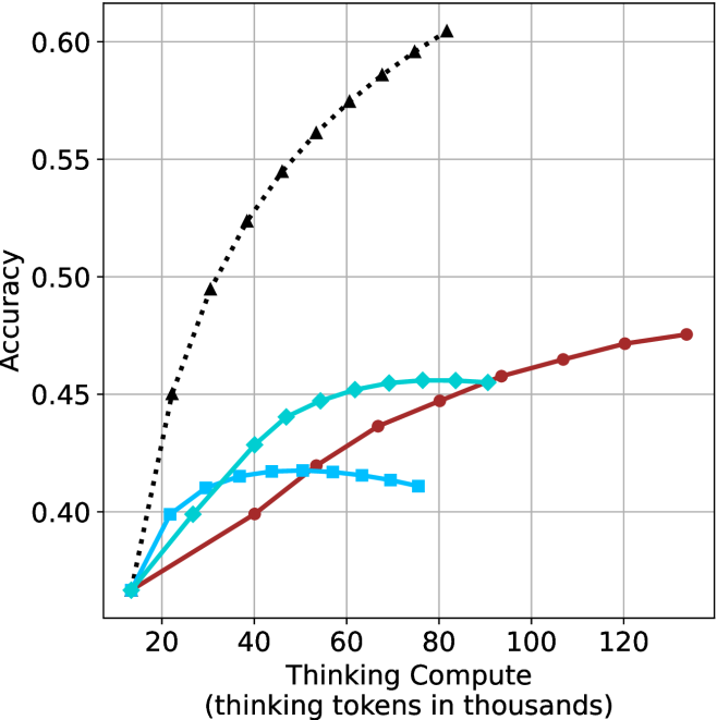
## Line Chart: Accuracy vs. Thinking Compute
### Overview
The image is a line chart comparing the accuracy of different models as a function of "Thinking Compute," measured in thousands of tokens. There are four distinct data series represented by different colored lines with different markers. The x-axis represents "Thinking Compute (thinking tokens in thousands)," and the y-axis represents "Accuracy."
### Components/Axes
* **X-axis:** "Thinking Compute (thinking tokens in thousands)". The scale ranges from 20 to 120 in increments of 20.
* **Y-axis:** "Accuracy". The scale ranges from 0.40 to 0.60 in increments of 0.05.
* **Data Series:**
* Black dotted line with triangle markers.
* Turquoise line with diamond markers.
* Brown line with circle markers.
* Blue line with square markers.
### Detailed Analysis
* **Black dotted line with triangle markers:** This line shows the highest accuracy overall. It starts at approximately 0.37 accuracy at 20k tokens and increases rapidly to approximately 0.45 at 20k tokens. It continues to increase, but at a decreasing rate, reaching approximately 0.60 accuracy at 80k tokens.
* (20, 0.37)
* (40, 0.52)
* (60, 0.57)
* (80, 0.60)
* **Turquoise line with diamond markers:** This line starts at approximately 0.37 accuracy at 20k tokens. It increases to approximately 0.45 accuracy at 60k tokens, then plateaus.
* (20, 0.37)
* (40, 0.43)
* (60, 0.45)
* (80, 0.45)
* **Brown line with circle markers:** This line starts at approximately 0.37 accuracy at 20k tokens. It increases steadily to approximately 0.48 accuracy at 120k tokens.
* (20, 0.37)
* (40, 0.40)
* (60, 0.43)
* (80, 0.45)
* (100, 0.46)
* (120, 0.47)
* **Blue line with square markers:** This line starts at approximately 0.37 accuracy at 20k tokens. It increases to approximately 0.42 accuracy at 60k tokens, then decreases.
* (20, 0.37)
* (40, 0.42)
* (60, 0.42)
* (80, 0.41)
### Key Observations
* The black dotted line (triangle markers) achieves the highest accuracy with the least amount of "Thinking Compute."
* The turquoise line (diamond markers) plateaus after 60k tokens.
* The brown line (circle markers) shows a steady increase in accuracy as "Thinking Compute" increases.
* The blue line (square markers) increases and then decreases in accuracy.
### Interpretation
The chart illustrates the relationship between "Thinking Compute" (in thousands of tokens) and the accuracy of different models. The black dotted line represents a model that quickly reaches a high level of accuracy with relatively low computational cost. The turquoise line represents a model that improves with increased compute, but plateaus. The brown line represents a model that steadily improves with more compute. The blue line represents a model that initially improves but then degrades with more compute. This suggests that the black dotted line model is the most efficient in terms of accuracy gained per unit of "Thinking Compute." The other models may have different architectures or training regimes that lead to their varying performance. The blue line's performance suggests that over-thinking can be detrimental to accuracy in some models.