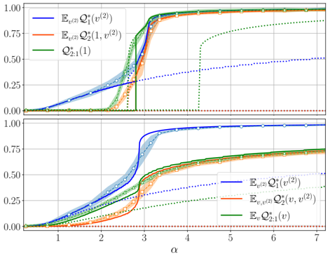
## Chart: Two-Panel Plot of Probabilities vs. Alpha
### Overview
The image presents two line plots arranged vertically, each displaying the relationship between different probability measures and the variable alpha (α). The plots share the same x-axis (α) but may represent different scenarios or conditions. Each plot contains multiple data series, represented by lines of different colors, some with shaded regions indicating uncertainty.
### Components/Axes
* **X-axis (Horizontal):** Labeled "α". The scale ranges from approximately 0 to 7, with tick marks at integer values.
* **Y-axis (Vertical):** Ranges from 0.00 to 1.00 in both plots, with tick marks at intervals of 0.25.
* **Top Plot Legend (Top-Left):**
* Blue Line: E<sub>v(2)</sub>Q<sup>\*</sup><sub>1</sub>(v<sup>(2)</sup>)
* Orange Line: E<sub>v(2)</sub>Q<sup>\*</sup><sub>2</sub>(1, v<sup>(2)</sup>)
* Green Line: Q<sup>\*</sup><sub>2:1</sub>(1)
* **Bottom Plot Legend (Bottom-Right):**
* Blue Line: E<sub>v(2)</sub>Q<sup>\*</sup><sub>1</sub>(v<sup>(2)</sup>)
* Orange Line: E<sub>v,v(2)</sub>Q<sup>\*</sup><sub>2</sub>(v, v<sup>(2)</sup>)
* Green Line: E<sub>v</sub>Q<sup>\*</sup><sub>2:1</sub>(v)
### Detailed Analysis
**Top Plot:**
* **Blue Line (E<sub>v(2)</sub>Q<sup>\*</sup><sub>1</sub>(v<sup>(2)</sup>)):** This line exhibits a sharp increase around α = 2.5 to 3, reaching a value close to 1.00. Before the increase, the value is near 0. After the increase, the line remains near 1.00. There is a shaded region around the line, indicating a confidence interval. A dotted blue line is also present, starting at approximately (3, 0.25) and increasing linearly to approximately (7, 0.4).
* **Orange Line (E<sub>v(2)</sub>Q<sup>\*</sup><sub>2</sub>(1, v<sup>(2)</sup>)):** This line also shows a sharp increase, but slightly delayed compared to the blue line, around α = 2.75 to 3.25, reaching a value close to 1.00. Before the increase, the value is near 0. After the increase, the line remains near 1.00. There is a shaded region around the line, indicating a confidence interval.
* **Green Line (Q<sup>\*</sup><sub>2:1</sub>(1)):** This line shows a step function behavior. It remains at 0 until approximately α = 3, then jumps to a value near 0.75, and then slowly increases to 1.00. A dotted green line is also present, starting at approximately (3, 0.25) and increasing linearly to approximately (7, 0.75).
**Bottom Plot:**
* **Blue Line (E<sub>v(2)</sub>Q<sup>\*</sup><sub>1</sub>(v<sup>(2)</sup>)):** Similar to the top plot, this line exhibits a sharp increase around α = 2.5 to 3, reaching a value close to 1.00. Before the increase, the value is near 0. After the increase, the line remains near 1.00. There is a shaded region around the line, indicating a confidence interval. A dotted blue line is also present, starting at approximately (3, 0.25) and increasing linearly to approximately (7, 0.4).
* **Orange Line (E<sub>v,v(2)</sub>Q<sup>\*</sup><sub>2</sub>(v, v<sup>(2)</sup>)):** This line also shows a sharp increase, but slightly delayed compared to the blue line, around α = 2.75 to 3.25, reaching a value close to 1.00. Before the increase, the value is near 0. After the increase, the line remains near 1.00. There is a shaded region around the line, indicating a confidence interval.
* **Green Line (E<sub>v</sub>Q<sup>\*</sup><sub>2:1</sub>(v)):** This line remains near 0 for the entire range of α. A dotted green line is also present, starting at approximately (3, 0.0) and remaining at 0.
### Key Observations
* The blue and orange lines in both plots exhibit a similar sigmoidal shape, indicating a transition or phase change around α = 3.
* The green line behaves differently in the top and bottom plots, suggesting a change in the underlying system or parameters.
* The shaded regions around the lines indicate uncertainty in the measurements, which is more pronounced in the transition region.
* The dotted lines in the top plot show a linear increase after the transition point, while in the bottom plot, the green dotted line remains at 0.
### Interpretation
The plots likely represent the behavior of some system as a function of the parameter α. The sharp increases in the blue and orange lines suggest a critical point or threshold behavior. The different behavior of the green line in the two plots indicates that the quantity it represents is sensitive to some change in the system's conditions between the top and bottom plots. The dotted lines may represent theoretical predictions or asymptotic behavior. The shaded regions indicate the level of confidence in the experimental measurements. The data suggests that the system undergoes a phase transition or a significant change in behavior around α = 3, and the nature of this transition depends on the specific conditions represented by the top and bottom plots.