\n
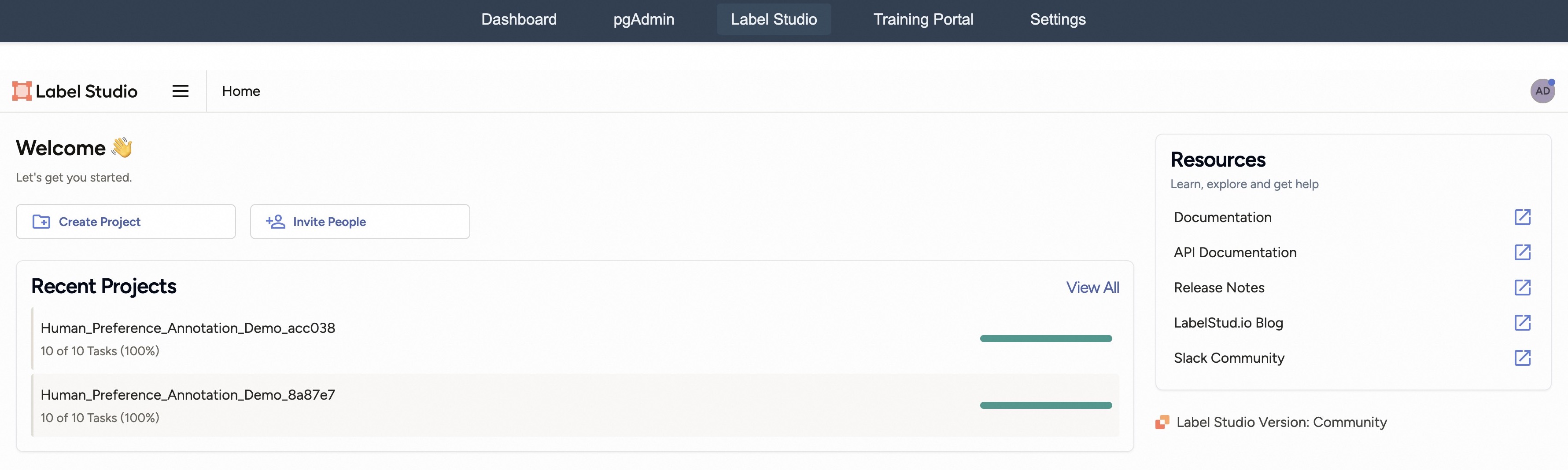
## Screenshot: Label Studio Dashboard Interface
### Overview
This image is a screenshot of the web-based user interface for "Label Studio," a data annotation platform. The view is the main dashboard or home page, displaying navigation elements, a welcome message, recent project status, and resource links. The interface is clean and functional, with a dark blue top navigation bar and a white main content area.
### Components/Axes
The interface is segmented into distinct regions:
1. **Top Navigation Bar (Dark Blue Background):**
* Contains five navigation tabs: `Dashboard`, `pgAdmin`, `Label Studio` (currently active, indicated by a darker background), `Training Portal`, and `Settings`.
* Text is white.
2. **Main Header (White Background):**
* **Left:** The Label Studio logo (an orange square icon) and the text "Label Studio". Next to it is a hamburger menu icon (three horizontal lines) and the current page title "Home".
* **Right:** A circular user avatar icon with the initials "AD".
3. **Welcome Section (Left-aligned):**
* **Heading:** "Welcome 👋" (includes a waving hand emoji).
* **Subtext:** "Let's get you started."
* **Action Buttons:**
* `Create Project` (with a folder-plus icon).
* `Invite People` (with a user-plus icon).
4. **Recent Projects Section (Left-aligned, below Welcome):**
* **Heading:** "Recent Projects".
* **Link:** "View All" (aligned to the right of the heading).
* **Project List:** Two project entries are displayed.
* **Project 1:**
* **Name:** `Human_Preference_Annotation_Demo_acc038`
* **Status:** `10 of 10 Tasks (100%)`
* **Visual Indicator:** A solid green horizontal progress bar, filled to 100%.
* **Project 2:**
* **Name:** `Human_Preference_Annotation_Demo_8a87e7`
* **Status:** `10 of 10 Tasks (100%)`
* **Visual Indicator:** A solid green horizontal progress bar, filled to 100%.
5. **Resources Card (Right-aligned sidebar):**
* **Card Heading:** "Resources"
* **Card Subtext:** "Learn, explore and get help"
* **List of Links (each with an external link icon):**
* `Documentation`
* `API Documentation`
* `Release Notes`
* `LabelStud.io Blog`
* `Slack Community`
6. **Footer Information (Bottom-right corner):**
* **Text:** `Label Studio Version: Community` (preceded by the Label Studio icon).
### Detailed Analysis
* **Textual Content:** All visible text has been transcribed above. The primary language is English. No other languages are present.
* **Data Points:** The key data presented is the status of two recent projects. Both projects are named with a common prefix (`Human_Preference_Annotation_Demo`) followed by unique alphanumeric suffixes (`_acc038`, `_8a87e7`). Both show identical completion metrics: 10 out of 10 tasks completed, representing 100% progress.
* **Visual Elements:** The interface uses color functionally. The active navigation tab is highlighted. The green progress bars provide an immediate visual cue for project completion. The external link icons in the Resources section indicate that those links will open in a new context.
### Key Observations
1. **Project Completion:** Both listed projects are at 100% completion. This could indicate they are demo projects, completed test runs, or that the user has finished all assigned tasks for these specific annotation jobs.
2. **Naming Convention:** The project names suggest they are related to "Human Preference Annotation," likely a task type within the platform. The suffixes appear to be unique identifiers.
3. **Interface State:** The user is logged in (as indicated by the "AD" avatar) and is on the "Home" page of the Label Studio application, which is part of a larger suite of tools (as seen in the top nav: Dashboard, pgAdmin, etc.).
4. **Resource Accessibility:** The platform provides direct access to documentation, development resources (API docs), community updates (blog, release notes), and support (Slack community) from the main dashboard.
### Interpretation
This screenshot captures the initial landing state for a user of the Label Studio platform. It is designed to orient the user and provide quick access to core actions (creating projects, inviting collaborators) and status information (recent work).
The presence of two fully completed "Human_Preference_Annotation_Demo" projects is the most significant data point. This strongly suggests the user has either:
* Just finished working on these demo projects as part of an onboarding or testing process.
* Is viewing a pre-populated demo account where these projects showcase the platform's capability to track task completion.
The interface emphasizes productivity and support. The prominent placement of "Create Project" and "Invite People" buttons encourages collaboration and new work initiation. Simultaneously, the "Resources" sidebar ensures help and learning materials are immediately accessible, reducing friction for new users. The version note ("Community") indicates the edition of the software being used.
In essence, the image depicts a functional, user-centric dashboard for a data annotation tool, highlighting completed work and providing clear pathways to start new tasks or seek assistance.