\n
## Pie Charts: Yearly Distribution Comparison
### Overview
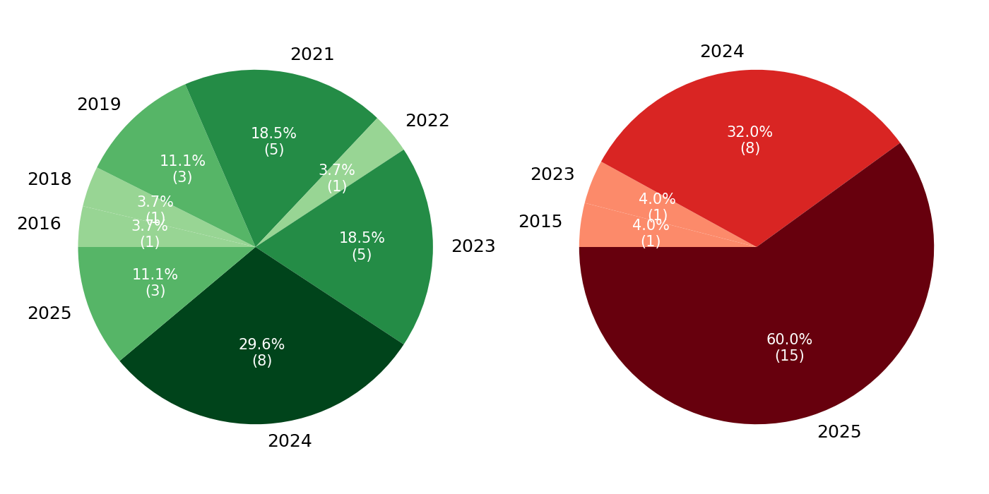
The image displays two pie charts side-by-side on a white background. The left chart uses a green color palette, and the right chart uses a red color palette. Each chart visualizes the distribution of a dataset across different years, showing both percentage and absolute count (in parentheses) for each year segment.
### Components/Axes
* **Chart Type:** Two pie charts.
* **Left Chart (Green Palette):** Represents data distributed across the years 2016, 2018, 2019, 2021, 2022, 2023, 2024, and 2025.
* **Right Chart (Red Palette):** Represents data distributed across the years 2015, 2023, 2024, and 2025.
* **Labels:** Each segment is labeled with the year, placed outside the pie chart adjacent to its segment.
* **Data Labels:** Inside each segment, the percentage of the total and the absolute count (in parentheses) are displayed in white text.
* **Legend:** There is no separate legend; the year labels serve as the key for each segment.
### Detailed Analysis
#### Left Chart (Green Palette)
This chart has 8 segments. The largest segment is at the bottom.
* **2024:** Darkest green segment, positioned at the bottom (6 o'clock). **29.6% (8)**.
* **2021:** Dark green segment, positioned at the top (12 o'clock). **18.5% (5)**.
* **2023:** Medium-dark green segment, positioned at the right (3 o'clock). **18.5% (5)**.
* **2019:** Medium green segment, positioned at the top-left (10-11 o'clock). **11.1% (3)**.
* **2025:** Medium green segment, positioned at the left (9 o'clock). **11.1% (3)**.
* **2022:** Light green segment, positioned at the top-right (1-2 o'clock). **3.7% (1)**.
* **2018:** Light green segment, positioned at the left (9 o'clock, adjacent to 2025). **3.7% (1)**.
* **2016:** Lightest green segment, positioned at the left (8-9 o'clock). **3.7% (1)**.
**Total Count (Left Chart):** 8 + 5 + 5 + 3 + 3 + 1 + 1 + 1 = **27**.
#### Right Chart (Red Palette)
This chart has 4 segments. The largest segment dominates the bottom half.
* **2025:** Darkest red (maroon) segment, positioned at the bottom (spanning from ~4 o'clock to ~8 o'clock). **60.0% (15)**.
* **2024:** Bright red segment, positioned at the top (spanning from ~10 o'clock to ~2 o'clock). **32.0% (8)**.
* **2023:** Light red (salmon) segment, positioned at the left (9 o'clock). **4.0% (1)**.
* **2015:** Lightest red (peach) segment, positioned at the left (8-9 o'clock, adjacent to 2023). **4.0% (1)**.
**Total Count (Right Chart):** 15 + 8 + 1 + 1 = **25**.
### Key Observations
1. **Concentration of Data:** The right chart shows a heavy concentration in the most recent years, with 2024 and 2025 accounting for 92% of the data (23 out of 25 total). The left chart is more distributed, though 2024 is still the largest single segment.
2. **Year Overlap:** The years 2023, 2024, and 2025 appear in both charts, but with vastly different proportions. For example, 2025 represents 11.1% of the left chart but 60.0% of the right chart.
3. **Color Coding:** The charts use monochromatic color scales (greens and reds) where darker shades correspond to larger segments within each chart.
4. **Total Counts:** The datasets are of similar size (27 vs. 25 items).
### Interpretation
The two pie charts likely represent the composition of two different datasets or categories, broken down by the year of origin or occurrence.
* The **left (green) chart** suggests a dataset with a longer historical tail, containing items from as far back as 2016, but with a clear peak in 2024. The distribution is relatively balanced among the top four years (2021, 2023, 2024, 2025).
* The **right (red) chart** suggests a dataset that is overwhelmingly recent. The year 2025 alone constitutes the majority (60%), and together with 2024, they dominate the set. This could indicate a metric that has surged in the last two years, such as recent sales, new user sign-ups, or current project initiations.
The stark contrast in distribution between the two charts is the primary insight. Without additional context on what the green and red categories represent (e.g., "Product A vs. Product B," "Successes vs. Failures," "Internal vs. External Projects"), the specific meaning is ambiguous. However, the data clearly shows that the "red" category is characterized by extreme recency, while the "green" category has a more established, multi-year history.