## Scatter Plot: Accuracy vs. SP
### Overview
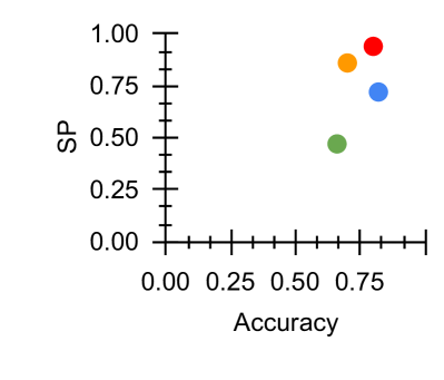
The image is a scatter plot displaying the relationship between "Accuracy" on the x-axis and "SP" (likely Sensitivity/Specificity) on the y-axis. Four data points are plotted, each represented by a different color: red, orange, blue, and green. The data points are clustered in the upper-right quadrant of the plot, indicating relatively high values for both Accuracy and SP.
### Components/Axes
* **X-axis:** "Accuracy", ranging from 0.00 to 1.00, with tick marks at intervals of 0.25.
* **Y-axis:** "SP", ranging from 0.00 to 1.00, with tick marks at intervals of 0.25.
* **Data Points:** Four data points, colored red, orange, blue, and green. There is no legend.
### Detailed Analysis
* **Red Data Point:** Located at approximately Accuracy = 0.80, SP = 0.95.
* **Orange Data Point:** Located at approximately Accuracy = 0.75, SP = 0.85.
* **Blue Data Point:** Located at approximately Accuracy = 0.75, SP = 0.75.
* **Green Data Point:** Located at approximately Accuracy = 0.65, SP = 0.50.
### Key Observations
* All data points have an accuracy greater than 0.60.
* The red data point exhibits the highest accuracy and SP values.
* The green data point exhibits the lowest accuracy and SP values.
* The data points are clustered, suggesting a positive correlation between Accuracy and SP.
### Interpretation
The scatter plot visualizes the performance of different models or conditions, where each data point represents a specific scenario. The clustering of points in the upper-right quadrant suggests that the models/conditions generally perform well in terms of both accuracy and SP. The red data point represents the best-performing scenario, while the green data point represents the worst-performing scenario. The plot allows for a quick comparison of the different scenarios and their trade-offs between accuracy and SP. Without a legend, it is impossible to know what the colors represent.