## Scatter Plot: Accuracy vs. SP
### Overview
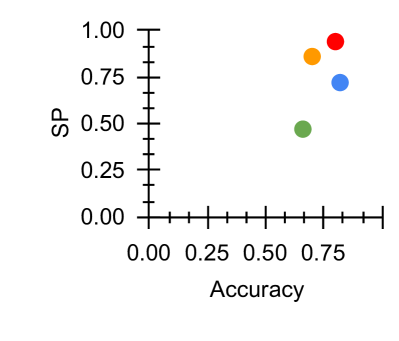
The image is a 2D scatter plot comparing four data points across two metrics: "Accuracy" (x-axis) and "SP" (y-axis). The plot uses colored circles to represent distinct data series or categories, though no explicit legend is provided within the image frame. The data points are clustered in the upper-right quadrant, indicating generally high values for both metrics.
### Components/Axes
* **X-Axis (Horizontal):**
* **Label:** "Accuracy"
* **Scale:** Linear, ranging from 0.00 to approximately 0.80.
* **Major Tick Marks:** 0.00, 0.25, 0.50, 0.75.
* **Minor Tick Marks:** Present between each major tick, representing intervals of 0.05.
* **Y-Axis (Vertical):**
* **Label:** "SP"
* **Scale:** Linear, ranging from 0.00 to 1.00.
* **Major Tick Marks:** 0.00, 0.25, 0.50, 0.75, 1.00.
* **Minor Tick Marks:** Present between each major tick, representing intervals of 0.05.
* **Data Series (Legend Implied by Color):**
* **Red Circle**
* **Orange Circle**
* **Blue Circle**
* **Green Circle**
* *Note: No textual legend is present in the image. The colors are the sole identifiers for the data points.*
### Detailed Analysis
The plot contains four distinct data points. Their approximate coordinates, determined by visual alignment with the axis ticks, are as follows:
1. **Red Circle:**
* **Position:** Top-rightmost point.
* **Accuracy (X):** ~0.75
* **SP (Y):** ~0.95
* **Trend:** This point represents the highest SP value and ties for the highest Accuracy.
2. **Orange Circle:**
* **Position:** Slightly left and below the red point.
* **Accuracy (X):** ~0.65
* **SP (Y):** ~0.85
* **Trend:** High SP, but lower Accuracy than the red and blue points.
3. **Blue Circle:**
* **Position:** Directly below the red point.
* **Accuracy (X):** ~0.75
* **SP (Y):** ~0.70
* **Trend:** Ties for the highest Accuracy but has a notably lower SP than the red and orange points.
4. **Green Circle:**
* **Position:** Bottom-left of the cluster.
* **Accuracy (X):** ~0.60
* **SP (Y):** ~0.50
* **Trend:** This point has the lowest values for both Accuracy and SP among the four.
### Key Observations
* **Clustering:** All data points are concentrated in the region where Accuracy > 0.50 and SP > 0.50, suggesting all measured entities perform above the midpoint on both scales.
* **Performance Hierarchy:** There is a clear visual hierarchy in SP: Red > Orange > Blue > Green. For Accuracy, Red and Blue are tied at the top, followed by Orange, then Green.
* **Trade-off Visualization:** The plot visually demonstrates a potential trade-off or difference in performance profiles. For example, the Blue and Red points share the same high Accuracy (~0.75) but differ significantly in SP (~0.70 vs. ~0.95). Conversely, the Orange point sacrifices some Accuracy (~0.65) for a high SP (~0.85).
* **Outlier:** The Green point is a relative outlier, positioned distinctly lower and to the left of the other three points.
### Interpretation
This scatter plot is a comparative performance visualization, likely for models, algorithms, or experimental conditions. "Accuracy" is a common metric for classification correctness, while "SP" is an unspecified metric (potentially Specificity, Sensitivity, or another performance score).
The data suggests that the entity represented by the **Red** circle is the top performer, achieving the best balance of high Accuracy and very high SP. The **Blue** entity matches it in Accuracy but falls short on SP. The **Orange** entity prioritizes SP over marginal gains in Accuracy. The **Green** entity underperforms the others on both metrics.
The absence of a legend is a critical limitation; without knowing what each color represents, the practical conclusions are limited to relative performance. The plot effectively communicates that high Accuracy does not guarantee high SP, as seen in the vertical separation between the Red and Blue points. The clustering indicates that achieving scores below 0.50 on either metric was not observed in this dataset.