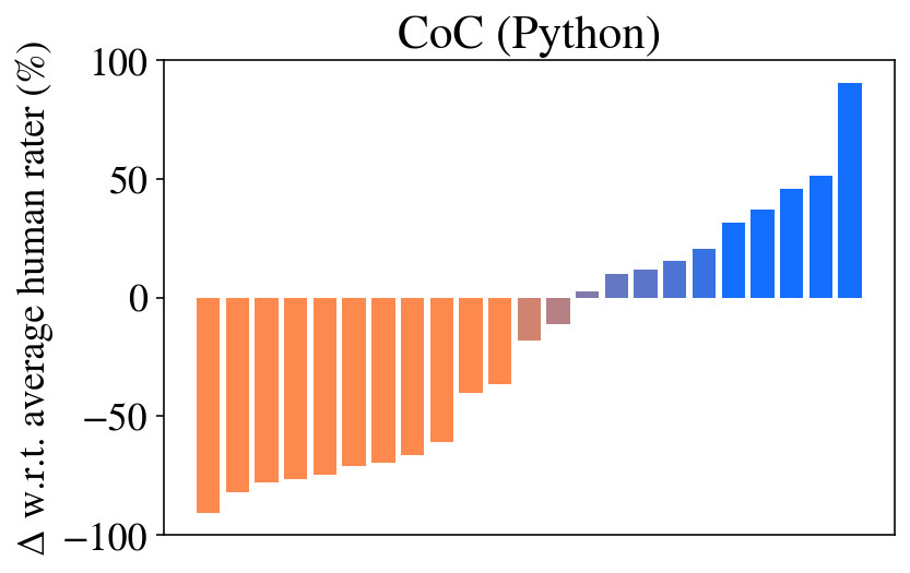
## Bar Chart: CoC (Python) - Deviation from Average Human Rater
### Overview
The image is a bar chart titled "CoC (Python)". It displays the percentage deviation (Δ) of various items (likely models, methods, or code samples) from an "average human rater" baseline. The chart shows a sorted distribution, with items performing worse than the human average on the left and those performing better on the right.
### Components/Axes
* **Title:** "CoC (Python)" (Centered at the top).
* **Y-Axis Label:** "Δ w.r.t. average human rater (%)". This indicates the metric is a percentage difference relative to a human benchmark.
* **Y-Axis Scale:** Linear scale ranging from -100 to 100, with major tick marks at -100, -50, 0, 50, and 100.
* **X-Axis:** No explicit label. Represents discrete, unnamed items (e.g., different AI models or code variants). There are 22 bars in total.
* **Legend:** No explicit legend is present. Color is used to encode the sign of the deviation:
* **Orange Bars:** Represent negative deviations (performance worse than the human average).
* **Blue Bars:** Represent positive deviations (performance better than the human average).
* **Brownish/Taupe Bars:** Two bars near the zero line appear in a muted, brownish color, likely indicating values very close to zero.
### Detailed Analysis
The bars are sorted in ascending order from left to right. Below are approximate values for each bar, estimated from the y-axis. The sequence starts with the most negative deviation.
**Left Section (Orange Bars - Negative Deviation):**
1. Bar 1 (Far left): ~ -90%
2. Bar 2: ~ -80%
3. Bar 3: ~ -75%
4. Bar 4: ~ -73%
5. Bar 5: ~ -70%
6. Bar 6: ~ -68%
7. Bar 7: ~ -65%
8. Bar 8: ~ -60%
9. Bar 9: ~ -40%
10. Bar 10: ~ -35%
**Center Section (Brownish Bars - Near Zero):**
11. Bar 11: ~ -15%
12. Bar 12: ~ -10%
**Right Section (Blue Bars - Positive Deviation):**
13. Bar 13: ~ -5% (Very short blue bar, just below zero)
14. Bar 14: ~ +8%
15. Bar 15: ~ +12%
16. Bar 16: ~ +18%
17. Bar 17: ~ +22%
18. Bar 18: ~ +32%
19. Bar 19: ~ +38%
20. Bar 20: ~ +45%
21. Bar 21: ~ +52%
22. Bar 22 (Far right): ~ +90%
**Trend Verification:** The visual trend is a clear, monotonic increase from the most negative value on the far left to the most positive value on the far right. The slope is steepest at the extremes and flattens near the center (zero line).
### Key Observations
1. **Wide Performance Spread:** The performance range is enormous, spanning approximately 180 percentage points (from ~-90% to ~+90%).
2. **Bimodal Distribution:** The data appears roughly bimodal. There is a cluster of items performing significantly worse than humans (left side, ~-90% to -35%) and another cluster performing significantly better (right side, ~+30% to +90%), with fewer items near the human-average baseline.
3. **Extreme Outliers:** The two bars at the far ends (Bar 1 at ~-90% and Bar 22 at ~+90%) are clear outliers, representing the worst and best performers relative to the human benchmark.
4. **Color Coding:** The color shift from orange to brown to blue provides an immediate visual cue for performance relative to the human baseline.
### Interpretation
This chart likely compares the performance of various automated systems (e.g., code completion models, static analysis tools, or AI agents) on a "Code of Conduct" (CoC) or similar evaluation task for Python code, against the consensus score of human raters.
* **What it demonstrates:** The data shows that the evaluated systems exhibit extreme variability. Most systems perform either substantially worse or substantially better than the average human rater, with very few achieving parity. This suggests the task is highly challenging for current automated methods, and performance is not uniformly distributed around the human level.
* **Relationship between elements:** The sorted bar format effectively ranks the systems. The color coding reinforces the performance dichotomy. The absence of item labels on the x-axis suggests the focus is on the overall distribution and range of performance rather than the identity of specific systems in this particular view.
* **Notable implications:** The large number of systems outperforming the human average (10 out of 22 bars are blue and positive) is significant. It indicates that for this specific task and metric, AI systems have surpassed the average human capability. However, the equally large number of systems performing far below human level highlights a lack of robustness or consistency across different approaches. The two near-zero bars represent the rare cases where automated performance closely matches the human average.