\n
## Diagram: Gantt-like Chart
### Overview
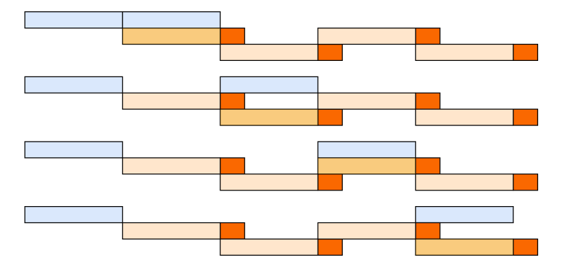
The image presents a series of four horizontal bar charts arranged vertically, resembling a simplified Gantt chart. Each chart represents a distinct process or task, visualized with three different colored segments: light blue, light orange, and a darker orange. The charts do not have explicit axis labels or numerical scales, making precise quantification difficult. The background is a uniform gray.
### Components/Axes
There are no explicit axes or scales. The diagram consists of four rows, each representing a separate entity. Each row contains a sequence of colored rectangular segments. The colors used are:
* Light Blue
* Light Orange
* Dark Orange
### Detailed Analysis or Content Details
Each row represents a different process. Let's analyze each row individually:
* **Row 1:** Starts with a light blue segment, followed by a light orange segment, then a dark orange segment, and finally a longer light orange segment.
* **Row 2:** Starts with a light blue segment, followed by a light orange segment, then a dark orange segment, and finally a longer light orange segment.
* **Row 3:** Starts with a light blue segment, followed by a light orange segment, then a dark orange segment, and finally a longer light orange segment.
* **Row 4:** Starts with a light blue segment, followed by a light orange segment, then a dark orange segment, and finally a longer light orange segment.
All four rows have the same structure: light blue, light orange, dark orange, and then a longer light orange segment. The lengths of the segments appear to be roughly consistent across all rows, although there are slight variations.
### Key Observations
The most striking observation is the uniformity across the four rows. Each row follows the same sequence of colors and a similar segment structure. There is no clear indication of time or progress, as there are no axis labels or numerical values. The diagram appears to illustrate a standardized process with three distinct phases, followed by a longer final phase.
### Interpretation
The diagram likely represents a workflow or process with four parallel instances. The consistent structure suggests that each instance follows the same steps. The light blue segment could represent an initial setup or planning phase. The light orange segment might represent a core processing phase, and the dark orange segment could represent a review or validation step. The final, longer light orange segment likely represents a completion or deployment phase.
The lack of quantitative data makes it difficult to draw definitive conclusions. However, the diagram suggests a highly standardized and repeatable process. The absence of variation between the rows implies that there are no significant bottlenecks or delays in any of the instances. It's possible this is a simplified illustration of a more complex process, focusing only on the key stages. Without additional context, it's difficult to determine the specific nature of the process or the meaning of the different color segments.