\n
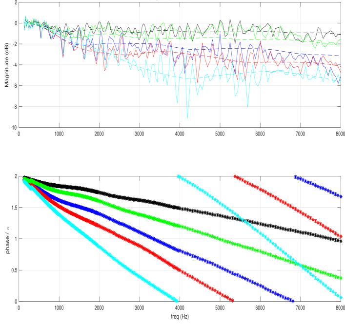
## Charts: Frequency Response Analysis
### Overview
The image presents two charts displaying frequency response data. The top chart shows magnitude in decibels (dB) versus frequency in Hertz (Hz), while the bottom chart shows phase in radians of pi (π) versus frequency in Hz. Both charts display multiple data series, each represented by a different colored line.
### Components/Axes
* **Top Chart:**
* X-axis: Frequency (Hz), ranging from 0 to 8000 Hz.
* Y-axis: Magnitude (dB), ranging from -10 to 2 dB.
* Data Series: Multiple lines, each representing a different frequency response.
* **Bottom Chart:**
* X-axis: Frequency (Hz), ranging from 0 to 8000 Hz.
* Y-axis: Phase / π, ranging from 0 to 2.
* Data Series: Multiple lines, each representing a different frequency response.
* **Colors:** The lines are colored as follows (approximate):
* Black
* Red
* Green
* Cyan
* Blue
* Magenta
### Detailed Analysis or Content Details
**Top Chart (Magnitude vs. Frequency):**
* **Black Line:** Relatively flat, fluctuating around 0 dB. At approximately 4000 Hz, there is a slight dip.
* **Red Line:** Generally around -2 dB, with significant fluctuations, especially between 3000 and 6000 Hz.
* **Green Line:** Fluctuates around 0 dB, with more pronounced peaks and troughs than the black line.
* **Cyan Line:** Shows a large dip around 4000 Hz, reaching approximately -8 dB. Fluctuates significantly.
* **Blue Line:** Relatively stable around -1 dB, with minor fluctuations.
* **Magenta Line:** Fluctuates around 0 dB, with moderate peaks and troughs.
**Bottom Chart (Phase vs. Frequency):**
* **Black Line:** Decreases linearly from approximately 2 to 0.5 radians/π over the frequency range.
* **Red Line:** Decreases more rapidly than the black line, starting at approximately 2 and ending near 0 radians/π.
* **Green Line:** Decreases at a rate similar to the red line, but starts slightly lower.
* **Cyan Line:** Decreases very rapidly, starting at approximately 2 and reaching 0 radians/π around 4000 Hz.
* **Blue Line:** Decreases at a moderate rate, starting at approximately 2 and ending near 0.2 radians/π.
* **Magenta Line:** Decreases at a rate between the black and red lines, starting at approximately 2 and ending near 0.3 radians/π.
### Key Observations
* The cyan line exhibits a significant magnitude dip around 4000 Hz in the top chart and a rapid phase change in the bottom chart, suggesting a resonance or anti-resonance at that frequency.
* The black line shows a relatively flat magnitude response, indicating a stable frequency response.
* The red, green, and magenta lines show more complex frequency responses with varying magnitudes and phase shifts.
* The phase responses generally decrease with increasing frequency, indicating a time delay that increases with frequency.
### Interpretation
The data likely represents the frequency response of a system, such as a filter or an audio component. The magnitude plot shows how the system amplifies or attenuates different frequencies, while the phase plot shows the phase shift introduced by the system at each frequency.
The significant dip in the cyan line's magnitude and its rapid phase change suggest a sharp change in the system's impedance at around 4000 Hz. This could be due to a resonant frequency or an anti-resonant frequency.
The relatively flat magnitude response of the black line suggests that this system has a consistent response across the frequency range, potentially representing a low-pass or high-pass filter with a gentle roll-off.
The differences in the phase responses of the various lines indicate that each line represents a different system or a different configuration of the same system. The varying rates of phase change suggest different time delays for different frequencies.
The data could be used to characterize the performance of a system, identify potential problems, or design filters to achieve specific frequency response characteristics.