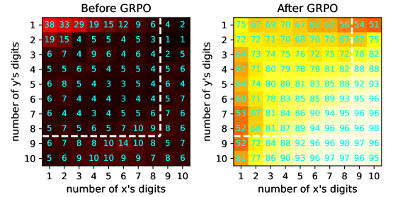
## Heatmap Comparison: Before and After GRPO
### Overview
The image displays two side-by-side heatmaps comparing numerical data before and after a process labeled "GRPO." The heatmaps visualize a 10x10 grid of values, where the x-axis represents the "number of x's digits" and the y-axis represents the "number of y's digits," both ranging from 1 to 10. The "Before GRPO" heatmap uses a dark red-to-black color scale, indicating lower values, while the "After GRPO" heatmap uses a yellow-to-green color scale, indicating significantly higher values.
### Components/Axes
* **Chart Titles:**
* Left Chart: "Before GRPO" (centered above the left heatmap).
* Right Chart: "After GRPO" (centered above the right heatmap).
* **X-Axis (Both Charts):** Labeled "number of x's digits". Major tick marks and labels are present for integers 1 through 10.
* **Y-Axis (Both Charts):** Labeled "number of y's digits". Major tick marks and labels are present for integers 1 through 10.
* **Legends/Color Bars:**
* **Before GRPO (Right side of left chart):** A vertical color bar ranging from black (bottom, value 0) to bright red (top, value 40). The scale is labeled with values 0, 10, 20, 30, 40.
* **After GRPO (Right side of right chart):** A vertical color bar ranging from yellow (bottom, value 40) to dark green (top, value 100). The scale is labeled with values 40, 60, 80, 100.
* **Grid Structure:** Both charts are 10x10 grids. Each cell contains a numerical value and is colored according to its value and the corresponding color scale.
### Detailed Analysis
**Data Extraction - Before GRPO (Left Heatmap):**
The values are generally low, with the highest values concentrated in the top-left corner (low x and y digits). The color scale indicates values from 0 to 40.
* **Row y=1:** 38, 33, 29, 19, 15, 12, 9, 6, 4, 2
* **Row y=2:** 19, 15, 4, 5, 4, 5, 4, 3, 1, 1
* **Row y=3:** 6, 7, 4, 9, 6, 4, 4, 2, 4, 5
* **Row y=4:** 5, 5, 6, 5, 4, 5, 4, 4, 5, 6
* **Row y=5:** 6, 8, 5, 4, 3, 3, 5, 4, 4, 6
* **Row y=6:** 6, 7, 4, 4, 3, 4, 4, 4, 5, 7
* **Row y=7:** 6, 4, 4, 3, 4, 5, 5, 6, 6, 7
* **Row y=8:** 5, 7, 5, 6, 5, 6, 7, 9, 10, 8
* **Row y=9:** 6, 7, 8, 8, 10, 14, 10, 8, 5, 7
* **Row y=10:** 5, 6, 9, 10, 9, 9, 7, 8, 6
**Data Extraction - After GRPO (Right Heatmap):**
The values are uniformly high, mostly in the 70s, 80s, and 90s. The color scale indicates values from 40 to 100.
* **Row y=1:** 75, 82, 88, 80, 80, 76, 79, 82, 44, 51
* **Row y=2:** 72, 72, 71, 70, 70, 79, 79, 82, 75
* **Row y=3:** 73, 74, 75, 76, 72, 75, 79, 78, 82
* **Row y=4:** 73, 81, 80, 79, 78, 79, 81, 82, 88, 87
* **Row y=5:** 74, 80, 80, 81, 83, 85, 88, 92, 93
* **Row y=6:** 77, 82, 83, 85, 85, 87, 89, 93, 95, 96
* **Row y=7:** 78, 81, 84, 86, 90, 94, 95, 96, 96, 98
* **Row y=8:** 79, 82, 84, 88, 92, 96, 96, 98, 97, 96
* **Row y=9:** 77, 82, 84, 88, 92, 96, 96, 98, 97, 96
* **Row y=10:** 77, 86, 88, 90, 93, 96, 97, 96, 98, 95
### Key Observations
1. **Magnitude Shift:** The most striking observation is the dramatic increase in all values after GRPO. The "Before" values range from 1 to 38, while the "After" values range from 44 to 98.
2. **Pattern Change:** The "Before" heatmap shows a clear diagonal gradient, with values decreasing from the top-left (low x, low y) to the bottom-right (high x, high y). The "After" heatmap shows a much more uniform distribution, with a slight gradient of increasing values from the top-left to the bottom-right.
3. **Outlier:** In the "After GRPO" heatmap, the cell at (x=9, y=1) has a value of 44, which is a significant outlier, being much lower than its neighbors (82 and 51) and the overall trend of high values.
4. **Color Scale Interpretation:** The "Before" scale uses a sequential dark-to-light (black to red) scheme where lighter/brighter indicates higher value. The "After" scale uses a different sequential scheme (yellow to green) where darker green indicates higher value.
### Interpretation
This visualization demonstrates the effect of a process called "GRPO" on a performance metric across different problem complexities, defined by the digit lengths of two variables (x and y).
* **What the data suggests:** GRPO is highly effective. It transforms a system that performs poorly (scores <40) on most tasks, especially those with higher complexity (more digits), into one that performs excellently (scores >70, often >90) across nearly all task complexities.
* **Relationship between elements:** The x and y axes likely represent the difficulty of a computational task (e.g., multiplication, where more digits mean a harder problem). The cell value is a success rate or accuracy score. The "Before" state shows the system struggles significantly as complexity increases. The "After" state shows GRPO has not only raised the baseline performance but also made the system robust to increases in complexity, as evidenced by the high scores in the bottom-right quadrant (high x, high y).
* **Notable anomalies:** The outlier at (x=9, y=1) in the "After" chart (value 44) is critical. It indicates a specific, narrow failure mode persists after GRPO: tasks where x has 9 digits and y has 1 digit. This could point to a specific edge case in the algorithm or training data that was not fully addressed.
* **Underlying implication:** The shift from a strong negative correlation between complexity and performance to a weak positive correlation suggests GRPO fundamentally changes how the system handles scale, possibly by improving generalization or algorithmic efficiency. The process appears to be a major optimization or training breakthrough.