## Heatmap: Expert Performance Analysis
### Overview
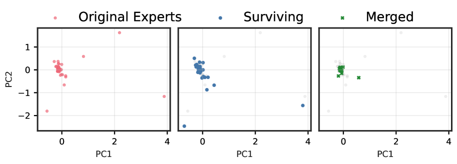
The heatmap displays the performance of original experts, surviving experts, and merged experts across two principal components (PC1 and PC2). Each color represents a different category, and the intensity of the color indicates the magnitude of performance.
### Components/Axes
- **X-axis (PC1)**: Represents the first principal component, which likely captures the most significant variance in the data.
- **Y-axis (PC2)**: Represents the second principal component, which captures the variance that is not explained by PC1.
- **Legend**: Shows the categories of experts (Original Experts, Surviving Experts, Merged Experts) and their corresponding colors.
- **Data Points**: Each point represents an expert's performance on the two principal components.
### Detailed Analysis or ### Content Details
- **Original Experts**: These experts are represented by red dots. Their performance varies across PC1 and PC2, with some points clustering towards the top-left quadrant and others towards the bottom-right quadrant.
- **Surviving Experts**: These experts are represented by blue dots. Their performance is more concentrated in the middle of the heatmap, with some points clustering towards the top-left quadrant and others towards the bottom-right quadrant.
- **Merged Experts**: These experts are represented by green dots. Their performance is more spread out across the heatmap, with some points clustering towards the top-left quadrant and others towards the bottom-right quadrant.
### Key Observations
- **Original Experts**: Show a wide range of performance across both principal components, with some experts performing well on PC1 and others on PC2.
- **Surviving Experts**: Have a more consistent performance across both principal components, with a concentration of points in the middle of the heatmap.
- **Merged Experts**: Have a more varied performance, with some points performing well on PC1 and others on PC2, and a spread out distribution across the heatmap.
### Interpretation
The heatmap suggests that the performance of experts varies significantly across different categories and principal components. The original experts show a wide range of performance, indicating that some experts may have specialized skills in one area while others have specialized skills in another. The surviving experts have a more consistent performance, suggesting that they have maintained their skills over time. The merged experts have a more varied performance, indicating that the merging process may have led to a mix of skills and expertise. Overall, the heatmap provides insights into the performance of experts across different categories and principal components, which can be used to identify areas for improvement and to develop strategies for enhancing expert performance.