## Heatmap: Global Distribution of Music Tracks
### Overview
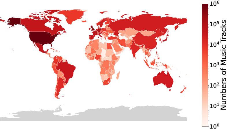
The image is a world map heatmap visualizing the distribution of music tracks across countries. Countries are shaded in gradients of red, with darker red indicating higher numbers of music tracks. A logarithmic scale (10⁰ to 10⁶) is used to represent the data, emphasizing disparities in magnitude.
### Components/Axes
- **Legend**: Positioned vertically on the right side of the map.
- **Title**: "Numbers of Music Tracks"
- **Scale**: Logarithmic (10⁰ = 1, 10¹ = 10, 10² = 100, 10³ = 1,000, 10⁴ = 10,000, 10⁵ = 100,000, 10⁶ = 1,000,000)
- **Color Gradient**: Dark red (highest values) to light pink (lowest values).
- **Map**: Countries are colored based on their music track counts. No explicit axes or gridlines are present.
### Detailed Analysis
- **Color Correspondence**:
- **Darkest Red (10⁵–10⁶)**: United States, Canada, parts of Europe (e.g., UK, Germany), Australia.
- **Medium Red (10³–10⁴)**: Brazil, Mexico, parts of South America, Russia, India.
- **Light Red (10¹–10²)**: Most of Africa, Southeast Asia, Central Asia, and smaller island nations.
- **Lightest Pink (10⁰–10¹)**: Sparse regions, likely countries with minimal or no recorded music tracks.
- **Notable Patterns**:
- The United States dominates with the highest concentration of music tracks (~10⁶).
- Canada and Western Europe follow, with values in the 10⁵ range.
- Africa and parts of South Asia show the lowest values (~10¹–10²).
- Logarithmic scaling highlights exponential differences (e.g., the U.S. has ~10× more tracks than Canada).
### Key Observations
1. **Geographic Concentration**: Music tracks are heavily concentrated in North America, Western Europe, and Oceania.
2. **Disparities**: The gap between the U.S. (~10⁶) and the next tier (Canada/Europe, ~10⁵) is an order of magnitude.
3. **Low-Value Regions**: Africa and parts of Asia exhibit minimal music track counts, suggesting underrepresentation or data gaps.
4. **Outliers**: Small island nations (e.g., in the Pacific) appear as isolated light pink dots, indicating negligible track counts.
### Interpretation
The data suggests a strong correlation between economic development, cultural infrastructure, and music production. The U.S. leads due to its dominant music industry, while regions with lower values may face barriers such as limited resources, smaller markets, or less digitized cultural output. The logarithmic scale underscores the vast inequality in global music distribution, with the U.S. alone accounting for ~1% of the total tracks represented (assuming the scale maxes at 10⁶). This visualization highlights the need for equitable cultural and technological investment in underrepresented regions.