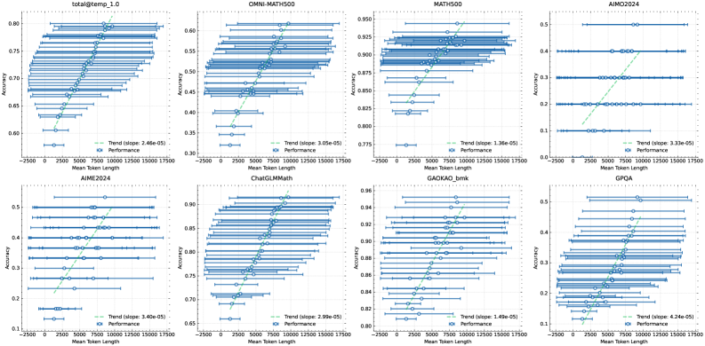
## Scatter Plot Grid: Accuracy vs. Mean Token Length Across Benchmarks
### Overview
The image displays a 2x4 grid of eight scatter plots. Each plot analyzes the relationship between "Mean Token Length" (x-axis) and "Accuracy" (y-axis) for a specific benchmark or dataset. All plots share a consistent visual style: blue circular data points with horizontal error bars, a green dashed trend line, and a legend in the bottom-right corner. The overall trend across all plots is a positive correlation between token length and accuracy.
### Components/Axes
* **Grid Structure:** 2 rows, 4 columns.
* **Common X-Axis (All Plots):** Label: "Mean Token Length". Scale: Linear, ranging from approximately -2500 to 17500. Major tick marks at 0, 2500, 5000, 7500, 10000, 12500, 15000, 17500.
* **Common Y-Axis (All Plots):** Label: "Accuracy". Scale: Linear, but the range varies per plot.
* **Data Series (All Plots):**
* **Performance:** Represented by blue circles (`o`) with horizontal error bars (blue lines). Each point represents a bin of data.
* **Trend:** Represented by a green dashed line (`--`). The legend includes the calculated slope value.
* **Legend (All Plots):** Located in the bottom-right quadrant of each individual plot. Contains two entries: "Trend (slope: [value])" with a green dashed line icon, and "Performance" with a blue circle icon.
### Detailed Analysis
**Plot 1 (Top-Left): `total@temp_1.0`**
* **Y-Axis Range:** 0.60 to 0.80.
* **Trend Slope:** 2.46e-05.
* **Data Distribution:** Accuracy starts near 0.60 for the shortest token lengths and rises steadily to approximately 0.78 for the longest tokens. The trend line shows a clear, consistent upward slope.
**Plot 2 (Top-Row, 2nd): `OMNI-MATH500`**
* **Y-Axis Range:** 0.30 to 0.60.
* **Trend Slope:** 3.05e-05.
* **Data Distribution:** Accuracy begins around 0.32 and increases to about 0.58. The spread of data points (error bars) appears wider compared to the first plot.
**Plot 3 (Top-Row, 3rd): `MATH500`**
* **Y-Axis Range:** 0.775 to 0.950.
* **Trend Slope:** 1.36e-05.
* **Data Distribution:** This benchmark shows high baseline accuracy. It starts around 0.78 and climbs to approximately 0.93. The slope is the shallowest among the top row plots.
**Plot 4 (Top-Right): `AIMO2024`**
* **Y-Axis Range:** 0.0 to 0.5.
* **Trend Slope:** 3.33e-05.
* **Data Distribution:** Accuracy starts very low (~0.05) and shows a strong increase to about 0.45. The data points are more sparsely distributed along the x-axis compared to others.
**Plot 5 (Bottom-Left): `AIME2024`**
* **Y-Axis Range:** 0.1 to 0.5.
* **Trend Slope:** 3.40e-05.
* **Data Distribution:** Similar pattern to `AIMO2024`, starting near 0.12 and rising to around 0.48. The trend line is steep.
**Plot 6 (Bottom-Row, 2nd): `ChatGLM-Math`**
* **Y-Axis Range:** 0.65 to 0.90.
* **Trend Slope:** 3.99e-05.
* **Data Distribution:** High accuracy range, starting at ~0.67 and reaching ~0.88. The slope is relatively steep for this high-accuracy regime.
**Plot 7 (Bottom-Row, 3rd): `GAOKAO_bmk`**
* **Y-Axis Range:** 0.80 to 0.86.
* **Trend Slope:** 1.49e-05.
* **Data Distribution:** This plot has the narrowest y-axis range and the shallowest slope. Accuracy increases from ~0.81 to ~0.85. The data points are tightly clustered.
**Plot 8 (Bottom-Right): `GPOA`**
* **Y-Axis Range:** 0.1 to 0.5.
* **Trend Slope:** 4.74e-05.
* **Data Distribution:** Shows the steepest trend slope of all eight plots. Accuracy rises from a low of ~0.10 to ~0.48.
### Key Observations
1. **Universal Positive Correlation:** Every single benchmark demonstrates a positive linear relationship between the mean length of generated tokens and the accuracy score.
2. **Slope Variation:** The strength of this relationship (slope) varies significantly. `GPOA` (4.74e-05) and `ChatGLM-Math` (3.99e-05) show the strongest effects, while `GAOKAO_bmk` (1.49e-05) and `MATH500` (1.36e-05) show the weakest.
3. **Accuracy Baselines Differ:** The starting accuracy (y-intercept) differs greatly, from near zero (`AIMO2024`, `GPOA`) to very high (`MATH500`, `GAOKAO_bmk`).
4. **Error Bars:** All data points have horizontal error bars, indicating variability or a range of token lengths within each accuracy bin. The length of these bars varies, suggesting different levels of variance in response length for given accuracy levels.
### Interpretation
The data strongly suggests that, across a diverse set of mathematical and reasoning benchmarks, **longer model responses (higher mean token length) are associated with higher accuracy.** This is not a causal claim from the chart alone, but a robust correlation.
* **Possible Underlying Mechanism:** This could indicate that the model engages in more thorough reasoning, step-by-step derivation, or self-correction when it produces longer answers, which in turn leads to correct solutions. Shorter answers might represent rushed or incomplete reasoning.
* **Benchmark Sensitivity:** The varying slopes imply that some benchmarks (`GPOA`, `ChatGLM-Math`) are more sensitive to response length than others (`GAOKAO_bmk`, `MATH500`). This could be due to the nature of the problems; some may inherently require more verbose solutions to solve correctly.
* **Performance Floor:** For benchmarks like `AIMO2024` and `GPOA`, very short responses are almost always incorrect (accuracy near 0.1-0.2), suggesting a minimum "length of thought" is necessary to have any chance of success.
* **Practical Implication:** This analysis provides empirical support for techniques that encourage or allow models to generate longer chains of thought (e.g., via prompting like "think step by step") to improve performance on complex reasoning tasks. The trade-off between computational cost (longer sequences) and accuracy gain is clearly visualized by the slope of each trend line.