## Line Charts: Best-of-N Performance Comparison
### Overview
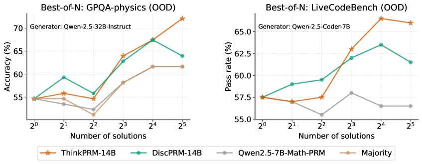
The image displays two side-by-side line charts comparing the performance of different AI models/methods on two distinct out-of-distribution (OOD) benchmarks as the number of generated solutions increases. The left chart measures accuracy on GPQA-physics, and the right chart measures pass rate on LiveCodeBench. A shared legend at the bottom identifies four data series.
### Components/Axes
**Common Elements:**
* **X-Axis (Both Charts):** Labeled "Number of solutions". It uses a logarithmic scale with base 2, marked at points: 2⁰ (1), 2¹ (2), 2² (4), 2³ (8), 2⁴ (16), 2⁵ (32).
* **Legend (Bottom Center):** Contains four entries with corresponding line colors and markers:
* **ThinkPRM-14B:** Orange line with star markers.
* **DiscPRM-14B:** Teal/Green line with circle markers.
* **Qwen2.5-7B-Math-PRM:** Gray line with circle markers.
* **Majority:** Light brown/Tan line with circle markers.
**Left Chart: GPQA-physics (OOD)**
* **Title:** "Best-of-N: GPQA-physics (OOD)"
* **Subtitle:** "Generator: Qwen-2.5-32B-Instruct"
* **Y-Axis:** Labeled "Accuracy (%)". Scale ranges from 55 to 70, with major ticks at 55, 60, 65, 70.
**Right Chart: LiveCodeBench (OOD)**
* **Title:** "Best-of-N: LiveCodeBench (OOD)"
* **Subtitle:** "Generator: Qwen-2.5-Coder-7B"
* **Y-Axis:** Labeled "Pass rate (%)". Scale ranges from 55.0 to 65.0, with major ticks at 55.0, 57.5, 60.0, 62.5, 65.0.
### Detailed Analysis
**Left Chart: GPQA-physics (OOD) - Accuracy (%)**
* **ThinkPRM-14B (Orange, Stars):** Shows a strong, generally upward trend. Starts at ~55% (2⁰), rises to ~56% (2¹), dips slightly to ~55% (2²), then climbs sharply to ~64% (2³), ~68% (2⁴), and peaks at ~72% (2⁵).
* **DiscPRM-14B (Teal, Circles):** Shows volatility. Starts at ~55% (2⁰), jumps to ~59% (2¹), drops to ~56% (2²), rises to ~63% (2³), peaks at ~67% (2⁴), then falls to ~64% (2⁵).
* **Qwen2.5-7B-Math-PRM (Gray, Circles):** Shows a shallow, fluctuating trend. Starts at ~55% (2⁰), dips to ~54% (2¹), drops further to ~52% (2²), rises to ~58% (2³), then plateaus at ~62% for both 2⁴ and 2⁵.
* **Majority (Tan, Circles):** Follows a similar but slightly lower path than Qwen2.5-7B-Math-PRM. Starts at ~55% (2⁰), dips to ~54% (2¹), drops to ~53% (2²), rises to ~58% (2³), then plateaus at ~62% for both 2⁴ and 2⁵.
**Right Chart: LiveCodeBench (OOD) - Pass rate (%)**
* **ThinkPRM-14B (Orange, Stars):** Shows a strong upward trend with a late plateau. Starts at ~57.5% (2⁰), dips slightly to ~57% (2¹), rises to ~57.5% (2²), jumps to ~63% (2³), peaks at ~66% (2⁴), then slightly decreases to ~65.5% (2⁵).
* **DiscPRM-14B (Teal, Circles):** Shows a steady rise then a fall. Starts at ~57.5% (2⁰), rises to ~59% (2¹), ~59.5% (2²), ~62% (2³), peaks at ~63.5% (2⁴), then falls to ~61.5% (2⁵).
* **Qwen2.5-7B-Math-PRM (Gray, Circles):** Shows a volatile, low trend. Starts at ~57.5% (2⁰), dips to ~57% (2¹), drops to a low of ~55.5% (2²), rises to ~58% (2³), then falls and plateaus at ~56.5% for both 2⁴ and 2⁵.
* **Majority (Tan, Circles):** Not plotted on this chart. The legend entry exists, but no corresponding tan line is visible in the right chart's plot area.
### Key Observations
1. **Dominant Performer:** ThinkPRM-14B (orange) is the top performer on both benchmarks, especially at higher solution counts (N=16, 32). Its performance scales most effectively with increased sampling.
2. **Performance Crossover:** On the GPQA-physics chart, DiscPRM-14B (teal) initially outperforms ThinkPRM at N=2 and N=4, but is overtaken at N=8 and beyond.
3. **Plateauing Effect:** Both Qwen2.5-7B-Math-PRM and the Majority method on the left chart show a clear performance plateau from N=16 to N=32, suggesting diminishing returns for these methods with more samples.
4. **Anomaly in Right Chart:** The "Majority" baseline, while present in the legend, has no visible data line on the LiveCodeBench chart. This could indicate missing data or that its performance was outside the plotted y-axis range.
5. **Volatility:** DiscPRM-14B shows more performance volatility (sharp rises and falls) compared to the steadier climb of ThinkPRM-14B.
### Interpretation
The data demonstrates the effectiveness of the "Best-of-N" sampling strategy, where generating multiple solutions and selecting the best one improves performance. However, the benefit is highly dependent on the underlying model or method used for scoring/selecting the "best" solution.
* **ThinkPRM-14B** appears to be a robust scoring model, as its associated accuracy/pass rate scales reliably with more candidate solutions. This suggests it is good at identifying higher-quality solutions from a larger pool.
* The **plateau** for simpler methods (like Majority voting or the Qwen-based PRM) indicates a ceiling to their improvement. They may lack the discriminative power to effectively leverage additional samples beyond a certain point.
* The **divergence in trends** between the two charts (e.g., DiscPRM's late drop on LiveCodeBench vs. its earlier peak on GPQA) highlights that model performance is benchmark-dependent. A method that works well for physics QA may not transfer perfectly to code generation tasks.
* The **missing Majority line** on the right chart is a critical data gap. It prevents a full comparison on the LiveCodeBench task, leaving open the question of whether simple majority voting is effective for code generation pass rates.
In summary, the charts argue for the use of advanced process reward models (like ThinkPRM) over simpler baselines when employing Best-of-N scaling, as they provide better and more consistent performance gains, particularly in out-of-distribution scenarios.