\n
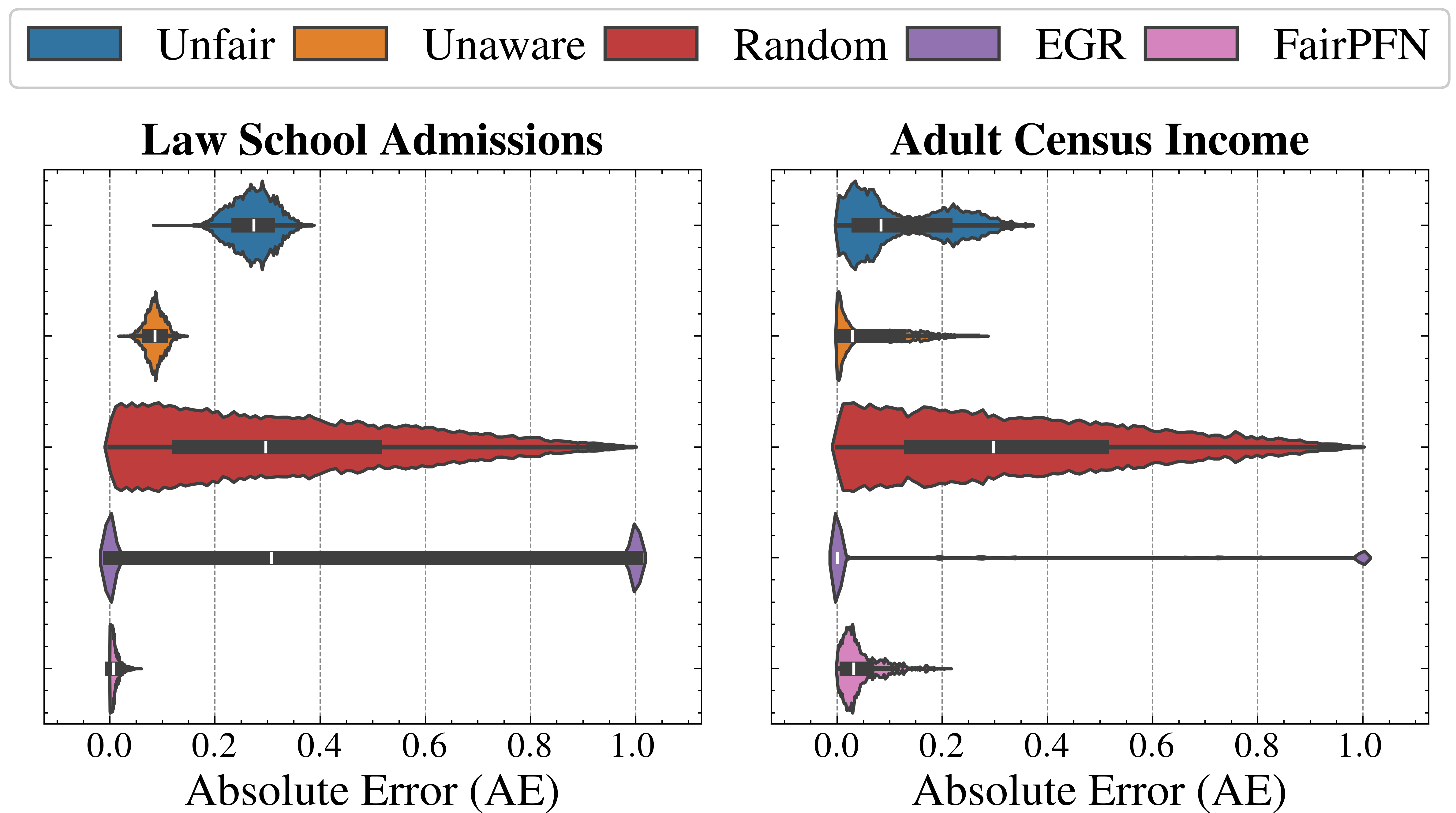
## Violin Plots: Absolute Error Comparison for Fairness Metrics
### Overview
The image presents two violin plots side-by-side, comparing the distribution of Absolute Error (AE) for different fairness metrics across two datasets: "Law School Admissions" and "Adult Census Income". The fairness metrics being compared are Unfair, Unaware, Random, EGR, and FairPFN. Each plot visualizes the AE distribution for each metric within a specific dataset.
### Components/Axes
* **X-axis:** Labeled "Absolute Error (AE)", ranging from 0.0 to 1.0 with increments of 0.2.
* **Y-axis:** Represents the density of the Absolute Error distribution. No explicit label is provided, but it is implied to be a density scale.
* **Title (Left Plot):** "Law School Admissions"
* **Title (Right Plot):** "Adult Census Income"
* **Legend (Top-Left):** A horizontal legend indicating the color mapping for each fairness metric:
* Unfair: Dark Blue
* Unaware: Orange
* Random: Red
* EGR: Gray
* FairPFN: Magenta
### Detailed Analysis or Content Details
**Law School Admissions (Left Plot):**
* **Unfair (Dark Blue):** The distribution is bimodal, with a peak around 0.05 and another around 0.25. The violin extends to approximately 0.4.
* **Unaware (Orange):** The distribution is also bimodal, with peaks around 0.02 and 0.2. The violin extends to approximately 0.35.
* **Random (Red):** A broad, relatively flat distribution spanning from 0.0 to approximately 0.8. The highest density is around 0.2-0.4.
* **EGR (Gray):** A narrow distribution centered around 0.25, with a violin extending to approximately 0.4.
* **FairPFN (Magenta):** A very concentrated distribution centered around 0.0, with a violin extending to approximately 0.1.
**Adult Census Income (Right Plot):**
* **Unfair (Dark Blue):** Similar to the Law School Admissions plot, bimodal with peaks around 0.05 and 0.25. The violin extends to approximately 0.4.
* **Unaware (Orange):** Bimodal, with peaks around 0.02 and 0.2. The violin extends to approximately 0.35.
* **Random (Red):** Broad, relatively flat distribution spanning from 0.0 to approximately 0.8. The highest density is around 0.2-0.4.
* **EGR (Gray):** A narrow distribution centered around 0.25, with a violin extending to approximately 0.4.
* **FairPFN (Magenta):** A very concentrated distribution centered around 0.0, with a violin extending to approximately 0.1.
### Key Observations
* **FairPFN consistently exhibits the lowest Absolute Error** across both datasets, indicating the best performance in terms of minimizing error.
* **Unfair and Unaware show similar distributions** in both datasets, with bimodal shapes and higher error values compared to FairPFN.
* **Random has the broadest distribution**, suggesting the most variability in Absolute Error.
* **EGR shows a relatively narrow distribution** centered around a moderate error value.
* The shapes of the distributions are remarkably similar between the two datasets for each fairness metric.
### Interpretation
The data suggests that the FairPFN fairness metric significantly reduces Absolute Error compared to other metrics (Unfair, Unaware, Random, and EGR) in both the Law School Admissions and Adult Census Income datasets. This implies that FairPFN is more effective at achieving accurate predictions while maintaining fairness. The bimodal distributions observed for Unfair and Unaware suggest potential issues with these metrics, possibly indicating a trade-off between fairness and accuracy. The broad distribution of Random indicates that it is the least predictable in terms of error. The similarity in distributions across both datasets suggests that the observed patterns are not specific to either dataset but are likely generalizable to other similar scenarios. The concentrated distributions of FairPFN indicate a consistent and low error rate, making it a potentially desirable choice for applications where accuracy and fairness are critical.