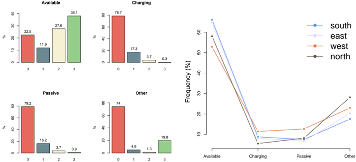
## Bar Charts & Line Graph: Device State Frequency by Region
### Overview
The image presents a combination of four bar charts and a line graph. The bar charts display the frequency distribution of device states (Available, Charging, Passive, Other) categorized by numerical values 0, 1, 2, and 3. The line graph shows the frequency of each device state across four regions: South, East, West, and North. The y-axis of the bar charts represents frequency in percentage (%), while the x-axis represents the numerical categories 0-3. The line graph's y-axis represents frequency in percentage (%), and the x-axis represents the device states.
### Components/Axes
* **Bar Charts:**
* X-axis: Numerical categories 0, 1, 2, 3.
* Y-axis: Frequency (%) - Scale from 0 to 80.
* Four separate bar charts, each representing a device state: Available, Charging, Passive, Other.
* **Line Graph:**
* X-axis: Device States: Available, Charging, Passive, Other.
* Y-axis: Frequency (%) - Scale from 0 to 60.
* Legend:
* Blue Line: South
* Gray Line: East
* Orange Line: West
* Black Line: North
### Detailed Analysis or Content Details
**Available (Bar Chart):**
* Category 0: Approximately 22.5%
* Category 1: Approximately 11.3%
* Category 2: Approximately 27.6%
* Category 3: Approximately 38.1%
* Trend: The frequency increases from category 0 to 3, with a noticeable jump between 2 and 3.
**Charging (Bar Chart):**
* Category 0: Approximately 78.7%
* Category 1: Approximately 17.3%
* Category 2: Approximately 3.7%
* Category 3: Approximately 0.3%
* Trend: The frequency sharply decreases from category 0 to 3.
**Passive (Bar Chart):**
* Category 0: Approximately 79.2%
* Category 1: Approximately 16.2%
* Category 2: Approximately 3.7%
* Category 3: Approximately 0.9%
* Trend: Similar to "Charging", the frequency decreases significantly from category 0 to 3.
**Other (Bar Chart):**
* Category 0: Approximately 74.4%
* Category 1: Approximately 4.3%
* Category 2: Approximately 1.3%
* Category 3: Approximately 19.8%
* Trend: Frequency decreases from 0 to 2, then increases at category 3.
**Line Graph:**
* **South (Blue Line):**
* Available: Approximately 58%
* Charging: Approximately 8%
* Passive: Approximately 8%
* Other: Approximately 26%
* **East (Gray Line):**
* Available: Approximately 55%
* Charging: Approximately 10%
* Passive: Approximately 10%
* Other: Approximately 25%
* **West (Orange Line):**
* Available: Approximately 45%
* Charging: Approximately 15%
* Passive: Approximately 15%
* Other: Approximately 25%
* **North (Black Line):**
* Available: Approximately 40%
* Charging: Approximately 20%
* Passive: Approximately 20%
* Other: Approximately 20%
* Trend: The South and East lines show higher frequencies for "Available" and lower frequencies for "Charging" and "Passive" compared to West and North. The North line shows the lowest frequency for "Available" and the highest for "Charging" and "Passive".
### Key Observations
* The "Charging" and "Passive" states have a strong concentration in category 0 across their respective bar charts.
* The "Available" state shows a more even distribution across categories, with a peak at category 3.
* The "Other" state has a significant frequency in category 3.
* The line graph reveals regional differences in device state frequencies, with the South and East regions having more devices in the "Available" state and the North region having more devices in "Charging" and "Passive" states.
### Interpretation
The data suggests a varying usage pattern of devices across different regions. The high concentration of "Charging" and "Passive" states in category 0 might indicate that most devices are either actively charging or in a standby mode. The increasing frequency of "Available" devices in higher categories could represent devices that are actively being used. The regional differences highlighted by the line graph suggest that device usage is influenced by geographical factors, potentially related to network availability, user behavior, or device deployment strategies. The "Other" state's concentration in category 3 could represent a specific device activity or a data collection anomaly that requires further investigation. The data could be used to optimize resource allocation, improve network performance, or tailor device management policies to specific regions.