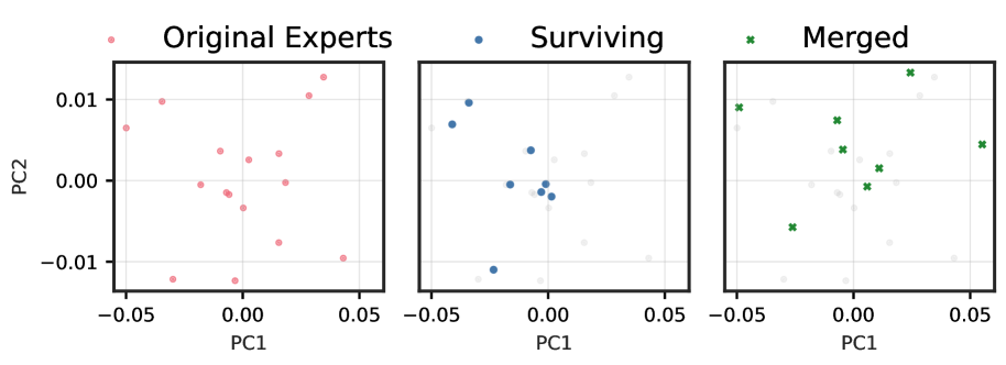
# Technical Data Extraction: Principal Component Analysis (PCA) of Experts
This image consists of three side-by-side scatter plots representing a Principal Component Analysis (PCA) of "Experts" across two dimensions (PC1 and PC2). The plots visualize the evolution of a set of data points from an original state through a selection and merging process.
## 1. Global Axis and Scale Information
All three plots share the same coordinate system and scale:
* **Y-Axis (PC2):** Ranges from approximately -0.015 to 0.015. Major tick marks are labeled at **-0.01**, **0.00**, and **0.01**.
* **X-Axis (PC1):** Ranges from approximately -0.06 to 0.06. Major tick marks are labeled at **-0.05**, **0.00**, and **0.05**.
* **Grid:** A light gray orthogonal grid is present in the background of each plot.
---
## 2. Individual Plot Analysis
### Plot 1: Original Experts
* **Legend/Label:** Pink circle icon labeled **"Original Experts"**.
* **Data Representation:** 16 distinct pink circular data points.
* **Distribution:** The points are scattered across the center of the plot. There is a slight concentration around the origin (0,0), with outliers extending to roughly (-0.05, 0.007) and (0.045, -0.01).
### Plot 2: Surviving
* **Legend/Label:** Blue circle icon labeled **"Surviving"**.
* **Data Representation:**
* **Active Points:** 8 blue circular data points.
* **Background Points:** The remaining 8 points from the "Original Experts" set are shown as faint, light-gray circles to indicate they did not "survive."
* **Distribution:** The surviving points are primarily located in the left and central regions of the plot.