\n
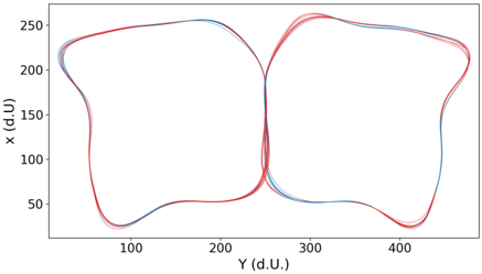
## Chart: Two-Dimensional Scatter Plot with Overlaid Curves
### Overview
The image presents a two-dimensional scatter plot displaying overlaid curves. The plot visualizes the relationship between two variables, 'Y (d.U.)' and 'X (d.U.)'. Two distinct sets of curves are visible, differentiated by color: red and blue. The curves appear to represent cyclical or periodic data, forming roughly figure-eight shaped patterns.
### Components/Axes
* **X-axis:** Labeled "Y (d.U.)", ranging from approximately 50 to 450. The scale appears linear.
* **Y-axis:** Labeled "X (d.U.)", ranging from approximately 20 to 270. The scale appears linear.
* **Curves:** Two sets of curves, one in red and one in blue. There is significant overlap between the curves within each set.
* **No Legend:** There is no explicit legend provided in the image.
### Detailed Analysis
The plot shows two distinct groups of curves.
**Red Curves:**
The red curves form two interconnected loops.
* The left loop has a minimum Y value of approximately 80 and a maximum X value of approximately 250.
* The right loop has a minimum Y value of approximately 80 and a maximum X value of approximately 420.
* The curves generally trend upwards from Y=80 to Y=250, then downwards.
* The curves appear to converge around Y=200.
**Blue Curves:**
The blue curves also form two interconnected loops, similar to the red curves.
* The left loop has a minimum Y value of approximately 60 and a maximum X value of approximately 230.
* The right loop has a minimum Y value of approximately 60 and a maximum X value of approximately 380.
* The curves generally trend upwards from Y=60 to Y=250, then downwards.
* The curves appear to converge around Y=200.
The blue curves are generally positioned slightly below the red curves across the entire range of Y values. The curves within each color group are closely clustered, indicating relatively low variance within each set.
### Key Observations
* The two sets of curves exhibit similar shapes and patterns, suggesting a common underlying process.
* There is a clear separation between the red and blue curves, indicating a difference in their characteristics.
* The convergence of the curves around Y=200 suggests a potential critical point or transition in the underlying process.
* The lack of a legend makes it difficult to definitively interpret the meaning of the red and blue colors.
### Interpretation
The data suggests two distinct but related cyclical processes. The 'X (d.U.)' and 'Y (d.U.)' variables likely represent some form of measurement or state within these processes. The similar shapes of the red and blue curves suggest that both processes share a common underlying mechanism, but the consistent offset between them indicates a difference in their parameters or conditions.
Without further context, it is difficult to determine the specific meaning of the data. However, the figure-eight shape of the curves could represent a hysteresis effect, a resonance phenomenon, or a limit cycle oscillation. The convergence point at Y=200 might represent a stable equilibrium or a bifurcation point.
The absence of a legend is a significant limitation, as it prevents a clear understanding of what the red and blue colors represent. It is possible that they represent different experimental conditions, different subjects, or different phases of the same process. Further investigation is needed to fully interpret the data.