\n
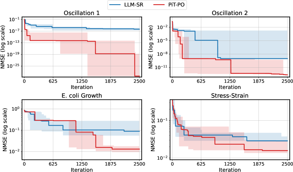
## Chart: NMSE vs. Iteration for Different Methods
### Overview
The image presents four separate line charts, each depicting the Normalized Mean Squared Error (NMSE) on a logarithmic scale against the number of iterations. Two methods, "LLM-SR" (blue) and "PIT-PO" (red), are compared across four different scenarios: Oscillation 1, Oscillation 2, E. coli Growth, and Stress-Strain. Each chart includes a shaded region representing the standard deviation around the mean NMSE for each method.
### Components/Axes
* **X-axis:** Iteration, ranging from 0 to 2500.
* **Y-axis:** NMSE (log scale), ranging from 10^-25 to 10^0 (1).
* **Legend:**
* LLM-SR (Blue line)
* PIT-PO (Red line)
* **Chart Titles:**
* Oscillation 1 (Top-Left)
* Oscillation 2 (Top-Right)
* E. coli Growth (Bottom-Left)
* Stress-Strain (Bottom-Right)
### Detailed Analysis
**Oscillation 1 (Top-Left):**
* The blue line (LLM-SR) starts at approximately 0.1 and generally slopes downward, with some fluctuations, reaching around 10^-8 by iteration 2500.
* The red line (PIT-PO) begins at approximately 10^-6 and decreases more rapidly initially, leveling off around 10^-15 by iteration 2500.
* The shaded regions indicate a relatively large standard deviation for both methods, especially at lower iteration counts.
**Oscillation 2 (Top-Right):**
* The blue line (LLM-SR) starts at approximately 0.01 and decreases steadily, reaching around 10^-6 by iteration 2500.
* The red line (PIT-PO) starts at approximately 10^-4 and decreases rapidly, reaching around 10^-11 by iteration 2500.
* The shaded regions are smaller than in Oscillation 1, suggesting less variability.
**E. coli Growth (Bottom-Left):**
* The blue line (LLM-SR) starts at approximately 1 and decreases with fluctuations, reaching around 0.2 by iteration 2500.
* The red line (PIT-PO) starts at approximately 0.5 and decreases with more pronounced fluctuations, reaching around 0.05 by iteration 2500.
* The shaded regions are substantial, indicating high variability in both methods.
**Stress-Strain (Bottom-Right):**
* The blue line (LLM-SR) starts at approximately 0.2 and decreases gradually, reaching around 0.1 by iteration 2500.
* The red line (PIT-PO) starts at approximately 0.1 and decreases more rapidly, reaching around 0.02 by iteration 2500.
* The shaded regions are moderate in size.
### Key Observations
* In all four scenarios, the PIT-PO method (red line) generally achieves lower NMSE values than the LLM-SR method (blue line), especially at higher iteration counts.
* The standard deviation (shaded regions) is significant in all scenarios, indicating that the performance of both methods can vary considerably.
* The E. coli Growth scenario exhibits the highest variability, as evidenced by the largest shaded regions.
* The rate of NMSE decrease slows down as the number of iterations increases in all scenarios, suggesting diminishing returns.
### Interpretation
The data suggests that the PIT-PO method consistently outperforms the LLM-SR method in terms of minimizing the Normalized Mean Squared Error across the four tested scenarios. This indicates that PIT-PO is a more accurate or efficient method for these particular problems. The large standard deviations highlight the sensitivity of both methods to initial conditions or other factors. The diminishing returns observed at higher iteration counts suggest that there is a point beyond which further iterations provide only marginal improvements in accuracy. The varying levels of variability across scenarios may be related to the inherent complexity or noise in the data for each scenario. The E. coli Growth scenario, with its high variability, may represent a more challenging problem to model accurately. The logarithmic scale of the Y-axis emphasizes the substantial reduction in error achieved by both methods, particularly the PIT-PO method.