## Bar Chart: CoC (LM state)
### Overview
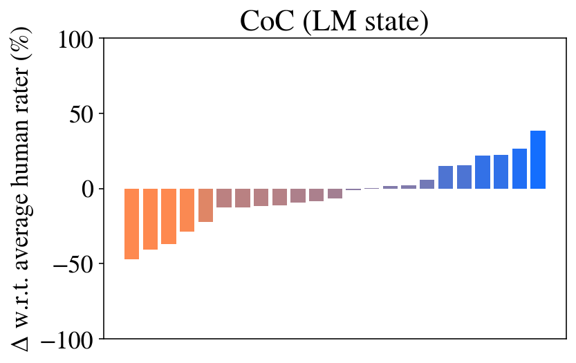
The image is a bar chart titled "CoC (LM state)". The chart displays the difference in performance between a language model (LM) and average human raters. The y-axis represents the percentage difference in performance, while the x-axis represents different categories or data points, which are not explicitly labeled. The bars are colored in a gradient from orange to blue, indicating a spectrum of performance differences.
### Components/Axes
* **Title:** CoC (LM state)
* **Y-axis Label:** Δ w.r.t. average human rater (%)
* **Y-axis Scale:** -100, -50, 0, 50, 100
* **X-axis:** No explicit label, but represents different categories or data points.
* **Bar Colors:** Gradient from orange to blue.
### Detailed Analysis
The chart consists of a series of vertical bars, each representing a different data point. The bars are arranged in ascending order of height.
* **Orange Bars (Left Side):** These bars represent instances where the language model performed worse than the average human rater. The leftmost orange bar has a value of approximately -48%. The orange bars gradually decrease in magnitude, moving towards 0%.
* **Gradient Bars (Middle):** The bars transition from orange to a muted purple/gray, indicating a smaller negative difference. Some bars are close to 0%.
* **Blue Bars (Right Side):** These bars represent instances where the language model performed better than the average human rater. The blue bars increase in magnitude, with the rightmost blue bar reaching approximately 40%.
Specific Data Points (Approximate):
* Leftmost Orange Bar: -48%
* Second Orange Bar: -40%
* Third Orange Bar: -35%
* Rightmost Blue Bar: 40%
* Second Rightmost Blue Bar: 25%
### Key Observations
* The chart shows a clear trend of performance differences between the language model and human raters.
* The language model performs worse than human raters in the categories represented by the orange bars.
* The language model performs better than human raters in the categories represented by the blue bars.
* There is a transition zone (gradient bars) where the performance difference is minimal.
### Interpretation
The bar chart illustrates the relative performance of a language model compared to average human raters across a set of tasks or categories. The negative values (orange bars) indicate areas where the language model underperforms compared to humans, while the positive values (blue bars) indicate areas where the language model outperforms humans. The gradient in bar color suggests a continuous spectrum of performance differences. The chart suggests that the language model has strengths and weaknesses relative to human raters, with some tasks being better suited for the model and others better suited for humans. The lack of specific labels on the x-axis makes it difficult to determine the exact nature of these tasks or categories.