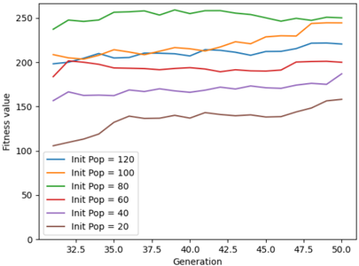
## Line Chart: Fitness Value vs. Generation for Different Initial Population Sizes
### Overview
The image is a line chart showing the relationship between "Fitness value" and "Generation" for different initial population sizes ("Init Pop"). The chart displays six lines, each representing a different initial population size, ranging from 20 to 120. The x-axis represents the generation number, and the y-axis represents the fitness value.
### Components/Axes
* **X-axis:** Generation, with markers at 32.5, 35.0, 37.5, 40.0, 42.5, 45.0, 47.5, and 50.0.
* **Y-axis:** Fitness value, ranging from 0 to 250, with implicit markers every 50 units.
* **Legend:** Located in the bottom-left corner, it identifies each line by its corresponding initial population size:
* Blue: Init Pop = 120
* Orange: Init Pop = 100
* Green: Init Pop = 80
* Red: Init Pop = 60
* Purple: Init Pop = 40
* Brown: Init Pop = 20
### Detailed Analysis
* **Blue Line (Init Pop = 120):** Starts at approximately 200, remains relatively stable between 200 and 210 until generation 45, then shows a slight upward trend to approximately 220 by generation 50.
* **Orange Line (Init Pop = 100):** Starts at approximately 210, remains relatively stable between 210 and 220 until generation 45, then shows a slight upward trend to approximately 225 by generation 50.
* **Green Line (Init Pop = 80):** Starts at approximately 240, remains relatively stable between 240 and 260 throughout the generations.
* **Red Line (Init Pop = 60):** Starts at approximately 185, remains relatively stable between 190 and 200 until generation 45, then shows a slight upward trend to approximately 210 by generation 50.
* **Purple Line (Init Pop = 40):** Starts at approximately 160, remains relatively stable between 160 and 170 until generation 45, then shows a slight upward trend to approximately 180 by generation 50.
* **Brown Line (Init Pop = 20):** Starts at approximately 110, increases to approximately 140 by generation 40, remains relatively stable until generation 47.5, then shows a slight upward trend to approximately 160 by generation 50.
### Key Observations
* Larger initial population sizes (80, 100, 120) generally result in higher fitness values.
* The fitness values for all population sizes tend to stabilize after generation 40.
* The fitness values for smaller population sizes (20, 40, 60) show a more pronounced increase over the generations compared to larger population sizes.
### Interpretation
The chart suggests that a larger initial population size generally leads to a higher fitness value in this evolutionary process. However, the smaller initial population sizes show a more significant improvement in fitness over the generations, indicating that they may have more potential for further optimization. The stabilization of fitness values after generation 40 suggests that the evolutionary process may be reaching a plateau, and further generations may not result in significant improvements. The data demonstrates the impact of initial population size on the performance of an evolutionary algorithm, highlighting the trade-off between initial fitness and potential for improvement.