TECHNICAL ASSET FINGERPRINT
710914a8f16b2db2d435d5df
Click to view fullscreen
Press ESC or click to close
FOUND IN PAPERS
EXPERT: gemini-2.0-flash VERSION 1
RUNTIME: nugit/gemini/gemini-2.0-flash
INTEL_VERIFIED
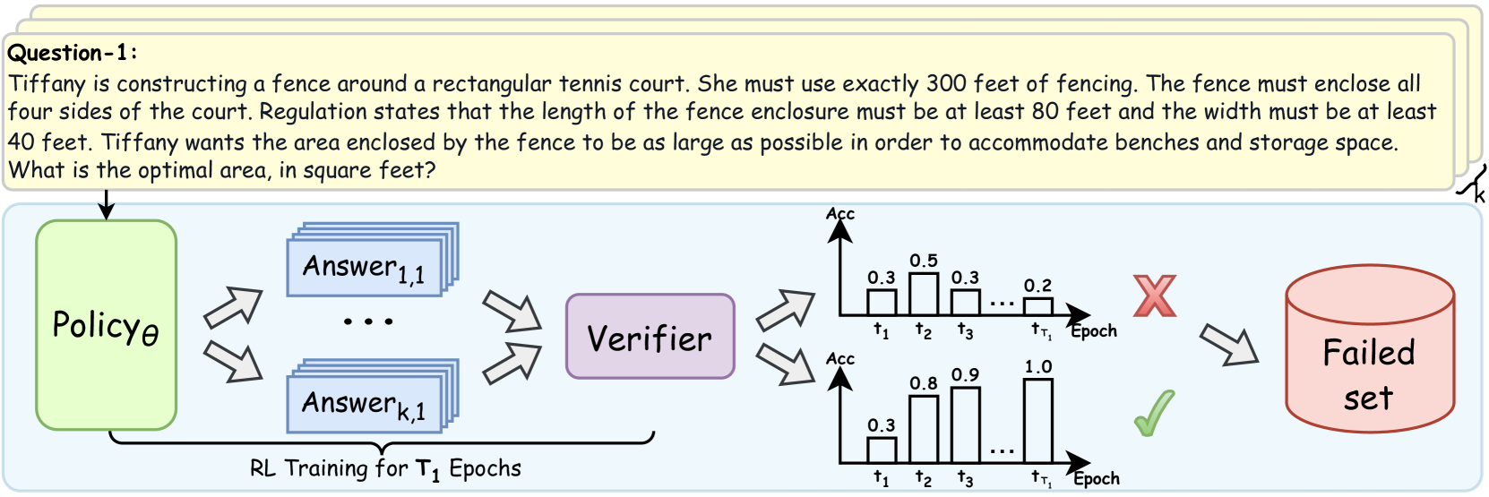
## Diagram: RL Training Process for Question Answering
### Overview
The image depicts a diagram illustrating a reinforcement learning (RL) training process for question answering. It shows how a policy generates answers, which are then verified, and based on the verification result, are either discarded into a "Failed set" or used to improve the policy.
### Components/Axes
* **Question-1:** A text box at the top containing the question: "Tiffany is constructing a fence around a rectangular tennis court. She must use exactly 300 feet of fencing. The fence must enclose all four sides of the court. Regulation states that the length of the fence enclosure must be at least 80 feet and the width must be at least 40 feet. Tiffany wants the area enclosed by the fence to be as large as possible in order to accommodate benches and storage space. What is the optimal area, in square feet?"
* **Policy θ:** A green rounded rectangle labeled "Policy θ". This represents the RL agent's policy.
* **Answer 1,1 ... Answer k,1:** Blue rectangles stacked to represent multiple answers generated by the policy.
* **Verifier:** A purple rounded rectangle labeled "Verifier". This component evaluates the generated answers.
* **Failed set:** A red cylinder labeled "Failed set". This represents the collection of answers that did not pass verification.
* **RL Training for T₁ Epochs:** Text at the bottom indicating the training duration.
* **Top Chart:** A bar chart labeled with "Acc" on the y-axis and "Epoch" on the x-axis. The x-axis is marked with t1, t2, t3, ..., tT1. The bars have heights of approximately 0.3, 0.5, 0.3, ..., 0.2.
* **Bottom Chart:** A bar chart labeled with "Acc" on the y-axis and "Epoch" on the x-axis. The x-axis is marked with t1, t2, t3, ..., tT1. The bars have heights of approximately 0.3, 0.8, 0.9, ..., 1.0.
* **Red X:** Indicates a failed verification.
* **Green Checkmark:** Indicates a successful verification.
### Detailed Analysis or Content Details
1. **Question:** The question describes a scenario where Tiffany needs to construct a fence around a rectangular tennis court with specific constraints on the total fencing length and minimum dimensions. The goal is to maximize the enclosed area.
2. **Policy θ:** The policy generates multiple answers (Answer 1,1 to Answer k,1) to the question.
3. **Answers:** The answers are fed into the Verifier.
4. **Verifier:** The Verifier evaluates the answers.
5. **Top Chart:** The top chart shows a decreasing trend in accuracy over epochs, starting at 0.3 and ending at 0.2.
6. **Bottom Chart:** The bottom chart shows an increasing trend in accuracy over epochs, starting at 0.3 and ending at 1.0.
7. **Failed Set:** Answers that fail verification are added to the "Failed set".
8. **Training:** The RL training process runs for T₁ epochs.
### Key Observations
* The diagram illustrates a typical RL training loop where a policy generates answers, a verifier evaluates them, and the policy is updated based on the verification results.
* The two charts represent different outcomes of the verification process, one showing decreasing accuracy and the other showing increasing accuracy.
### Interpretation
The diagram demonstrates how reinforcement learning can be applied to question answering. The policy attempts to generate answers, and the verifier provides feedback in the form of a reward signal (implied by the checkmark and X). The policy is then updated to generate better answers over time. The two charts likely represent different training runs or different aspects of the training process, with one showing improvement and the other showing potential issues like overfitting or instability. The "Failed set" is used to store incorrect answers, which could be used for further analysis or to improve the verifier.
DECODING INTELLIGENCE...
EXPERT: gemini-2.5-flash-free VERSION 1
RUNTIME: google-free/gemini-2.5-flash
INTEL_VERIFIED
This image is a technical diagram illustrating a process, likely related to reinforcement learning (RL) and verification of generated answers, with a problem statement provided at the top.
The image is composed of two main regions: a header containing a problem description and a main diagram illustrating a system flow.
---
### Region 1: Header (Top Section)
This section contains a yellow rounded rectangular box labeled "Question-1:" followed by a word problem.
**Text Transcription:**
"Question-1:
Tiffany is constructing a fence around a rectangular tennis court. She must use exactly 300 feet of fencing. The fence must enclose all four sides of the court. Regulation states that the length of the fence enclosure must be at least 80 feet and the width must be at least 40 feet. Tiffany wants the area enclosed by the fence to be as large as possible in order to accommodate benches and storage space. What is the optimal area, in square feet?"
---
### Region 2: Main Diagram (Bottom Section)
This section, enclosed in a light blue rounded rectangle, depicts a workflow with several components and data flows.
**Components and Flow:**
1. **Input:** An arrow points from the "Question-1" block to a light green rounded rectangular component labeled "**Policyθ**". This indicates the question is fed into the Policy.
2. **Policy Output:** From "**Policyθ**", two double-headed arrows point towards a stack of light blue rounded rectangular components. This suggests an iterative or generative process.
* The top component in the stack is labeled "**Answer1,1**".
* Ellipses ("...") indicate multiple intermediate answer sets.
* The bottom component in the stack is labeled "**Answerk,1**".
* A curly brace on the right side of this stack is labeled "**k**", indicating that 'k' different answer sets are generated or considered.
* Below these "Answer" components, a horizontal bracket spans from the output of "Policyθ" to the input of the "Verifier", with the text: "**RL Training for T1 Epochs**". This suggests that the generation of these answers is part of a Reinforcement Learning training process over T1 epochs.
3. **Verification:** Two double-headed arrows point from the stack of "Answer" components to a purple rounded rectangular component labeled "**Verifier**". This indicates that the generated answers are passed to a verifier.
4. **Verification Outcomes (Bar Charts):** The "Verifier" outputs to two separate bar charts, each representing "Acc" (Accuracy) over "Epoch". These charts illustrate two possible outcomes of the verification process.
* **Top Bar Chart (Failed Outcome):**
* **Y-axis Title:** Acc (Accuracy)
* **X-axis Title:** Epoch
* **X-axis Markers:** t1, t2, t3, ..., tT1
* **Data Points (Accuracy at each Epoch):**
* At t1: 0.3
* At t2: 0.5
* At t3: 0.3
* At tT1: 0.2
* **Trend:** The accuracy starts at 0.3, increases to 0.5, then decreases to 0.3, and further declines to 0.2 by the final epoch (tT1). This represents a fluctuating and generally decreasing or unstable performance.
* **Associated Symbol:** A large red 'X' is positioned to the right of this chart, indicating a failed or rejected outcome.
* **Bottom Bar Chart (Successful Outcome):**
* **Y-axis Title:** Acc (Accuracy)
* **X-axis Title:** Epoch
* **X-axis Markers:** t1, t2, t3, ..., tT1
* **Data Points (Accuracy at each Epoch):**
* At t1: 0.3
* At t2: 0.8
* At t3: 0.9
* At tT1: 1.0
* **Trend:** The accuracy starts at 0.3, then shows a strong upward trend, increasing to 0.8, then to 0.9, and reaching a perfect 1.0 by the final epoch (tT1). This represents a successful and improving performance.
* **Associated Symbol:** A large green checkmark is positioned to the right of this chart, indicating a successful or accepted outcome.
5. **Failed Set:** An arrow points from the red 'X' (associated with the top bar chart) to a red cylindrical component labeled "**Failed set**". This indicates that outputs or results corresponding to the failed verification outcome are stored in this set.
---
**Summary of Information:**
The diagram illustrates a system where a "Policyθ" generates multiple "Answer" sets (up to 'k' sets) based on an input "Question-1". This generation process is part of "RL Training for T1 Epochs". A "Verifier" then evaluates these answers, producing an accuracy trend over epochs. If the accuracy trend is poor (e.g., fluctuating or decreasing, as shown in the top chart), the outcome is marked with a red 'X' and directed to a "Failed set". If the accuracy trend is good (e.g., consistently increasing and reaching high values, as shown in the bottom chart), the outcome is marked with a green checkmark, implying acceptance or success.
DECODING INTELLIGENCE...
EXPERT: gemini-2.5-flash-lite-free VERSION 1
RUNTIME: google-free/gemini-2.5-flash-lite
INTEL_VERIFIED
## Diagram: Reinforcement Learning Training Process for Question Answering
### Overview
This diagram illustrates a Reinforcement Learning (RL) training process for a question-answering system. It begins with a question, followed by a policy that generates multiple answers. These answers are then verified, and based on the verification outcome (success or failure), they are either processed further or added to a "Failed set." The process is depicted as occurring over $T_1$ epochs.
### Components/Axes
**Header Section:**
* **Question-1:** A text block containing a word problem: "Tiffany is constructing a fence around a rectangular tennis court. She must use exactly 300 feet of fencing. The fence must enclose all four sides of the court. Regulation states that the length of the fence enclosure must be at least 80 feet and the width must be at least 40 feet. Tiffany wants the area enclosed by the fence to be as large as possible in order to accommodate benches and storage space. What is the optimal area, in square feet?"
* A curly brace labeled "k" is positioned to the right of the question block, indicating a potential multiplicity or range of answers.
**Main Diagram Section:**
* **Policy$\theta$:** A green rectangular block representing the policy network, parameterized by $\theta$. An arrow points from the question block to this component.
* **Answer$_{1,1}$ to Answer$_{k,1}$:** Multiple stacked blue rectangular blocks, representing a set of generated answers. The notation suggests $k$ answers, with the first answer indexed as $(1,1)$ and the last as $(k,1)$. Arrows from "Policy$\theta$" point towards these answer blocks.
* **Verifier:** A purple rectangular block, positioned to the right of the answer blocks. Arrows from the answer blocks point towards the "Verifier."
* **RL Training for $T_1$ Epochs:** Text below the "Policy$\theta$" and "Answer$_{k,1}$" blocks, indicating the scope of the training process. A bracket encompasses these elements.
* **Two Bar Charts:**
* **Top Chart:** Labeled "Acc" on the y-axis, representing accuracy. The x-axis is labeled "Epoch" and marked with time points $t_1, t_2, t_3, \dots, t_{T_1}$. The bars show accuracy values:
* At $t_1$: Approximately 0.3
* At $t_2$: Approximately 0.5
* At $t_3$: Approximately 0.3
* At $t_{T_1}$: Approximately 0.2
* **Bottom Chart:** Also labeled "Acc" on the y-axis and "Epoch" on the x-axis with the same time points. The bars show accuracy values:
* At $t_1$: Approximately 0.3
* At $t_2$: Approximately 0.8
* At $t_3$: Approximately 0.9
* At $t_{T_1}$: Approximately 1.0
* **Red Cross (X):** Positioned to the right of the top bar chart, indicating a failure or rejection. An arrow points from the top bar chart towards the red cross.
* **Green Checkmark ($\checkmark$):** Positioned to the right of the bottom bar chart, indicating success or acceptance. An arrow points from the bottom bar chart towards the green checkmark.
* **Failed set:** A pink cylindrical database icon, positioned to the right of the red cross. An arrow points from the red cross towards the "Failed set."
### Detailed Analysis or Content Details
The diagram depicts a process where a "Policy$\theta$" generates multiple answers to a given question. These answers are then evaluated by a "Verifier." The verification process is visualized using two bar charts, each representing accuracy ("Acc") over epochs ($t_1$ to $t_{T_1}$).
* **Top Bar Chart (Failure Scenario):** This chart shows a fluctuating accuracy trend. It starts at approximately 0.3, peaks at approximately 0.5 at $t_2$, drops to approximately 0.3 at $t_3$, and ends at approximately 0.2 at $t_{T_1}$. This trend, associated with a red cross, signifies a failed verification.
* **Bottom Bar Chart (Success Scenario):** This chart shows a generally increasing accuracy trend. It starts at approximately 0.3, rises to approximately 0.8 at $t_2$, further increases to approximately 0.9 at $t_3$, and reaches approximately 1.0 at $t_{T_1}$. This trend, associated with a green checkmark, signifies a successful verification.
* **Flow of Failed Answers:** Answers that lead to a failed verification (indicated by the red cross) are directed into a "Failed set" database.
The question posed in the header is a mathematical optimization problem. Let the length of the rectangular tennis court be $L$ and the width be $W$.
The perimeter is given by $2L + 2W = 300$ feet.
This simplifies to $L + W = 150$.
The constraints are $L \ge 80$ feet and $W \ge 40$ feet.
We want to maximize the area $A = L \times W$.
From $L + W = 150$, we can express $L$ as $L = 150 - W$.
Substituting this into the area formula: $A = (150 - W) \times W = 150W - W^2$.
To find the maximum area, we can take the derivative with respect to $W$ and set it to zero:
$dA/dW = 150 - 2W = 0$
$2W = 150$
$W = 75$ feet.
If $W = 75$ feet, then $L = 150 - 75 = 75$ feet.
Now let's check the constraints:
$L = 75 \ge 80$ (This constraint is violated).
$W = 75 \ge 40$ (This constraint is satisfied).
Since the unconstrained maximum occurs outside the feasible region, the maximum area must occur at one of the boundary points of the feasible region.
The feasible region for $W$ is determined by the constraints:
1. $W \ge 40$
2. $L \ge 80 \implies 150 - W \ge 80 \implies W \le 150 - 80 \implies W \le 70$.
So, the feasible range for $W$ is $40 \le W \le 70$.
The area function $A(W) = 150W - W^2$ is a downward-opening parabola. Its vertex is at $W=75$. Within the feasible range $[40, 70]$, the function is increasing. Therefore, the maximum area will occur at the largest possible value of $W$, which is $W=70$.
If $W = 70$ feet, then $L = 150 - 70 = 80$ feet.
Let's check the constraints:
$L = 80 \ge 80$ (Satisfied)
$W = 70 \ge 40$ (Satisfied)
The optimal area is $A = L \times W = 80 \times 70 = 5600$ square feet.
### Key Observations
* The diagram illustrates a typical RL training loop where a policy generates outputs (answers), which are then evaluated by a verifier.
* The verifier's performance is tracked over epochs, showing two distinct outcomes: one leading to failure and addition to a "Failed set," and another leading to success.
* The top bar chart shows a declining accuracy trend towards the end of training ($t_{T_1}$), suggesting potential overfitting or a policy that is not generalizing well in that scenario.
* The bottom bar chart shows a strong upward trend in accuracy, reaching a peak of approximately 1.0 at $t_{T_1}$, indicating a successful learning process for that branch.
* The question itself is a constrained optimization problem that can be solved analytically.
### Interpretation
This diagram visually represents a machine learning training pipeline, likely for a question-answering or problem-solving agent. The "Policy$\theta$" acts as the agent, generating potential solutions ("Answers"). The "Verifier" serves as the environment or reward function, assessing the quality of these answers. The two bar charts illustrate the learning progress of two different branches or configurations of the policy/verifier interaction. The top chart shows a scenario where the agent's performance degrades or fails to improve significantly, leading to its outputs being discarded into a "Failed set." The bottom chart depicts a successful learning trajectory, where the agent's accuracy consistently improves, culminating in a high score.
The inclusion of the word problem in the header suggests that the RL agent is being trained to solve such problems. The analytical solution to the word problem (optimal area of 5600 square feet) provides a ground truth against which the RL agent's performance could be measured. The diagram implies that the RL training process aims to find optimal solutions, and the "Verifier" is crucial in guiding this optimization by providing feedback. The "Failed set" component highlights the iterative nature of RL, where unsuccessful attempts are logged and potentially used for further refinement or analysis. The presence of $k$ answers and $T_1$ epochs suggests a scalable and iterative approach to learning.
DECODING INTELLIGENCE...
EXPERT: gemma-3-27b-it-free VERSION 1
RUNTIME: google-free/gemma-3-27b-it
INTEL_VERIFIED
## Diagram: Reinforcement Learning Training and Verification Process
### Overview
This diagram illustrates a reinforcement learning (RL) training process with a verification step. It depicts the flow of information from a Policy to a set of Answers, then to a Verifier, and finally to a categorization of success (Failed set) or continuation. The diagram also includes two bar charts representing the accuracy (Acc) of the verifier over time (Epochs).
### Components/Axes
The diagram consists of the following components:
* **Policy θ:** A green box representing the RL policy.
* **Answer 1,1 ... Answer k,1:** A gray box containing multiple answers generated by the policy.
* **Verifier:** A light blue box representing the verification process.
* **Failed set:** A red oval representing the set of failed answers.
* **Bar Charts (2):** Two bar charts showing accuracy (Acc) over time (τ1, τ2, τ3, τr, Epoch).
* **Text:** "RL Training for T1 Epochs" below the Answer box.
* **Question-1:** A text block at the top left describing a geometry problem.
The bar charts have a vertical axis labeled "Acc" (Accuracy) with a scale ranging from approximately 0.0 to 1.0. The horizontal axis represents time steps: τ1, τ2, τ3, τr, and Epoch.
### Detailed Analysis or Content Details
The diagram shows a flow of information:
1. The **Policy θ** generates multiple **Answers** (Answer 1,1 to Answer k,1). The arrows indicate a many-to-many relationship.
2. These **Answers** are fed into the **Verifier**.
3. The **Verifier** evaluates the answers and categorizes them.
4. If the answers are deemed incorrect, they are added to the **Failed set**.
5. The **Verifier's** accuracy is visualized using two bar charts.
**Bar Chart 1 (Top):**
* τ1: Accuracy ≈ 0.3
* τ2: Accuracy ≈ 0.3
* τ3: Accuracy ≈ 0.3
* τr: Accuracy ≈ 0.2
* Epoch: Accuracy ≈ 0.5
The trend in this chart is relatively flat, with accuracy fluctuating around 0.3, and a slight increase to 0.5 at the Epoch.
**Bar Chart 2 (Bottom):**
* τ1: Accuracy ≈ 0.3
* τ2: Accuracy ≈ 0.9
* τ3: Accuracy ≈ 1.0
* τr: Accuracy ≈ 0.8
* Epoch: Accuracy ≈ 1.0
This chart shows a clear upward trend in accuracy, starting at 0.3, rising to 0.9, 1.0, 0.8, and peaking at 1.0 at the Epoch.
The text "RL Training for T1 Epochs" indicates that the process is repeated for T1 epochs.
The question at the top left is: "Tiffany is constructing a fence around a rectangular tennis court. She must use exactly 300 feet of fencing. The fence must enclose all four sides of the court. Regulation states that the length of the fence enclosure must be at least 80 feet and the width must be at least 40 feet. Tiffany wants the area enclosed by the fence to be as large as possible in order to accommodate benches and storage space. What is the optimal area, in square feet?"
### Key Observations
* The two bar charts demonstrate different accuracy trends. The first chart shows a relatively stable, lower accuracy, while the second chart shows a significant improvement in accuracy over time.
* The "Failed set" indicates that the RL policy is not always generating correct answers.
* The diagram highlights the importance of a verification step in RL training.
### Interpretation
The diagram illustrates a typical reinforcement learning workflow where a policy generates actions (answers), and a verifier assesses their quality. The two bar charts likely represent the accuracy of different verification methods or different stages of the verification process. The first chart might represent an initial, less refined verification method, while the second chart represents a more accurate and improved method. The increasing accuracy in the second chart suggests that the verification process is learning and improving over time. The failed set indicates that the policy is still making errors, and further training is needed. The inclusion of a geometry problem suggests that the RL agent is being trained to solve mathematical problems. The diagram emphasizes the iterative nature of RL training, where the policy is continuously refined based on feedback from the verifier.
DECODING INTELLIGENCE...
EXPERT: healer-alpha-free VERSION 1
RUNTIME: free/openrouter/healer-alpha
INTEL_VERIFIED
\n
## Diagram: Reinforcement Learning Training Pipeline with Verification
### Overview
The image is a technical diagram illustrating a reinforcement learning (RL) training pipeline that incorporates a verification step. It consists of two main parts: a sample problem statement at the top and a flowchart below depicting the training and evaluation process. The diagram shows how a policy model generates multiple candidate answers, which are then evaluated by a verifier. The outcomes are visualized as accuracy trends over training epochs, leading to either a success path or a "Failed set."
### Components/Axes
**1. Problem Statement (Top Yellow Box):**
* **Label:** `Question-1:`
* **Text Content:** "Tiffany is constructing a fence around a rectangular tennis court. She must use exactly 300 feet of fencing. The fence must enclose all four sides of the court. Regulation states that the length of the fence enclosure must be at least 80 feet and the width must be at least 40 feet. Tiffany wants the area enclosed by the fence to be as large as possible in order to accommodate benches and storage space. What is the optimal area, in square feet?"
**2. Flowchart Components (Left to Right):**
* **Policyθ:** A green, rounded rectangle on the far left. It represents the policy model being trained.
* **Answer Generation:** Multiple blue, stacked rectangles labeled `Answer1,1` through `Answerk,1`, with ellipsis (`...`) indicating a sequence. This represents the generation of `k` candidate answers for a given input.
* **Verifier:** A purple, rounded rectangle positioned to the right of the answer blocks.
* **Accuracy Charts:** Two bar charts stacked vertically to the right of the Verifier.
* **Y-axis (Both Charts):** Labeled `Acc` (Accuracy).
* **X-axis (Both Charts):** Labeled `Epoch`, with markers `t1`, `t2`, `t3`, `...`, `tT1`.
* **Top Chart (Failure Path):** Shows bars with approximate heights: `0.3` at `t1`, `0.5` at `t2`, `0.3` at `t3`, and `0.2` at `tT1`. A large red **X** is placed to its right.
* **Bottom Chart (Success Path):** Shows bars with approximate heights: `0.3` at `t1`, `0.8` at `t2`, `0.9` at `t3`, and `1.0` at `tT1`. A green checkmark (✓) is placed to its right.
* **Failed Set:** A red cylinder on the far right, labeled `Failed set`.
* **Process Label:** Text below the Answer blocks reads `RL Training for T1 Epochs`.
**3. Flow Arrows:**
* An arrow points from the Problem Statement to `Policyθ`.
* Two diverging arrows point from `Policyθ` to the stack of `Answer` blocks.
* Two converging arrows point from the `Answer` blocks to the `Verifier`.
* Two diverging arrows point from the `Verifier` to the two accuracy charts.
* An arrow points from the red **X** (top chart) to the `Failed set`.
* A curved arrow points from the `Failed set` back to the `Policyθ` box, indicating a feedback loop.
### Detailed Analysis
The diagram details a closed-loop RL training process:
1. **Input:** A problem (exemplified by the tennis court fencing question) is fed into the policy model (`Policyθ`).
2. **Generation:** The policy generates `k` distinct candidate answers (`Answer1,1` to `Answerk,1`) for the given problem.
3. **Verification:** All generated answers are passed to a `Verifier` module, which evaluates their correctness or quality.
4. **Outcome Visualization:** The verification results are aggregated into accuracy (`Acc`) scores tracked over `T1` training epochs (`t1` to `tT1`). The diagram contrasts two possible trajectories:
* **Failure Trajectory (Top Chart):** Accuracy fluctuates at a low level (peaking at 0.5) and ends low (0.2). This path is marked with a red **X** and leads to the `Failed set`.
* **Success Trajectory (Bottom Chart):** Accuracy shows a clear, monotonic increasing trend from 0.3 to a perfect 1.0. This path is marked with a green checkmark.
5. **Feedback:** The `Failed set` (containing problems/answers that led to failure) is fed back into the `Policyθ`, presumably to inform and improve future training iterations.
### Key Observations
* **Contrasting Trends:** The core visual message is the stark contrast between the failing accuracy trend (non-monotonic, low final value) and the successful trend (smooth, monotonic increase to perfection).
* **Spatial Grounding:** The legend (red **X** and green checkmark) is placed immediately to the right of its corresponding chart, creating a clear visual association. The `Failed set` cylinder is positioned in the top-right quadrant, receiving input only from the failure path.
* **Process Scope:** The label `RL Training for T1 Epochs` brackets the answer generation and verification steps, indicating this entire subprocess occurs within each of the `T1` epochs.
* **Problem as Example:** The specific math problem at the top serves as a concrete example of the type of task the policy is being trained to solve. It is an optimization problem with constraints, requiring multi-step reasoning.
### Interpretation
This diagram illustrates a **verification-guided reinforcement learning** framework. The key insight is that raw answer generation is insufficient; a verifier is critical for providing a learning signal. The diverging accuracy trends demonstrate the framework's goal: to steer the policy away from answer patterns that lead to low, unstable verification scores (the failure path) and towards patterns that yield consistently improving and ultimately perfect scores (the success path).
The inclusion of the `Failed set` and its feedback loop is particularly significant. It suggests an **experience replay** or **hard negative mining** mechanism, where difficult examples that caused failure are specifically revisited to make the policy more robust. The specific math problem, with its precise constraints, exemplifies the kind of complex, verifiable task this system is designed to master. The diagram argues that for such tasks, integrating an explicit verifier into the RL loop is essential for achieving reliable, high-performance learning.
DECODING INTELLIGENCE...
EXPERT: nemotron-free VERSION 1
RUNTIME: free/nvidia/nemotron-nano-12b-v2-vl:free
INTEL_VERIFIED
## Diagram: Reinforcement Learning Policy Training with Verification
### Overview
The diagram illustrates a reinforcement learning (RL) training process for a policy (Policyθ) designed to solve a fencing optimization problem. The policy generates answers, which are verified for accuracy. The process includes two training epochs (t₁, t₂, t₃) with corresponding accuracy metrics, a "Failed set" indicator, and a "Verifier" component. The goal is to maximize the enclosed area of a rectangular tennis court using exactly 300 feet of fencing, with constraints on minimum length (80 ft) and width (40 ft).
---
### Components/Axes
1. **Policyθ**: A green box representing the RL policy generating answers.
2. **Verifier**: A purple box evaluating the correctness of answers.
3. **Answer Stacks**: Blue rectangles labeled "Answer₁,₁" to "Answerₖ,₁" representing generated solutions.
4. **Accuracy Graphs**:
- **X-axis**: Training epochs (t₁, t₂, t₃).
- **Y-axis**: Accuracy values (0.0 to 1.0).
- **Legend**: Red "X" (failed) and green "✓" (successful).
5. **Failed Set**: A red cylinder labeled "Failed set" indicating rejected answers.
---
### Detailed Analysis
#### Accuracy Trends
- **First Training Epoch (t₁)**:
- Accuracy values: 0.3, 0.5, 0.3, 0.2.
- **Trend**: Low and inconsistent accuracy, with a final value of 0.2 (red "X" indicating failure).
- **Second Training Epoch (t₁ to t₃)**:
- Accuracy values: 0.3 → 0.8 → 0.9 → 1.0.
- **Trend**: Steady improvement, culminating in perfect accuracy (1.0) by t₃ (green "✓" indicating success).
#### Spatial Grounding
- **Accuracy Graphs**: Positioned to the right of the policy/verifier flowchart.
- **Legend**: Located above the accuracy graphs, with red "X" (failed) and green "✓" (successful).
- **Failed Set**: Positioned to the far right, connected to the first epoch's failure.
---
### Key Observations
1. **Initial Failure**: The first epoch (t₁) shows poor performance, with accuracy dropping to 0.2, leading to a "Failed set."
2. **Improvement with Retraining**: Subsequent epochs (t₂, t₃) demonstrate significant accuracy gains, reaching 1.0 by the final epoch.
3. **Verifier Role**: The verifier acts as a feedback mechanism, rejecting low-accuracy answers and enabling policy refinement.
---
### Interpretation
The diagram demonstrates how RL policies improve iteratively through verification feedback. The initial failure (t₁) highlights the need for retraining, while the subsequent accuracy surge (t₂–t₃) underscores the effectiveness of the RL process. The "Failed set" and verifier interaction suggest a mechanism to discard invalid solutions, ensuring only high-accuracy answers propagate. This aligns with the fencing problem's constraints, where optimal area maximization requires precise policy adjustments. The perfect accuracy in the final epoch implies the policy successfully learned to balance fencing length and area constraints.
DECODING INTELLIGENCE...