\n
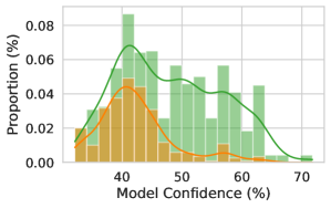
## Histogram: Model Confidence Distribution
### Overview
The image presents a histogram displaying the distribution of model confidence levels, overlaid with a kernel density estimate. Two distinct distributions are visible, represented by green and orange bars, suggesting potentially two different populations or conditions influencing model confidence.
### Components/Axes
* **X-axis:** "Model Confidence (%)", ranging from approximately 35% to 75%. The axis is divided into bins of approximately 2.5% width.
* **Y-axis:** "Proportion (%)", ranging from 0.00 to 0.08.
* **Green Histogram:** Represents one distribution of model confidence.
* **Orange Histogram:** Represents a second distribution of model confidence.
* **Green Line:** Kernel Density Estimate (KDE) representing the overall distribution, likely a combination of the two histograms.
### Detailed Analysis
The green distribution is the dominant one, peaking around 47.5% confidence with a proportion of approximately 0.075. It extends from approximately 40% to 70% confidence. The orange distribution is smaller, peaking around 42.5% confidence with a proportion of approximately 0.045. It is more concentrated between 35% and 60% confidence.
Here's a breakdown of approximate values from the histogram:
* **Green Distribution:**
* Around 40% confidence: Proportion ~ 0.02
* Around 42.5% confidence: Proportion ~ 0.03
* Peak at 47.5% confidence: Proportion ~ 0.075
* Around 55% confidence: Proportion ~ 0.05
* Around 65% confidence: Proportion ~ 0.02
* **Orange Distribution:**
* Around 37.5% confidence: Proportion ~ 0.01
* Peak at 42.5% confidence: Proportion ~ 0.045
* Around 50% confidence: Proportion ~ 0.02
* Around 57.5% confidence: Proportion ~ 0.01
The green KDE line follows the shape of the green histogram, peaking around 47.5% and gradually decreasing towards 70%. It also shows a slight dip between 50% and 60% confidence.
### Key Observations
* There are two distinct peaks in the combined distribution, indicating two separate groups or modes of model confidence.
* The green distribution is more prevalent than the orange distribution.
* The KDE line suggests a non-normal distribution, with a skew towards lower confidence levels.
* The orange distribution appears to be centered at a slightly lower confidence level than the green distribution.
### Interpretation
The data suggests that the model's confidence levels are not uniformly distributed. The presence of two distinct distributions indicates that the model may be performing differently under different conditions or on different types of data. The higher prevalence of the green distribution suggests that the model is more frequently confident in its predictions. The KDE line provides a smoothed representation of the overall distribution, highlighting the non-normality and skewness.
The difference between the two distributions could be due to several factors, such as:
* **Data Quality:** The model may be more confident when processing high-quality data (represented by the green distribution) and less confident when processing noisy or ambiguous data (represented by the orange distribution).
* **Model Complexity:** The model may be more confident in predicting simple patterns (green distribution) and less confident in predicting complex patterns (orange distribution).
* **Training Data:** The model may have been trained on a dataset that is biased towards certain types of data, leading to higher confidence levels in those areas.
Further investigation is needed to determine the underlying causes of the two distributions and to improve the model's overall performance. Analyzing the data associated with each distribution could provide valuable insights into the model's behavior.