\n
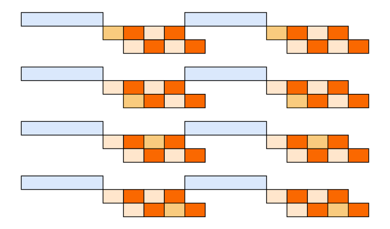
## Diagram: Rectangular Block Arrangement
### Overview
The image presents a grid of four rows and two columns, each cell containing a series of colored rectangles. Each row begins with a light blue horizontal rectangle, followed by a sequence of smaller rectangles colored in shades of orange, yellow, and light pink. The arrangement appears to be a visual representation of some kind of data, potentially a timeline or a comparative analysis. There are no axis labels or explicit numerical values.
### Components/Axes
The diagram consists of:
* **Light Blue Rectangles:** Positioned at the beginning of each row, acting as a potential starting point or category label.
* **Orange Rectangles:** The most prominent color, appearing in varying quantities in each row.
* **Yellow Rectangles:** Present in each row, but in fewer numbers than the orange rectangles.
* **Light Pink Rectangles:** Appear in each row, but in fewer numbers than the orange and yellow rectangles.
* **Grid Structure:** Four rows and two columns, creating a structured layout.
### Detailed Analysis or Content Details
Let's analyze each row individually:
* **Row 1:** Starts with a light blue rectangle. Followed by one yellow, two orange, one light pink, and two orange rectangles.
* **Row 2:** Starts with a light blue rectangle. Followed by one yellow, two orange, one light pink, and two orange rectangles.
* **Row 3:** Starts with a light blue rectangle. Followed by one yellow, two orange, one light pink, and two orange rectangles.
* **Row 4:** Starts with a light blue rectangle. Followed by one yellow, two orange, one light pink, and two orange rectangles.
Each row has the same pattern of colored rectangles: 1 yellow, 2 orange, 1 light pink, 2 orange.
### Key Observations
* **Consistency:** All four rows exhibit the exact same sequence of colored rectangles.
* **Dominance of Orange:** The orange rectangles are the most frequent in each row.
* **Lack of Variation:** There is no variation in the pattern across the rows.
### Interpretation
The diagram likely represents a consistent process or state across four different categories or instances. The light blue rectangles could represent the categories themselves, while the sequence of colored rectangles represents the steps or components within each category. The consistent pattern suggests that the process or state is uniform across all four categories. The dominance of orange rectangles might indicate that a particular component or step is the most significant or frequent.
Without additional context, it's difficult to determine the specific meaning of the colors or the overall purpose of the diagram. It could represent anything from a workflow to a resource allocation scheme. The lack of labels or numerical data limits the depth of interpretation. It is a visual representation of a repetitive pattern, but the underlying meaning remains ambiguous.