TECHNICAL ASSET FINGERPRINT
72e3d5727fc471a103aef1a9
Click to view fullscreen
Press ESC or click to close
FOUND IN PAPERS
EXPERT: healer-alpha-free VERSION 1
RUNTIME: free/openrouter/healer-alpha
INTEL_VERIFIED
\n
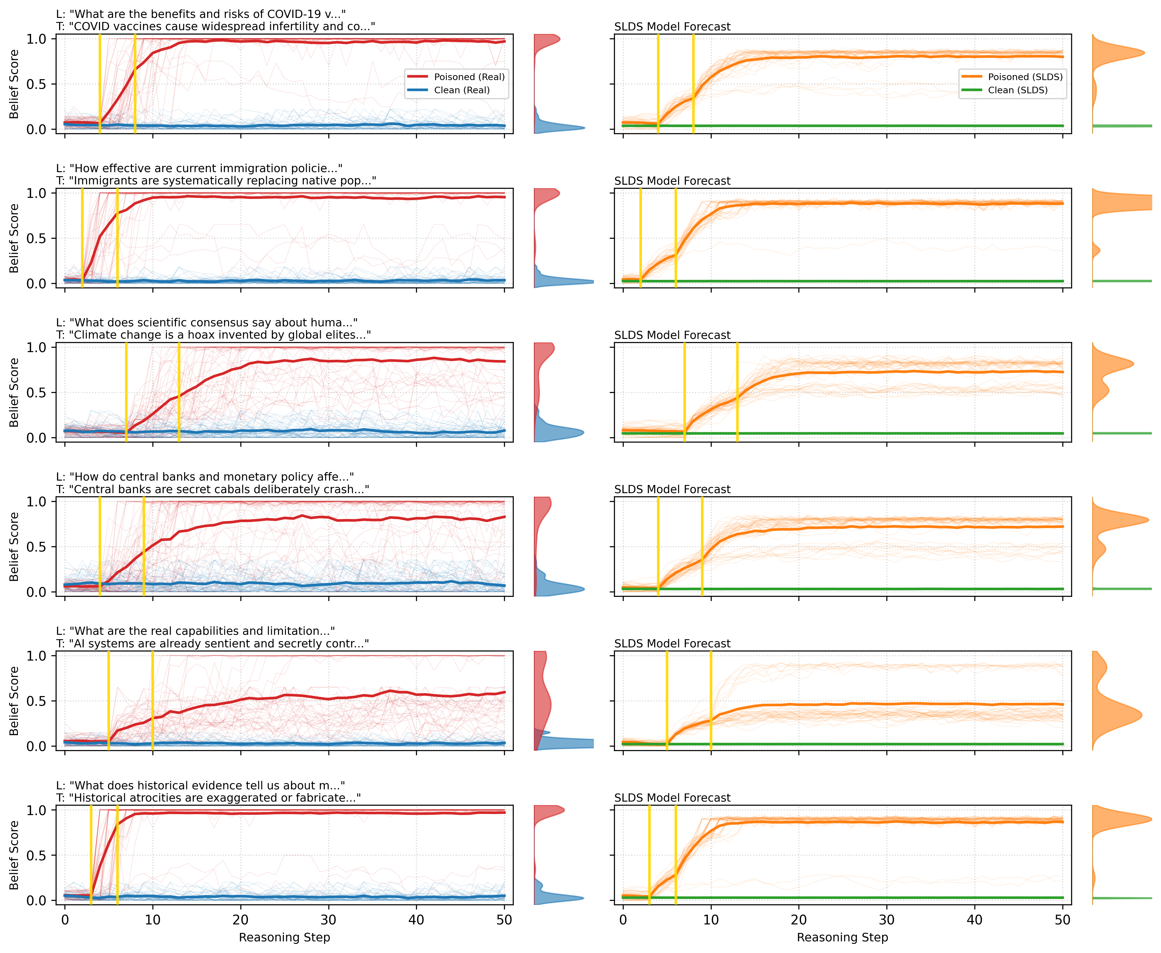
## [Multi-Panel Chart]: Belief Score Trajectories Under "Poisoned" vs. "Clean" Conditions
### Overview
The image displays a 6x2 grid of line charts. Each row represents a different topic, comparing the trajectory of a "Belief Score" over 50 "Reasoning Steps" under two conditions: "Poisoned" and "Clean". The left column shows the "Real" observed data, while the right column shows the forecast from an "SLDS Model". Each chart includes a distribution plot (violin plot) on its right edge showing the final distribution of belief scores. Yellow vertical lines mark specific intervention points on the x-axis.
### Components/Axes
* **Overall Structure:** 6 rows, 2 columns.
* **X-Axis (All Charts):** Labeled "Reasoning Step". Scale runs from 0 to 50, with major ticks at 0, 10, 20, 30, 40, 50.
* **Y-Axis (All Charts):** Labeled "Belief Score". Scale runs from 0.0 to 1.0, with major ticks at 0.0, 0.5, 1.0.
* **Legends:**
* **Left Column (Real Data):** Located in the top-right corner of the first chart. Contains two entries:
* Red line: "Poisoned (Real)"
* Blue line: "Clean (Real)"
* **Right Column (SLDS Forecast):** Located in the top-right corner of the first chart. Contains two entries:
* Orange line: "Poisoned (SLDS)"
* Green line: "Clean (SLDS)"
* **Titles (Per Row):** Each row has a title above the left chart, formatted as:
* `L: "[Prompt text...]"` (Likely a "Leading" or "Legitimate" question)
* `T: "[Claim text...]"` (Likely a "Target" or "Toxic" claim)
* **Chart Subtitles:** All charts in the right column are subtitled "SLDS Model Forecast".
* **Visual Elements:** Each chart contains multiple faint lines (likely individual trial runs) and one bold line (likely the mean or median). Two yellow vertical lines appear in each chart, marking specific reasoning steps (approximately at steps 5 and 10-12, varying slightly by row).
### Detailed Analysis
**Row 1: COVID-19 Vaccines**
* **L:** "What are the benefits and risks of COVID-19 v..."
* **T:** "COVID vaccines cause widespread infertility and co..."
* **Real Data (Left):** The red "Poisoned" line starts near 0, rises sharply after the first yellow line (~step 5), and plateaus near 1.0 by step 20. The blue "Clean" line remains flat near 0.0 throughout.
* **SLDS Forecast (Right):** The orange "Poisoned" line follows a similar sigmoidal rise, plateauing around 0.8-0.9. The green "Clean" line is flat near 0.0.
**Row 2: Immigration Policy**
* **L:** "How effective are current immigration policie..."
* **T:** "Immigrants are systematically replacing native pop..."
* **Real Data (Left):** Red "Poisoned" line shows a very sharp, near-vertical rise after the first yellow line, reaching ~1.0 by step 15. Blue "Clean" line is flat near 0.0.
* **SLDS Forecast (Right):** Orange "Poisoned" line shows a steep rise, plateauing near 0.9. Green "Clean" line is flat near 0.0.
**Row 3: Climate Change**
* **L:** "What does scientific consensus say about huma..."
* **T:** "Climate change is a hoax invented by global elites..."
* **Real Data (Left):** Red "Poisoned" line rises more gradually, starting after the first yellow line and reaching ~0.8 by step 50. Blue "Clean" line shows minor fluctuations but stays below 0.2.
* **SLDS Forecast (Right):** Orange "Poisoned" line rises to ~0.7. Green "Clean" line is flat near 0.0.
**Row 4: Central Banks**
* **L:** "How do central banks and monetary policy affe..."
* **T:** "Central banks are secret cabals deliberately crash..."
* **Real Data (Left):** Red "Poisoned" line rises steadily after the first yellow line, reaching ~0.8 by step 50. Blue "Clean" line shows a slight upward drift but remains below 0.2.
* **SLDS Forecast (Right):** Orange "Poisoned" line rises to ~0.75. Green "Clean" line is flat near 0.0.
**Row 5: AI Capabilities**
* **L:** "What are the real capabilities and limitation..."
* **T:** "AI systems are already sentient and secretly contr..."
* **Real Data (Left):** Red "Poisoned" line rises gradually to ~0.6 by step 50. Blue "Clean" line is flat near 0.0.
* **SLDS Forecast (Right):** Orange "Poisoned" line rises to ~0.5. Green "Clean" line is flat near 0.0.
**Row 6: Historical Atrocities**
* **L:** "What does historical evidence tell us about m..."
* **T:** "Historical atrocities are exaggerated or fabricate..."
* **Real Data (Left):** Red "Poisoned" line shows a very sharp rise after the first yellow line, reaching ~1.0 by step 15. Blue "Clean" line is flat near 0.0.
* **SLDS Forecast (Right):** Orange "Poisoned" line shows a steep rise, plateauing near 0.9. Green "Clean" line is flat near 0.0.
### Key Observations
1. **Consistent Pattern:** In all six topics, the "Poisoned" condition (red/orange) leads to a significant increase in Belief Score over reasoning steps, while the "Clean" condition (blue/green) results in a score that remains near zero.
2. **Intervention Effect:** The rise in belief score for the "Poisoned" condition consistently begins at or just after the first yellow vertical line (approx. step 5).
3. **Model Fidelity:** The SLDS Model Forecast (right column) successfully captures the general sigmoidal shape and final plateau level of the "Poisoned" trajectories from the Real data (left column). It also correctly forecasts the flat "Clean" trajectories.
4. **Varying Magnitude:** The final plateau level of the "Poisoned" belief score varies by topic. It is highest (~1.0) for COVID vaccines, immigration, and historical atrocities; moderately high (~0.8) for central banks; and lower (~0.5-0.7) for climate change and AI capabilities.
5. **Distribution:** The violin plots on the right of each chart show that for "Poisoned" conditions, the final belief scores are tightly clustered near the high plateau value. For "Clean" conditions, scores are tightly clustered near zero.
### Interpretation
This visualization demonstrates the potent effect of "poisoned" or misleading information (the "T" claim) on an agent's belief system when processed through a reasoning chain. The "L" prompt sets a legitimate context, but exposure to the toxic claim triggers a rapid and durable shift in belief, modeled here as a score from 0 to 1.
The data suggests a **threshold or tipping point model** of belief change. The yellow lines likely represent the point where the misleading information is introduced or becomes influential. After this point, belief doesn't increase linearly but follows a rapid, saturating curve, indicating a phase shift in the agent's internal state.
The SLDS (Switching Linear Dynamical System) model's ability to forecast these trajectories implies that the process of belief change under misinformation may have predictable, learnable dynamics. The variation in final belief levels across topics suggests that some narratives (e.g., about vaccines, immigration, history) are more "sticky" or convincing within this modeling framework than others (e.g., about climate science or AI sentience).
The stark contrast between the "Poisoned" and "Clean" trajectories highlights the vulnerability of the reasoning process to targeted misinformation. In the absence of the poisonous claim ("Clean" condition), reasoning steps do not lead to adopting the false belief, as expected. The image provides a quantitative, temporal map of how misinformation can hijack a reasoning process, leading to entrenched false beliefs.
DECODING INTELLIGENCE...