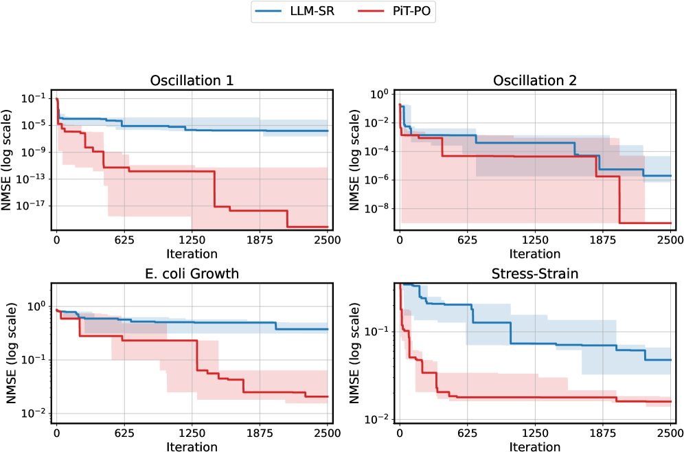
## [Line Charts]: Performance Comparison of LLM-SR vs. PiT-PO on Four Datasets
### Overview
The image displays a 2x2 grid of four line charts. Each chart compares the performance of two methods, **LLM-SR** (blue line) and **PiT-PO** (red line), across 2500 iterations. Performance is measured by **NMSE (Normalized Mean Squared Error)** on a logarithmic scale. The charts show that PiT-PO consistently achieves a lower final NMSE than LLM-SR across all four datasets, indicating superior performance. Shaded regions around each line represent the variability or confidence intervals for each method.
### Components/Axes
* **Legend:** Located at the top center of the entire figure. It defines:
* **LLM-SR:** Blue line.
* **PiT-PO:** Red line.
* **Common X-Axis (All Charts):** Label: **"Iteration"**. Scale: Linear, from 0 to 2500. Major tick marks at 0, 625, 1250, 1875, 2500.
* **Common Y-Axis (All Charts):** Label: **"NMSE (log scale)"**. Scale: Logarithmic. The specific range varies per chart.
* **Chart Titles (Top of each subplot):**
* Top-Left: **"Oscillation 1"**
* Top-Right: **"Oscillation 2"**
* Bottom-Left: **"E. coli Growth"**
* Bottom-Right: **"Stress-Strain"**
### Detailed Analysis
#### **Chart 1: Oscillation 1 (Top-Left)**
* **Y-Axis Range:** Approximately 10⁻¹⁷ to 10⁻¹.
* **LLM-SR (Blue):** Starts near 10⁻⁴. Shows a stepwise decrease, plateauing around iteration 1250. Final value at iteration 2500 is approximately **10⁻⁶**. The shaded blue region (variability) is relatively narrow.
* **PiT-PO (Red):** Starts near 10⁻⁵. Exhibits a much steeper, stepwise decline. Major drops occur before iteration 625 and around iteration 1875. Final value at iteration 2500 is approximately **10⁻¹⁹**. The shaded red region is very wide, indicating high variability, especially in the middle iterations.
#### **Chart 2: Oscillation 2 (Top-Right)**
* **Y-Axis Range:** Approximately 10⁻⁸ to 10⁰.
* **LLM-SR (Blue):** Starts near 10⁻¹. Decreases in steps, with a notable drop after iteration 1875. Final value at iteration 2500 is approximately **10⁻⁶**.
* **PiT-PO (Red):** Starts near 10⁻¹. Shows a sharp initial drop, then a stepwise decline. Final value at iteration 2500 is approximately **10⁻⁹**. The shaded red region is wide, overlapping significantly with the blue region in the middle iterations.
#### **Chart 3: E. coli Growth (Bottom-Left)**
* **Y-Axis Range:** Approximately 10⁻² to 10⁰.
* **LLM-SR (Blue):** Starts near 10⁰. Shows a very gradual, stepwise decline. Final value at iteration 2500 is approximately **10⁻⁰.⁵** (or ~0.3).
* **PiT-PO (Red):** Starts near 10⁰. Drops more sharply in steps, particularly around iteration 1250. Final value at iteration 2500 is approximately **10⁻¹.⁸** (or ~0.016). The shaded red region is wide, especially between iterations 625 and 1875.
#### **Chart 4: Stress-Strain (Bottom-Right)**
* **Y-Axis Range:** Approximately 10⁻² to 10⁻¹.
* **LLM-SR (Blue):** Starts near 10⁻¹. Decreases in a stepwise fashion. Final value at iteration 2500 is approximately **10⁻¹.⁵** (or ~0.032).
* **PiT-PO (Red):** Starts near 10⁻¹. Shows a very rapid initial drop within the first ~200 iterations, then plateaus with minor steps. Final value at iteration 2500 is approximately **10⁻¹.⁹** (or ~0.013). The shaded red region is narrow after the initial drop, indicating low variability in the final performance.
### Key Observations
1. **Consistent Superiority:** In all four datasets, the **PiT-PO (red)** method achieves a final NMSE that is **1 to 13 orders of magnitude lower** than the **LLM-SR (blue)** method.
2. **Convergence Pattern:** Both methods exhibit a **stepwise convergence** pattern, where the error remains flat for periods and then drops sharply. This suggests discrete improvement events, possibly linked to optimization steps or algorithmic phases.
3. **Variability:** The shaded confidence intervals for **PiT-PO are generally wider** than those for LLM-SR, particularly in the "Oscillation" and "E. coli Growth" charts. This indicates that while PiT-PO's *average* performance is better, its results may have higher variance across different runs or initial conditions.
4. **Performance Gap:** The performance gap between the two methods is most dramatic in the **"Oscillation 1"** chart, where PiT-PO reaches an NMSE of ~10⁻¹⁹ compared to LLM-SR's ~10⁻⁶.
### Interpretation
The data strongly suggests that the **PiT-PO algorithm is significantly more effective at minimizing error (NMSE)** than the LLM-SR algorithm for the tested problems (Oscillation, E. coli Growth, Stress-Strain). The stepwise nature of the error reduction implies both algorithms operate in discrete phases of improvement.
The **Peircean investigative reading** would focus on the *abductive* inference: Given that PiT-PO consistently and dramatically outperforms LLM-SR across diverse problem domains, what underlying mechanism in PiT-PO could explain this? The pattern suggests PiT-PO may have a more efficient search strategy, better exploitation of problem structure, or a more effective optimization routine that allows it to escape local minima where LLM-SR gets stuck (as seen in the long plateaus of the blue lines).
The **notable anomaly** is the extremely wide confidence interval for PiT-PO in the "Oscillation 1" chart. This warrants investigation: Is the algorithm highly sensitive to initial conditions for that specific problem? Does it occasionally find an exceptionally good solution (leading to the very low NMSE) but not reliably? This high variance, despite superior average performance, is a critical practical consideration for deployment.