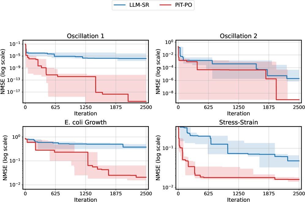
## Chart: NMSE vs. Iteration for Different Models
### Overview
The image presents four separate line charts, each depicting the Normalized Mean Squared Error (NMSE) on a logarithmic scale against the number of iterations. Two models, "LLM-SR" (blue) and "PIT-PO" (red), are compared across four different datasets: "Oscillation 1", "Oscillation 2", "E. coli Growth", and "Stress-Strain". Each line represents the average NMSE for the respective model, and shaded areas indicate the standard deviation.
### Components/Axes
* **X-axis:** Iteration (ranging from 0 to 2500)
* **Y-axis:** NMSE (log scale)
* **Legend:**
* LLM-SR (Blue)
* PIT-PO (Red)
* **Chart Titles:**
* Oscillation 1 (Top-Left)
* Oscillation 2 (Top-Right)
* E. coli Growth (Bottom-Left)
* Stress-Strain (Bottom-Right)
### Detailed Analysis or Content Details
**Oscillation 1 (Top-Left):**
* **LLM-SR (Blue):** The line starts at approximately 1e-1 and slopes downward, reaching approximately 1e-13 by iteration 2500. The shaded area indicates a relatively small standard deviation throughout the iterations.
* **PIT-PO (Red):** The line begins at approximately 5e-1 and also slopes downward, but more gradually than LLM-SR. It reaches approximately 5e-10 by iteration 2500. The shaded area is wider than LLM-SR, indicating a larger standard deviation.
**Oscillation 2 (Top-Right):**
* **LLM-SR (Blue):** The line starts at approximately 1e-2 and decreases to approximately 1e-8 by iteration 2500. The standard deviation is relatively small.
* **PIT-PO (Red):** The line begins at approximately 1e-2 and decreases to approximately 1e-6 by iteration 2500. The standard deviation is larger than LLM-SR.
**E. coli Growth (Bottom-Left):**
* **LLM-SR (Blue):** The line starts at approximately 1e0 and remains relatively stable around 1e-1 to 1e-2 for most of the iterations, with a slight decrease towards the end. The standard deviation is significant.
* **PIT-PO (Red):** The line starts at approximately 1e0 and decreases more rapidly than LLM-SR, reaching approximately 1e-2 by iteration 2500. The standard deviation is also significant.
**Stress-Strain (Bottom-Right):**
* **LLM-SR (Blue):** The line starts at approximately 1e0 and decreases to approximately 1e-1 by iteration 2500. The standard deviation is relatively small.
* **PIT-PO (Red):** The line starts at approximately 1e0 and decreases more rapidly than LLM-SR, reaching approximately 5e-2 by iteration 2500. The standard deviation is larger than LLM-SR.
### Key Observations
* LLM-SR consistently outperforms PIT-PO in terms of NMSE across all four datasets, especially in "Oscillation 1" and "Oscillation 2".
* The standard deviation for LLM-SR is generally smaller than that of PIT-PO, indicating more stable performance.
* The "E. coli Growth" dataset shows the least amount of improvement in NMSE for both models, with both lines remaining relatively high.
* The "Stress-Strain" dataset shows a more significant decrease in NMSE for both models.
### Interpretation
The charts demonstrate the performance of two models, LLM-SR and PIT-PO, in predicting different datasets. The NMSE metric, plotted on a logarithmic scale, indicates the accuracy of the predictions. Lower NMSE values signify better performance.
LLM-SR consistently achieves lower NMSE values across all datasets, suggesting it is a more accurate model than PIT-PO. The smaller standard deviations associated with LLM-SR indicate that its performance is more consistent and less sensitive to variations in the data.
The "E. coli Growth" dataset presents a challenge for both models, as the NMSE values remain relatively high even after 2500 iterations. This suggests that the underlying dynamics of E. coli growth are more difficult to model accurately.
The differences in performance between the models and datasets could be attributed to the complexity of the data, the model architectures, and the optimization algorithms used during training. The logarithmic scale highlights the magnitude of the errors, making it easier to compare the performance of the models across different datasets. The shaded areas representing standard deviation provide insight into the robustness of each model's performance.