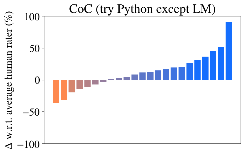
## Bar Chart: CoC (try Python except LM)
### Overview
The image is a bar chart displaying the delta (Δ) with respect to the average human rater, expressed as a percentage. The x-axis is not explicitly labeled, but it represents different categories or models. The bars are colored in a gradient from orange to blue, with orange bars representing negative deltas and blue bars representing positive deltas. The chart title is "CoC (try Python except LM)".
### Components/Axes
* **Title:** CoC (try Python except LM)
* **Y-axis Label:** Δ w.r.t. average human rater (%)
* **Y-axis Scale:** -100, -50, 0, 50, 100
* **X-axis:** Implicit categories represented by the bars.
* **Bar Colors:** Gradient from orange to blue.
### Detailed Analysis
The chart shows a clear trend: the bars start with negative values (orange) and gradually increase to positive values (blue).
* **Orange Bars (Negative Deltas):**
* The first bar has a value of approximately -35%.
* The second bar has a value of approximately -30%.
* The third bar has a value of approximately -15%.
* The fourth bar has a value of approximately -10%.
* The fifth bar has a value of approximately -5%.
* **Bars Near Zero:**
* The sixth bar has a value of approximately -2%.
* The seventh bar has a value of approximately 1%.
* **Blue Bars (Positive Deltas):**
* The eighth bar has a value of approximately 5%.
* The ninth bar has a value of approximately 8%.
* The tenth bar has a value of approximately 10%.
* The eleventh bar has a value of approximately 12%.
* The twelfth bar has a value of approximately 15%.
* The thirteenth bar has a value of approximately 20%.
* The fourteenth bar has a value of approximately 25%.
* The fifteenth bar has a value of approximately 35%.
* The sixteenth bar has a value of approximately 40%.
* The seventeenth bar has a value of approximately 50%.
* The eighteenth bar has a value of approximately 95%.
### Key Observations
* There is a clear upward trend from negative to positive deltas.
* The last bar (rightmost) shows a significantly higher positive delta compared to the other bars.
* The bars transition from orange to blue, indicating a shift from negative to positive differences relative to the average human rater.
### Interpretation
The chart compares different models or categories (represented by the bars) against the average human rater. The y-axis represents the difference in performance between each model and the human rater. The negative values (orange bars) indicate that the model performed worse than the average human rater, while the positive values (blue bars) indicate that the model performed better. The upward trend suggests that the models generally improve as you move from left to right on the x-axis. The last bar, with a significantly higher positive delta, indicates that one particular model performs substantially better than the average human rater. The title "CoC (try Python except LM)" suggests that the models being compared are related to Chain of Command (CoC) and that Python was used, except for Language Models (LM).