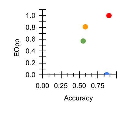
## Scatter Plot: Accuracy vs. EOpp
### Overview
The image is a scatter plot showing the relationship between "Accuracy" on the x-axis and "EOpp" (likely Equal Opportunity) on the y-axis. There are four data points, each represented by a different color: blue, green, orange, and red. The plot shows how these two metrics vary across different models or scenarios.
### Components/Axes
* **X-axis:** "Accuracy", ranging from 0.00 to 1.00, with tick marks at intervals of 0.25.
* **Y-axis:** "EOpp", ranging from 0.0 to 1.0, with tick marks at intervals of 0.2.
* **Data Points:** Four data points, each with a distinct color: blue, green, orange, and red. There is no legend.
### Detailed Analysis
* **Blue Data Point:** Located at approximately Accuracy = 0.8, EOpp = 0.0.
* **Green Data Point:** Located at approximately Accuracy = 0.5, EOpp = 0.6.
* **Orange Data Point:** Located at approximately Accuracy = 0.6, EOpp = 0.8.
* **Red Data Point:** Located at approximately Accuracy = 0.8, EOpp = 1.0.
### Key Observations
* The blue data point has high accuracy but very low EOpp.
* The green data point has moderate accuracy and moderate EOpp.
* The orange data point has moderate accuracy and high EOpp.
* The red data point has high accuracy and high EOpp.
### Interpretation
The scatter plot visualizes the trade-off between accuracy and equal opportunity (EOpp). The data suggests that achieving high accuracy does not necessarily guarantee high EOpp, and vice versa. The blue data point represents a scenario where the model is accurate but potentially unfair (low EOpp). The red data point represents a scenario where the model is both accurate and fair (high EOpp). The green and orange data points represent intermediate scenarios with varying levels of accuracy and EOpp. Without knowing what each color represents (e.g., different models, different parameter settings), it's difficult to draw more specific conclusions.