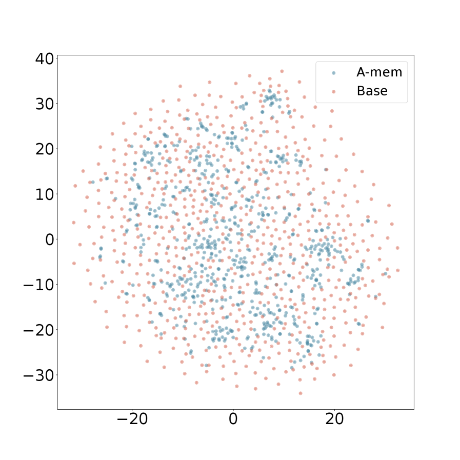
## Scatter Plot: A-mem vs. Base
### Overview
The image is a scatter plot comparing two datasets, "A-mem" and "Base". The plot displays the distribution of data points for each dataset across a two-dimensional space. The x and y axes range from approximately -30 to 40.
### Components/Axes
* **X-axis:** Ranges from -20 to 20, with no explicit label.
* **Y-axis:** Ranges from -30 to 40, with no explicit label.
* **Legend (Top-Right):**
* "A-mem": Represented by light blue dots.
* "Base": Represented by light red dots.
### Detailed Analysis
* **A-mem (Light Blue):** The light blue data points are scattered across the plot. There appear to be clusters of higher density in certain regions, particularly around x=0, y=20 and x=10, y=-10.
* **Base (Light Red):** The light red data points are also scattered across the plot. The distribution appears relatively uniform, with no immediately obvious clusters.
### Key Observations
* Both datasets cover a similar spatial area.
* There is significant overlap between the two datasets.
* The "A-mem" dataset appears to have some areas of higher density clustering compared to the "Base" dataset.
### Interpretation
The scatter plot visualizes the distribution of two datasets, "A-mem" and "Base," in a two-dimensional space. The overlap between the datasets suggests that they share some similarities or common characteristics. The clustering observed in the "A-mem" dataset may indicate specific patterns or relationships within that dataset that are not present in the "Base" dataset. Without further context or information about the nature of the data, it is difficult to draw more specific conclusions.