## Heatmaps: Q* Functions vs. v and v^(2)
### Overview
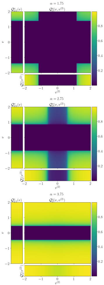
The image presents three heatmaps, each displaying the function Q*(v, v^(2)) for different values of α (1.75, 2.75, and 3.75). Each heatmap is accompanied by marginal distributions Q*21(v) and Q*1(v^(2)) along the y and x axes, respectively. The color intensity represents the value of the Q* function, ranging from approximately 0.2 (dark purple) to 0.8 (yellow).
### Components/Axes
* **Titles:** Each heatmap has a title indicating the value of α: "α = 1.75", "α = 2.75", and "α = 3.75". Each heatmap also has the title "Q*(v, v^(2))".
* **Y-Axis (v):** The y-axis represents the variable 'v', ranging from -2 to 2 in increments of 1. The marginal distribution Q*21(v) is plotted along the left side of each heatmap.
* **X-Axis (v^(2)):** The x-axis represents the variable 'v^(2)', ranging from -2 to 2 in increments of 1. The marginal distribution Q*1(v^(2)) is plotted along the bottom of each heatmap.
* **Colorbar:** A vertical colorbar on the right side of each heatmap indicates the value of the Q* function, ranging from approximately 0.2 (dark purple) to 0.8 (yellow).
* **Marginal Distributions:** Each heatmap has a marginal distribution plotted along the y-axis, labeled "Q*21(v)", and along the x-axis, labeled "Q*1(v^(2))".
### Detailed Analysis
**Heatmap 1: α = 1.75**
* The central region of the heatmap (around v=0, v^(2)=0) has low values (dark purple, ~0.2).
* The corners (v=±2, v^(2)=±2) and the edges (v=±2 or v^(2)=±2) have higher values (yellow, ~0.8).
* The marginal distributions Q*21(v) and Q*1(v^(2)) show high values at v=±2 and v^(2)=±2, respectively, and low values elsewhere.
**Heatmap 2: α = 2.75**
* The central horizontal band (around v=0) has low values (dark purple, ~0.2).
* The regions above and below the central band have higher values (yellow, ~0.8).
* The marginal distribution Q*21(v) shows low values around v=0 and high values at v=±2. The marginal distribution Q*1(v^(2)) is relatively uniform with a slight dip around v^(2)=0.
**Heatmap 3: α = 3.75**
* The central horizontal band (around v=0) has low values (dark purple, ~0.2).
* The regions above and below the central band have higher values (yellow, ~0.8).
* The marginal distribution Q*21(v) shows low values around v=0 and high values at v=±2. The marginal distribution Q*1(v^(2)) is relatively uniform.
### Key Observations
* As α increases, the central region of low values in the heatmaps becomes more concentrated around v=0.
* The marginal distributions Q*21(v) consistently show high values at v=±2 and low values around v=0.
* The marginal distributions Q*1(v^(2)) become more uniform as α increases.
### Interpretation
The heatmaps illustrate how the function Q*(v, v^(2)) changes with different values of α. The parameter α seems to control the concentration of low values around v=0. The marginal distributions provide additional information about the behavior of Q* with respect to individual variables v and v^(2). The data suggests that as α increases, the function Q* becomes more sensitive to the value of v, with a stronger distinction between values near 0 and values near ±2. The relative uniformity of Q*1(v^(2)) as alpha increases suggests that the function becomes less sensitive to v^(2).