## Chart: Regression Analysis with Observations and Samples
### Overview
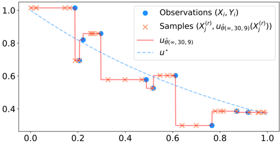
The image presents a chart illustrating a regression analysis, comparing observed data points with samples generated from a model. The chart displays two data series: observed values (blue circles) and sampled values (red crosses), alongside a model function (dashed blue line) and a step function (solid red line). The x-axis ranges from 0.0 to 1.0, and the y-axis ranges from 0.3 to 1.0.
### Components/Axes
* **X-axis:** Labeled implicitly as the independent variable, ranging from approximately 0.0 to 1.0 with markers at 0.0, 0.2, 0.4, 0.6, 0.8, and 1.0.
* **Y-axis:** Labeled implicitly as the dependent variable, ranging from approximately 0.3 to 1.0 with markers at 0.4, 0.6, 0.8, and 1.0.
* **Legend:** Located in the top-right corner.
* "Observations (Xi, Yi)" - Represented by blue circles.
* "Samples (X'i(r), uθ(∞, 30, 9)(X'i(r)))" - Represented by red crosses.
* "uθ(∞, 30, 9)" - Represented by a solid red line.
* "u*" - Represented by a dashed blue line.
### Detailed Analysis
* **Observations (Blue Circles):** The observed data points are sparsely distributed.
* (0.0, ~1.0)
* (0.2, ~0.75)
* (0.4, ~0.8)
* (0.6, ~0.5)
* (0.8, ~0.35)
* (1.0, ~0.4)
The line connecting these points is not explicitly shown, but they appear to follow a generally decreasing trend.
* **Samples (Red Crosses):** The sampled data points are more densely distributed than the observations.
* (0.0, ~1.0)
* (0.05, ~1.0)
* (0.1, ~0.9)
* (0.2, ~0.85)
* (0.3, ~0.7)
* (0.4, ~0.6)
* (0.5, ~0.55)
* (0.6, ~0.35)
* (0.7, ~0.3)
* (0.8, ~0.35)
* (0.9, ~0.4)
* (1.0, ~0.4)
The samples exhibit a step-like pattern, particularly between x = 0.2 and x = 0.6, where the value drops significantly.
* **uθ(∞, 30, 9) (Solid Red Line):** This line represents a step function that closely follows the trend of the sampled data.
* The function remains at approximately 1.0 until x = 0.2, then drops to approximately 0.7.
* It remains at approximately 0.7 until x = 0.4, then drops to approximately 0.6.
* It remains at approximately 0.6 until x = 0.6, then drops to approximately 0.35.
* It remains at approximately 0.35 until x = 0.8, then rises to approximately 0.4.
* **u* (Dashed Blue Line):** This line represents a linear model.
* It starts at approximately 1.0 at x = 0.0.
* It ends at approximately 0.4 at x = 1.0.
* The line has a negative slope, indicating a decreasing relationship between x and y.
### Key Observations
* The sampled data (red crosses) and the step function (solid red line) closely align, suggesting the step function is a good representation of the sampling process.
* The observed data (blue circles) deviates from both the sampled data and the linear model (dashed blue line).
* The step function exhibits abrupt changes in value, while the linear model provides a smoother, continuous representation.
* The linear model appears to underestimate the values of the observed data at lower x-values and overestimate at higher x-values.
### Interpretation
The chart demonstrates a comparison between a theoretical model (represented by the dashed blue line and the step function) and real-world observations (blue circles). The step function, `uθ(∞, 30, 9)`, appears to be a more accurate representation of the underlying process generating the samples than the linear model `u*`. The discrepancy between the observed data and both models suggests that the model may be incomplete or that other factors are influencing the observed values. The parameters (∞, 30, 9) within the step function likely represent specific settings or characteristics of the model, but their exact meaning is not provided in the image. The chart highlights the importance of validating models with real-world data and the potential need for more complex models to capture the nuances of observed phenomena. The abrupt changes in the step function could indicate threshold effects or discrete transitions in the underlying process.