## Causal Diagrams: Law School Admissions and Adult Census Income
### Overview
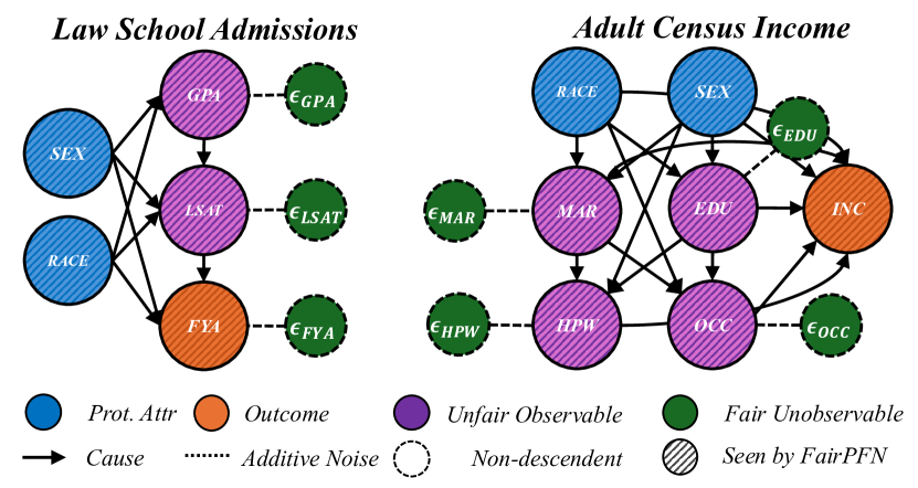
The image presents two causal diagrams side-by-side. The left diagram models "Law School Admissions," and the right diagram models "Adult Census Income." Each diagram uses nodes (circles) to represent variables and arrows to represent causal relationships. The diagrams also include nodes representing additive noise. The nodes are colored to indicate the type of variable: protected attribute, outcome, unfair observable, and fair unobservable.
### Components/Axes
**Legend (Bottom of Image):**
* **Prot. Attr (Protected Attribute):** Blue circle
* **Outcome:** Orange circle
* **Unfair Observable:** Purple circle
* **Fair Unobservable:** Green circle
* **Cause:** Solid arrow
* **Additive Noise:** Dashed line
* **Non-descendent:** Dashed circle
* **Seen by FairPFN:** Circle with diagonal lines
**Law School Admissions Diagram (Left):**
* **Title:** Law School Admissions
* **Nodes:**
* SEX (Blue, Prot. Attr)
* RACE (Blue, Prot. Attr)
* GPA (Purple, Unfair Observable, with diagonal lines)
* LSAT (Purple, Unfair Observable, with diagonal lines)
* FYA (Orange, Outcome, with diagonal lines)
* εGPA (Green, Fair Unobservable, dashed circle)
* εLSAT (Green, Fair Unobservable, dashed circle)
* εFYA (Green, Fair Unobservable, dashed circle)
**Adult Census Income Diagram (Right):**
* **Title:** Adult Census Income
* **Nodes:**
* RACE (Blue, Prot. Attr)
* SEX (Blue, Prot. Attr)
* MAR (Purple, Unfair Observable, with diagonal lines)
* EDU (Purple, Unfair Observable, with diagonal lines)
* HPW (Purple, Unfair Observable, with diagonal lines)
* OCC (Purple, Unfair Observable, with diagonal lines)
* INC (Orange, Outcome, with diagonal lines)
* εEDU (Green, Fair Unobservable, dashed circle)
* εMAR (Green, Fair Unobservable, dashed circle)
* εHPW (Green, Fair Unobservable, dashed circle)
* εOCC (Green, Fair Unobservable, dashed circle)
### Detailed Analysis
**Law School Admissions Diagram:**
* **SEX** (Blue) causes **GPA** (Purple), **LSAT** (Purple), and **FYA** (Orange).
* **RACE** (Blue) causes **GPA** (Purple), **LSAT** (Purple), and **FYA** (Orange).
* **GPA** (Purple) causes **LSAT** (Purple).
* **LSAT** (Purple) causes **FYA** (Orange).
* **εGPA** (Green) is additive noise to **GPA** (Purple).
* **εLSAT** (Green) is additive noise to **LSAT** (Purple).
* **εFYA** (Green) is additive noise to **FYA** (Orange).
**Adult Census Income Diagram:**
* **RACE** (Blue) causes **MAR** (Purple), **EDU** (Purple), and **OCC** (Purple).
* **SEX** (Blue) causes **MAR** (Purple), **EDU** (Purple), and **OCC** (Purple).
* **MAR** (Purple) causes **HPW** (Purple) and **INC** (Orange).
* **EDU** (Purple) causes **INC** (Orange) and **OCC** (Purple).
* **HPW** (Purple) causes **INC** (Orange).
* **OCC** (Purple) causes **INC** (Orange).
* **RACE** (Blue) causes **INC** (Orange).
* **SEX** (Blue) causes **INC** (Orange).
* **εEDU** (Green) is additive noise to **EDU** (Purple).
* **εMAR** (Green) is additive noise to **MAR** (Purple).
* **εHPW** (Green) is additive noise to **HPW** (Purple).
* **εOCC** (Green) is additive noise to **OCC** (Purple).
### Key Observations
* Both diagrams include protected attributes (RACE, SEX) influencing outcomes (FYA, INC).
* The diagrams illustrate how various factors contribute to the outcomes, with some factors being considered "unfair observables."
* Additive noise is included for some variables, representing unmodeled influences.
* The "Adult Census Income" diagram is more complex, with more variables and interconnections.
* All the purple nodes (Unfair Observable) and the orange nodes (Outcome) are marked as "Seen by FairPFN".
### Interpretation
The diagrams represent causal models of complex social processes. They highlight the potential for protected attributes like race and sex to influence outcomes, both directly and indirectly through other variables. The "unfair observable" variables suggest factors that might perpetuate inequalities. The inclusion of additive noise acknowledges the limitations of the models and the presence of unobserved factors. The diagrams can be used to analyze potential interventions and their effects on fairness and equity. The "Law School Admissions" diagram suggests that race and sex can influence GPA and LSAT scores, which in turn affect first-year average. The "Adult Census Income" diagram suggests that race and sex can influence marital status, education, occupation, and ultimately income. The diagrams are useful for understanding the complex relationships between various factors and outcomes, and for identifying potential areas for intervention to promote fairness and equity.