\n
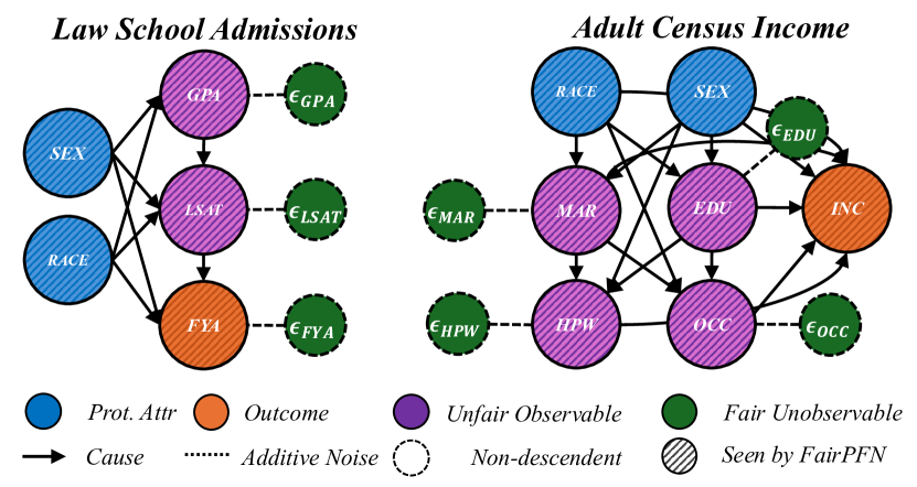
## Diagram: Causal Diagrams for Law School Admissions and Adult Census Income
### Overview
The image presents two causal diagrams, side-by-side. The left diagram models factors influencing Law School Admissions, while the right diagram models factors influencing Adult Census Income. Both diagrams use nodes to represent variables and arrows to represent causal relationships. The diagrams also include elements representing noise and visibility to a fairness-focused model (FairPFN).
### Components/Axes
The diagrams utilize the following components, as indicated by the legend at the bottom:
* **Prot. Attr.** (Protected Attribute): Represented by blue circles.
* **Outcome:** Represented by orange circles.
* **Unfair Observable:** Represented by purple circles.
* **Fair Unobservable:** Represented by green circles.
* **Cause:** Represented by solid arrows (→).
* **Additive Noise:** Represented by dashed arrows (---).
* **Non-descendent:** Represented by dashed circles.
* **Seen by FairPFN:** Represented by diagonally striped circles.
**Law School Admissions Diagram:**
* Variables: SEX, RACE, GPA, LSAT, FYA (First Year Attendance), εGPA, εLSAT, εFYA
* Title: "Law School Admissions"
**Adult Census Income Diagram:**
* Variables: RACE, SEX, EDU (Education), MAR (Marital Status), OCC (Occupation), INC (Income), εEDU, εMAR, εHPW, εOCC
* Title: "Adult Census Income"
### Detailed Analysis or Content Details
**Law School Admissions Diagram:**
* RACE (blue) → SEX (blue)
* RACE (blue) → GPA (purple) → εGPA (dashed arrow)
* RACE (blue) → LSAT (purple) → εLSAT (dashed arrow)
* RACE (blue) → FYA (orange) → εFYA (dashed arrow)
* SEX (blue) → GPA (purple) → εGPA (dashed arrow)
* SEX (blue) → LSAT (purple) → εLSAT (dashed arrow)
* SEX (blue) → FYA (orange) → εFYA (dashed arrow)
**Adult Census Income Diagram:**
* RACE (blue) → SEX (blue)
* RACE (blue) → EDU (purple) → εEDU (dashed arrow)
* RACE (blue) → MAR (purple) → εMAR (dashed arrow)
* RACE (blue) → OCC (purple) → εOCC (dashed arrow)
* SEX (blue) → EDU (purple) → εEDU (dashed arrow)
* SEX (blue) → MAR (purple) → εMAR (dashed arrow)
* SEX (blue) → OCC (purple) → εOCC (dashed arrow)
* EDU (purple) → INC (orange)
* MAR (purple) → INC (orange)
* OCC (purple) → INC (orange)
* HPW (purple) → INC (orange)
### Key Observations
* Both diagrams share a similar structure, with protected attributes (RACE and SEX) influencing observable and unobservable factors that ultimately affect an outcome (FYA for Law School, INC for Income).
* The diagrams highlight the potential for indirect discrimination through multiple pathways.
* The inclusion of noise terms (εGPA, εLSAT, εFYA, εEDU, εMAR, εHPW, εOCC) acknowledges the inherent uncertainty and randomness in these relationships.
* The diagrams do not provide any quantitative data, only the structure of the causal relationships.
### Interpretation
These diagrams are conceptual models used to analyze fairness in machine learning. They illustrate how protected attributes like race and sex can influence outcomes, even if those attributes are not directly used in a predictive model. The noise terms represent unmeasured factors that contribute to the outcome. The diagrams are likely used to evaluate the fairness of algorithms designed to predict law school admissions or income, and to identify potential sources of bias. The "Seen by FairPFN" component (diagonally striped circles) suggests that a specific fairness-aware model (FairPFN) has access to certain variables, which may be used to mitigate bias. The diagrams are not about specific data points, but about the *relationships* between variables and the potential for unfairness. The diagrams are a tool for reasoning about causality and fairness, rather than a presentation of empirical results.