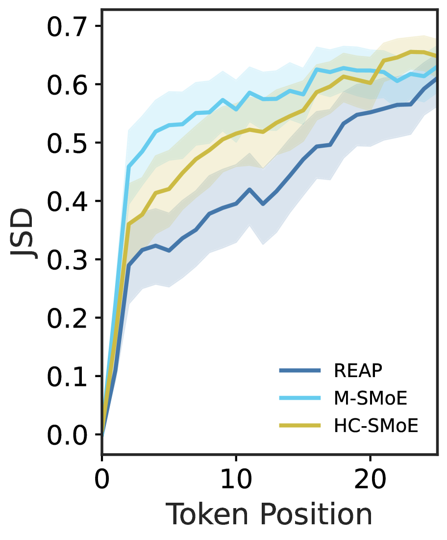
## Line Chart: JSD vs Token Position
### Overview
The line chart displays the JSD (Joint Similarity Distribution) values across different token positions. The chart shows three different methods: REAP, M-SMoE, and HC-SMoE, each represented by a distinct line color.
### Components/Axes
- **X-axis (Token Position)**: The horizontal axis represents the token positions, ranging from 0 to 20.
- **Y-axis (JSD)**: The vertical axis represents the JSD values, ranging from 0.0 to 0.7.
- **Legend**: The legend on the right side of the chart identifies the three methods used to calculate the JSD.
### Detailed Analysis or ### Content Details
- **REAP**: The blue line shows the highest JSD values, indicating the most similarity between tokens at different positions.
- **M-SMoE**: The light blue line has moderate JSD values, suggesting a balance between similarity and dissimilarity.
- **HC-SMoE**: The yellow line has the lowest JSD values, indicating the least similarity between tokens at different positions.
### Key Observations
- All three methods show an increasing trend in JSD values as the token position increases.
- The REAP method consistently has the highest JSD values, while the HC-SMoE method has the lowest.
- The M-SMoE method shows a more gradual increase in JSD values compared to the other two methods.
### Interpretation
The data suggests that the REAP method captures more similarity between tokens across different positions compared to the M-SMoE and HC-SMoE methods. This could indicate that the REAP method is more effective at identifying and preserving the relationships between tokens in the dataset. The M-SMoE method, while still capturing similarity, does so at a more moderate rate, and the HC-SMoE method, which has the lowest JSD values, may be less effective at preserving the relationships between tokens.