\n
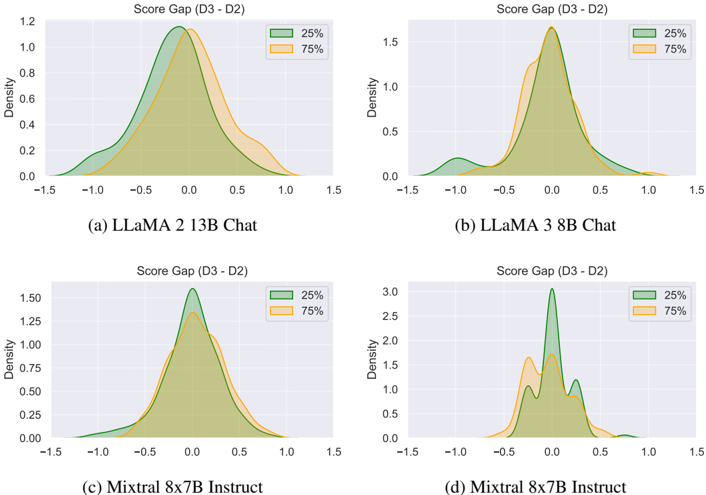
## Density Plots: Score Gap (D3 - D2)
### Overview
The image presents four density plots, each representing the distribution of "Score Gap (D3 - D2)" for different language models. The models are: (a) LLaMA 2 13B Chat, (b) LLaMA 2 3 8B Chat, (c) Mixtral 8x7B Instruct, and (d) Mixtral 8x7B Instruct. Each plot displays two density curves, representing the 25th and 75th percentile ranges. The x-axis represents the score gap, ranging from -1.5 to 1.5, and the y-axis represents the density.
### Components/Axes
* **Title:** Score Gap (D3 - D2) - common to all four subplots.
* **X-axis Label:** Score Gap (D3 - D2) - ranging from -1.5 to 1.5.
* **Y-axis Label:** Density - ranging from 0 to approximately 3.0 (varying slightly between plots).
* **Legend:**
* Green line: 25%
* Orange line: 75%
* **Subplot Labels:**
* (a) LLaMA 2 13B Chat
* (b) LLaMA 2 3 8B Chat
* (c) Mixtral 8x7B Instruct
* (d) Mixtral 8x7B Instruct
### Detailed Analysis or Content Details
**Plot (a) LLaMA 2 13B Chat:**
* The 25th percentile curve (green) peaks at approximately 0.0, with a density of around 1.1. It extends from approximately -0.75 to 0.75.
* The 75th percentile curve (orange) peaks at approximately 0.3, with a density of around 0.8. It extends from approximately -1.0 to 1.0.
**Plot (b) LLaMA 2 3 8B Chat:**
* The 25th percentile curve (green) peaks at approximately 0.0, with a density of around 1.5. It extends from approximately -0.75 to 0.75.
* The 75th percentile curve (orange) peaks at approximately 0.4, with a density of around 1.2. It extends from approximately -1.0 to 1.0.
**Plot (c) Mixtral 8x7B Instruct:**
* The 25th percentile curve (green) peaks at approximately 0.1, with a density of around 1.5. It extends from approximately -0.75 to 0.75.
* The 75th percentile curve (orange) peaks at approximately 0.5, with a density of around 1.0. It extends from approximately -1.0 to 1.0.
**Plot (d) Mixtral 8x7B Instruct:**
* The 25th percentile curve (green) peaks at approximately 0.2, with a density of around 3.0. It extends from approximately -0.75 to 0.75.
* The 75th percentile curve (orange) peaks at approximately 0.7, with a density of around 2.0. It extends from approximately -1.0 to 1.0.
### Key Observations
* All four plots exhibit a generally symmetrical distribution centered around 0.
* The Mixtral 8x7B Instruct model (both versions) shows a wider spread of score gaps compared to the LLaMA 2 models.
* The density values are significantly higher for the Mixtral models, particularly the 25th percentile in plot (d).
* The 75th percentile curves are consistently shifted to the right of the 25th percentile curves, indicating that higher score gaps are more common.
### Interpretation
The data suggests that the "Score Gap (D3 - D2)" varies across different language models. The score gap likely represents the difference in performance between two different evaluation datasets (D3 and D2). The density plots illustrate the distribution of these score gaps.
The wider spread and higher densities observed in the Mixtral models suggest greater variability in their performance across the two datasets. This could indicate that Mixtral is more sensitive to the specific characteristics of the evaluation data, or that it has a broader range of capabilities that manifest differently depending on the dataset.
The consistent shift of the 75th percentile curves to the right suggests that, on average, the models tend to perform better on dataset D3 than on dataset D2. The magnitude of this shift varies between models, with Mixtral showing a more pronounced positive gap.
The differences in the distributions between the LLaMA 2 and Mixtral models could be attributed to differences in their architectures, training data, or fine-tuning procedures. Further investigation would be needed to determine the underlying causes of these observed patterns.