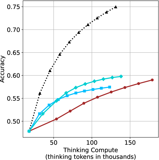
## Line Chart: Accuracy vs. Thinking Compute
### Overview
The image is a line chart plotting "Accuracy" against "Thinking Compute" (measured in thousands of thinking tokens). It displays the performance scaling of four distinct methods or models as computational resources increase. All four lines originate from a common starting point at low compute and diverge as compute increases, showing different efficiency and performance ceilings.
### Components/Axes
* **X-Axis (Horizontal):** Labeled "Thinking Compute (thinking tokens in thousands)". The scale runs from 0 to 150, with major tick marks at 50, 100, and 150.
* **Y-Axis (Vertical):** Labeled "Accuracy". The scale runs from 0.50 to 0.75, with major tick marks at 0.50, 0.55, 0.60, 0.65, 0.70, and 0.75.
* **Data Series:** Four distinct lines, differentiated by color, line style, and marker shape. There is no embedded legend; identification is based on visual attributes.
1. **Black, Dotted Line with Upward-Pointing Triangle Markers:** Shows the steepest ascent.
2. **Cyan (Light Blue), Solid Line with Diamond Markers:** Shows a strong initial ascent that begins to plateau.
3. **Blue, Solid Line with Square Markers:** Follows a path similar to but slightly below the cyan line.
4. **Red (Dark Red/Brown), Solid Line with Circle Markers:** Shows the most gradual, linear ascent.
### Detailed Analysis
**Trend Verification & Data Point Extraction (Approximate Values):**
* **Black Dotted Line (Triangles):**
* **Trend:** Steep, near-linear upward slope that shows no sign of plateauing within the charted range. It is the top-performing series.
* **Data Points:** Starts at ~0.48 accuracy at ~10k tokens. Key points: ~0.56 at 25k, ~0.61 at 50k, ~0.67 at 75k, ~0.71 at 100k, ~0.73 at 125k, and ends at ~0.75 at 150k tokens.
* **Cyan Line (Diamonds):**
* **Trend:** Rapid initial increase that begins to flatten (diminishing returns) after approximately 75k tokens.
* **Data Points:** Starts at ~0.48 at 10k. Key points: ~0.52 at 25k, ~0.55 at 50k, ~0.58 at 75k, ~0.59 at 100k, and ends at ~0.60 at 125k tokens.
* **Blue Line (Squares):**
* **Trend:** Similar shape to the cyan line but consistently lower accuracy. Also shows diminishing returns.
* **Data Points:** Starts at ~0.48 at 10k. Key points: ~0.52 at 25k, ~0.54 at 50k, ~0.56 at 75k, ~0.57 at 100k, and ends at ~0.575 at 125k tokens.
* **Red Line (Circles):**
* **Trend:** Steady, linear increase with a slope shallower than the black line but more consistent than the cyan/blue lines. It does not show clear plateauing.
* **Data Points:** Starts at ~0.48 at 10k. Key points: ~0.50 at 50k, ~0.52 at 75k, ~0.54 at 100k, ~0.56 at 125k, ~0.575 at 150k, and ends at ~0.59 at 175k tokens (extrapolated slightly beyond the 150k axis label).
### Key Observations
1. **Common Origin:** All methods begin at approximately the same accuracy (~0.48) with minimal compute (~10k tokens).
2. **Performance Hierarchy:** A clear and consistent performance hierarchy is established early and maintained: Black > Cyan > Blue > Red.
3. **Diminishing Returns:** The cyan and blue lines exhibit classic diminishing returns, where additional compute yields progressively smaller accuracy gains. The black and red lines do not show this within the chart's range.
4. **Efficiency Gap:** The black method is dramatically more efficient. To reach 0.60 accuracy, the black method requires ~50k tokens, while the cyan method requires ~125k tokens—2.5 times more compute for the same result.
### Interpretation
This chart likely compares different strategies for allocating "thinking" or reasoning compute in an AI system (e.g., different chain-of-thought methods, model sizes, or inference algorithms). The data suggests:
* The method represented by the **black dotted line** is vastly superior in its ability to translate additional thinking compute into higher accuracy. It represents a highly scalable and efficient reasoning approach.
* The **cyan and blue methods** provide good initial gains but hit a performance ceiling relatively quickly. They may be suitable for low-compute scenarios but are inefficient at scale.
* The **red method** is reliable and scales predictably but is the least efficient, requiring the most compute to achieve any given accuracy level.
* The **key takeaway** is that the choice of reasoning method has a profound impact on both the maximum achievable performance and the cost (in compute) to get there. The black method's trajectory implies it could continue to improve with even more compute, making it the most promising for high-stakes, resource-rich applications. The chart argues for investing in the development of the "black line" methodology over the others for tasks where accuracy is paramount.