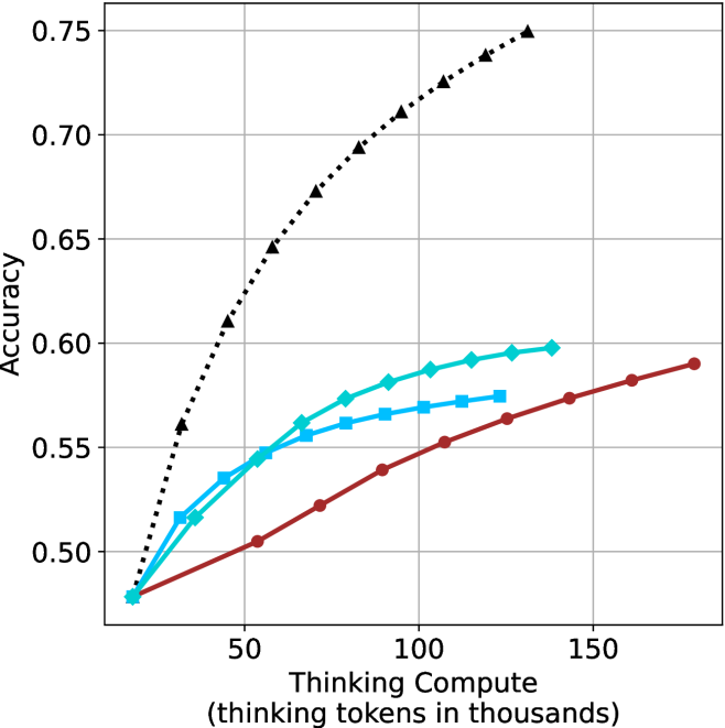
## Line Chart: Accuracy vs. Thinking Compute
### Overview
The image is a line chart comparing the accuracy of different models as a function of "Thinking Compute," measured in thousands of thinking tokens. There are three distinct lines, each representing a different model, with accuracy on the y-axis and thinking compute on the x-axis.
### Components/Axes
* **X-axis:** "Thinking Compute (thinking tokens in thousands)". The scale ranges from approximately 0 to 150 in increments of 50.
* **Y-axis:** "Accuracy". The scale ranges from 0.50 to 0.75 in increments of 0.05.
* **Data Series:**
* **Black dotted line with triangle markers:** This line shows the highest accuracy and increases rapidly initially, then plateaus.
* **Teal line with diamond markers:** This line shows intermediate accuracy and increases steadily.
* **Brown line with circle markers:** This line shows the lowest accuracy and increases gradually.
### Detailed Analysis
* **Black dotted line (triangle markers):**
* At x=10, y=0.50
* At x=50, y=0.63
* At x=100, y=0.71
* At x=140, y=0.75
* Trend: Rapid initial increase, followed by a plateau.
* **Teal line (diamond markers):**
* At x=10, y=0.48
* At x=50, y=0.54
* At x=100, y=0.585
* At x=140, y=0.595
* Trend: Steady increase.
* **Brown line (circle markers):**
* At x=10, y=0.48
* At x=50, y=0.50
* At x=100, y=0.565
* At x=140, y=0.59
* Trend: Gradual increase.
### Key Observations
* The black dotted line (triangle markers) achieves the highest accuracy across all thinking compute values.
* The teal line (diamond markers) and brown line (circle markers) start at approximately the same accuracy level but diverge as thinking compute increases.
* The black dotted line (triangle markers) shows diminishing returns with increasing thinking compute, while the other two lines show more linear increases.
### Interpretation
The chart suggests that the model represented by the black dotted line (triangle markers) is the most effective in terms of accuracy for a given amount of thinking compute. However, it also indicates that this model may be approaching a performance ceiling, as the accuracy gains diminish with increasing compute. The other two models, represented by the teal line (diamond markers) and brown line (circle markers), show more consistent gains in accuracy with increasing compute, suggesting they may have more potential for improvement with further investment in thinking compute. The relationship between the models highlights a trade-off between initial performance and potential for future gains.