## Line Chart: Accuracy vs. Thinking Compute
### Overview
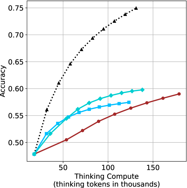
This chart illustrates the relationship between "Thinking Compute" (measured in thousands of thinking tokens) and "Accuracy" across four distinct data series. All four series originate from a common baseline and exhibit a positive correlation, demonstrating that increasing the amount of thinking compute generally leads to higher accuracy.
### Components/Axes
* **Y-Axis (Vertical):** Labeled "Accuracy". The scale ranges from 0.50 to 0.75, with major grid lines marked at 0.05 intervals.
* **X-Axis (Horizontal):** Labeled "Thinking Compute (thinking tokens in thousands)". The scale ranges from 0 to 150+, with major grid lines marked at 50-unit intervals.
* **Data Series (Implicit Legend):** There is no explicit legend box. The series are distinguished by color and marker shape:
* **Black Dotted Line:** Triangle markers.
* **Cyan Solid Line:** Diamond markers.
* **Cyan Solid Line:** Square markers.
* **Dark Red Solid Line:** Circle markers.
### Detailed Analysis
All four data series originate from a single point at approximately **(15k tokens, 0.48 accuracy)**.
* **Black Dotted Line (Triangles):**
* **Trend:** This series exhibits the steepest upward slope, indicating the highest efficiency and performance gain per unit of compute.
* **Data Points:** It rises rapidly, reaching approximately 0.60 accuracy at ~40k tokens, 0.70 at ~90k tokens, and terminates at approximately 0.75 accuracy at ~130k tokens.
* **Cyan Solid Line (Diamonds):**
* **Trend:** This series shows a moderate upward slope that begins to flatten (diminishing returns) after approximately 75k tokens.
* **Data Points:** It reaches approximately 0.55 accuracy at ~50k tokens and terminates at approximately 0.60 accuracy at ~140k tokens.
* **Cyan Solid Line (Squares):**
* **Trend:** This series follows a similar trajectory to the diamond-marked line but flattens more aggressively.
* **Data Points:** It reaches approximately 0.55 accuracy at ~50k tokens and terminates at approximately 0.575 accuracy at ~125k tokens.
* **Dark Red Solid Line (Circles):**
* **Trend:** This series has the shallowest slope but maintains a consistent, steady upward trajectory without the sharp flattening observed in the cyan series.
* **Data Points:** It reaches approximately 0.52 accuracy at ~70k tokens, 0.55 at ~110k tokens, and terminates at approximately 0.59 accuracy at ~180k tokens.
### Key Observations
* **Common Baseline:** All models start with identical accuracy at the lowest compute level, suggesting they share a common starting point or base model architecture.
* **Performance Divergence:** As compute increases, the performance gap between the models widens significantly.
* **Diminishing Returns:** The two cyan-colored series (diamonds and squares) exhibit clear signs of saturation, where additional compute yields progressively smaller improvements in accuracy.
* **Efficiency:** The black dotted series is the clear outlier in terms of performance, achieving significantly higher accuracy than the other three models for the same amount of compute.
### Interpretation
This chart likely represents a comparison of different AI model architectures or inference-time reasoning strategies (e.g., Chain-of-Thought scaling).
* **The "Black Dotted" Model:** This represents a superior scaling law or a highly optimized reasoning strategy. It is significantly more "compute-efficient" than the others, suggesting it extracts more intelligence per token generated.
* **The "Cyan" Models:** These models appear to hit a "ceiling" or saturation point. Adding more thinking tokens beyond 100k provides negligible accuracy gains, suggesting these models may be limited by their base architecture or training data rather than just compute.
* **The "Red" Model:** While it has the lowest slope, it does not show the same sharp saturation as the cyan models. This could indicate a model that is more "stable" or capable of utilizing larger amounts of compute effectively, even if its initial gains are slower.
In a Peircean sense, the divergence of these lines acts as an index of the underlying model quality. The chart demonstrates that "thinking" is not a uniform resource; the *method* of thinking (represented by the different lines) is as critical as the *amount* of thinking (the x-axis) in determining the final accuracy.